Al Swanson

November 2026 - Workshop
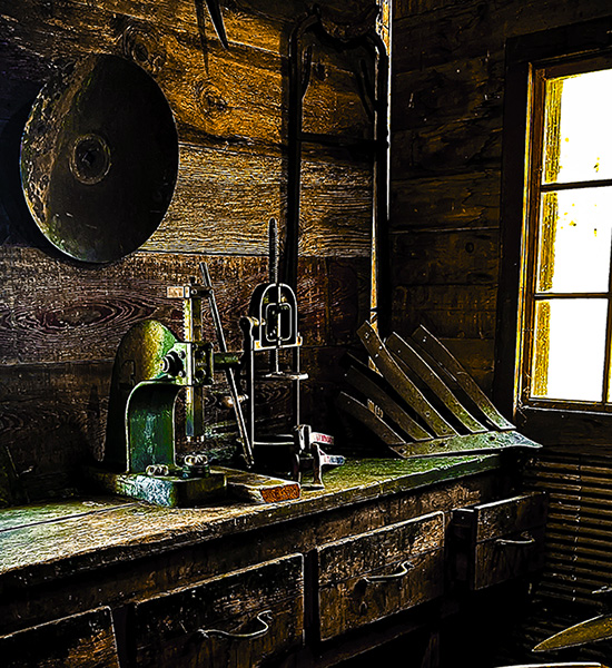
Original
About the Image(s)
We were traveling through western Nebraska and stopped by a pioneer village to have a look around. The workshop was a dimly lit building with old tools and antiques strewn about. I went to a corner with a window to get more light and shot this. I decided I wanted to play with it in black and white so I converted it and then ran it through Topaz Studio 2 to alter the structure and texture of the wood. After highlighting the image I applied a couple masks including impressionism to really make the wood grain pop. While either version has its + and - I prefer the mystique of the black and white.
6 comments posted
Al, you discovered something different and I would save it as another version of your original. Frankly, I like very much the colors and the texture of the original best. I would only eliminate the tail and shadow from the center top and darken the white strip at the bottom right. Hope you will keep and enjoy both versions. Posted: 11/04/2026 00:02:52
I'm curious as to what you shoot with. The original looks like an altered image. I like the final however it would not qualify as a black and white - or monochrome as there are colors that appear. It's very interesting though. Posted: 11/09/2026 04:18:57
This was an iPhone 13 Posted: 11/09/2026 14:24:28
Your original image looks overly processed, or too saturated or something unnatural. Your processed image created a style that I always find rather unattractive. I think you would have been better if you had done a straight black and white of the image. Posted: 11/09/2026 22:33:26
I prefer your final image, and I agree that it really makes the wood grain pop. It also seems to me to reduce the clutter and emphasize the various elements. I would just tone down the Topaz filter a little, maybe reduce the opacity a bit. Also tone down the left corner if possible. I think you did well to get as much light into the image as you did. It was a challenging scene for sure!
Posted: 11/11/2026 18:56:35
Posted: 11/11/2026 18:56:35
I like the feel and visual impact of the final. You've taken a different and effective approach that makes every detail stand out. I also like the coloring, even it might not be accepted in some composition categories. A lot of AI renderings are taking on this kind of exaggerated look. The brightness and placement of the window is a bit distracting, but overall a fine effort.
Posted: 11/12/2026 14:56:36
Posted: 11/12/2026 14:56:36