Al Swanson

August 2026 - Tucson Barrio
About the Image(s)
Lots of room for comments on this one. Don't have the original. Took this in the Tucson Barrio a few years ago while roaming around Old Tucson looking for artifacts of the past. The barrio is filled with them! I came upon this relic on a back street. It was pretty overgrown but still usable. The uneven plaster topped with splash-on paint made the exterior stand out well textured. Light was distributed unevenly as you see. I added contrast to give some separation to the vegetation. I also gave a small bump to vibrance but not much because I wanted the original dilapidation to show through. The door itself is a story with the peeling paint, uneven application, and contrasting colors. I thought this was a tale unto itself.
8 comments posted
This is an extremely attractive image. Looks like a painting! Can't think of anything to improve it. Nicely done. Posted: 08/03/2026 21:25:10
Yes, I do agree that this image is colorful, artistic and story-telling. At first I thought it was a window, because the overpowering flowers. However, the composition appeared to me out of balance. So I was not sure if I could explaine it and I thought it was easier to show it; now it is only a suggestion, I do not mean to change your picture. What do you think Al? I think that this way It gives more emphasis to the door than the flowers. Posted: 08/11/2026 18:06:07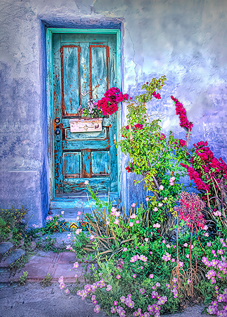
I like it. Because of the subject--doors--your version makes the door the clear subject. The foliage becomes supporting. Good edit. Posted: 08/12/2026 15:23:10
Glad you approve Al. thanks ! Posted: 08/15/2026 20:56:07
I really like your approach for this image. You have two different points of interest, but they end up combining anyways to form a unified composition. The relatively recent overgrowth confirms that this place has long since been abandoned, and nature is taking its reclamation course. Not having seen the original I'm guessing that you've boosted the door color and texture quite a bit, but this fits in well with the prevailing theme. Good that the door is off center. Fine and original effort! Posted: 08/14/2026 23:19:26
Another blue door! This one looks like a watercolor in beautiful pastels. I like what Joe has done with the flowers, but I would also remove the red bloom that is right on the door. The offset placement of the door is perfect. Nicely done.
Posted: 08/16/2026 15:50:02
Posted: 08/16/2026 15:50:02
Nice job, Al. I like the artsy look on this one. I agree with Peggy - my first thought was that the bloom on the door was distracting. I took Joe's rework and removed the bloom on the door using Generative Fill in PS.
In looking at the reworks and the original I'm kind of thinking that removing the blooms makes it less "over-run" looking. Many of the barrio places do look over-run. Posted: 08/16/2026 16:48:28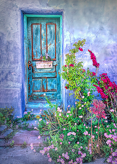
In looking at the reworks and the original I'm kind of thinking that removing the blooms makes it less "over-run" looking. Many of the barrio places do look over-run. Posted: 08/16/2026 16:48:28
Yes Marti, That does help very much. Posted: 08/17/2026 19:17:21