Jerry Biddlecom
About the Image(s)
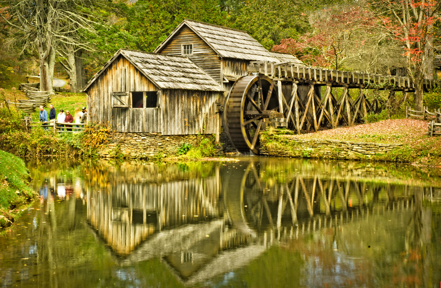
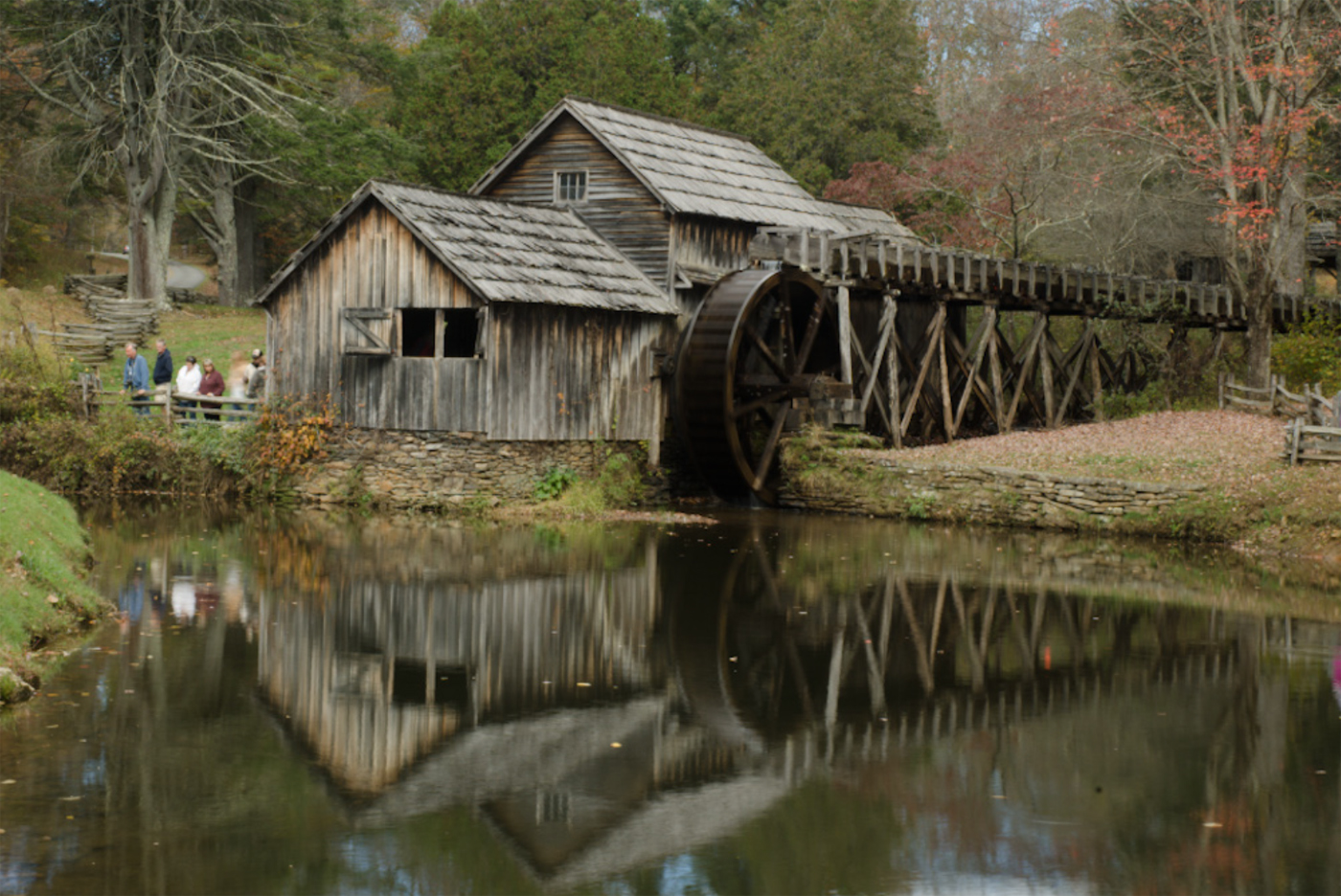
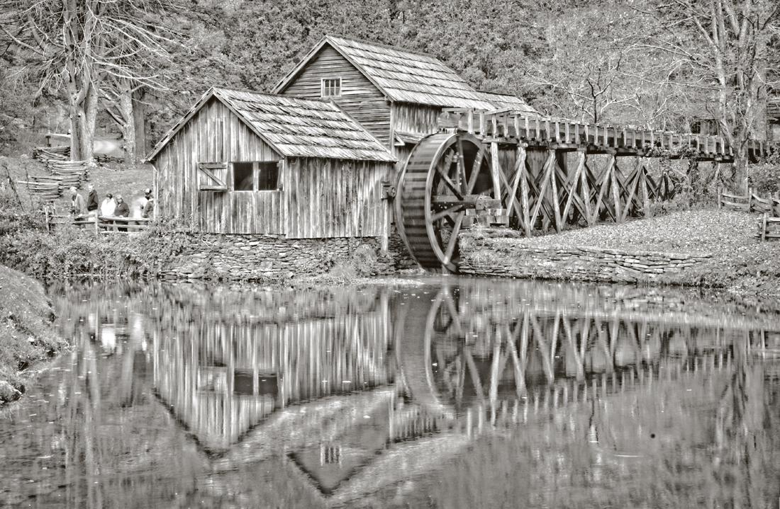
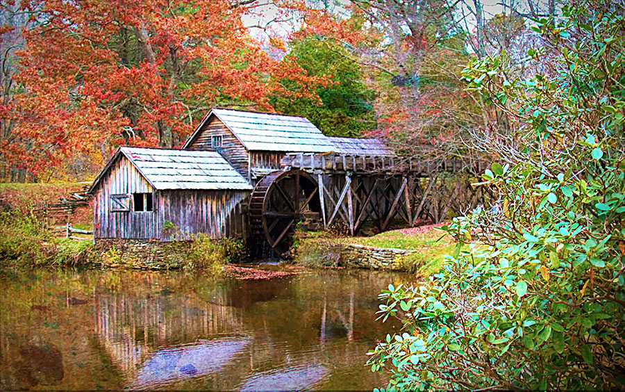
This was taken at the popular Mabry Mill in Virginia set along the Blue Ridge Parkway. I started out in Camera Raw and it required fiddling around with a lot of the adjustment sliders, mostly the usual ones like fill light and recovery, brightness, contrast, clarity and saturation, etc. I thought I might try converting to black and white, but was not overly satisfied, so I went ahead with the color final. What do you think? I also considered removing the people (such power do I possess!) but decided to give them a stay of execution.
7 comments posted
Very pretty. My first thought was - why didn't you remove the people? Or at least tone down the brightness-especially the two in white. My eye went there first. I like the way you brought out the detail in the mill and other parts of the image. Posted: 11/07/2024 05:51:35
Yeah, probably should have removed the people -- looks too touristy. Posted: 11/10/2024 13:54:39
What a lovely setting, and you have it well composed. I have no strong objection to the people, but with Photoshop's latest Remove Tool, you could disappear the ones wearing white very easily. The tone seems to me somewhat too warm, especially compared to your original. Overall - beautifully done! Just the kind of scene that I love to find! Posted: 11/09/2024 17:05:32
Looking back at it once again, I think you're right about it being too warm -- too much yellow saturation applied. Posted: 11/10/2024 13:56:24
HMMMM....Love the way you cropped this down. I stood in the same spot a few years ago. I agree with the removal of the people. Did you add an extended split rail fence on the left? The roadway the only thing there when I visited. Love the way you treated the reflection and I agree that the yellowish tint should be made softer. Nice job! Posted: 11/10/2024 18:30:41
Beautiful composition. To me, it appeared too garish and with an overly green tone. However, some like it that way. I'm just saying how it appeared to me. Posted: 11/14/2024 13:23:59
This is a lovely scene. I like the leading lines throughout the scene. The reflection is spot on. It does have a green tint, but it sounds like you have that figured out. I prefer the people out of the scene. I'd also like to see a little bit more room at the bottom. Perhaps add some canvas. Posted: 11/20/2024 17:13:36


