Carlos Roman
About the Image(s)
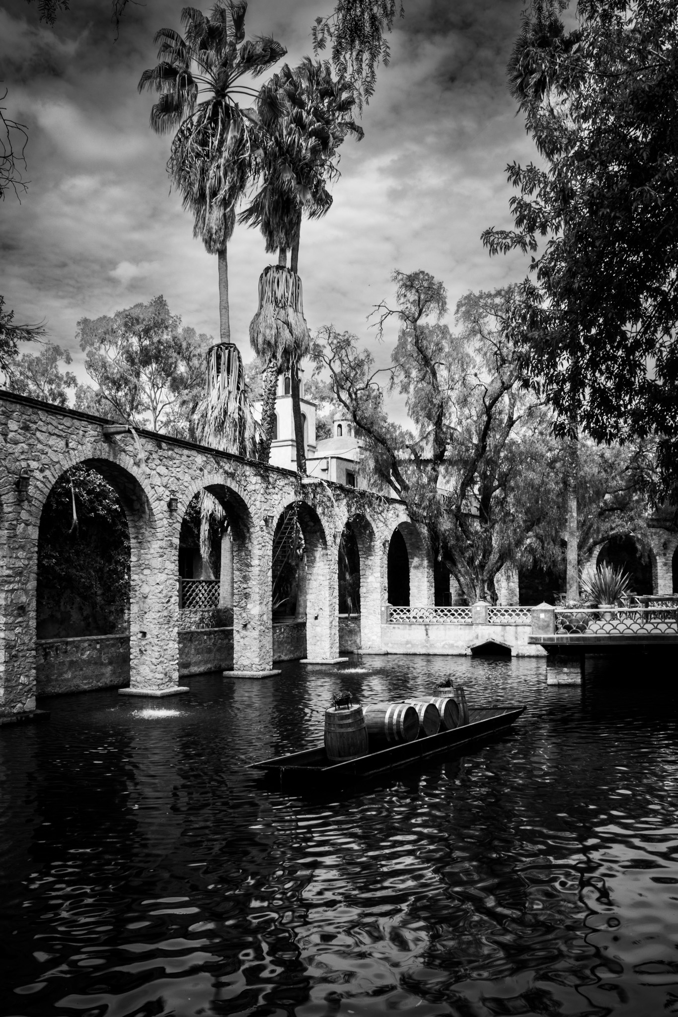
Description: this is a picture I took of an old hacienda, which is now a hotel. It reminds me of the old Mexican films when all the world seemed to be black and white.
Technical details: Canon camera EOS 1500D 18mm f/16 1/30 s ISO 100. Exposition time: 1/30s. No flash, no tripod, no filters. Edited with Lightroom by setting b/w, increasing the exposure, saturation and intensity of color.
6 comments posted
Hi Carlos, Nice and interesting BW photo. I really like it because there is a lot to look at right down to the barrels in the boat. It may be my screen but I feel the clouds in the center could be a little darker. Maybe tough to do since there is a lot in front of them and the tree to the right doesn't need to be any darker. Nice opportunity to take this photo. Posted: 11/16/2024 00:24:14
Carlos Roman
Thanks Joe, I will try to experiment with your suggestion. Posted: 11/16/2024 15:53:01
Very interesting subject, and black and white is a good choice.
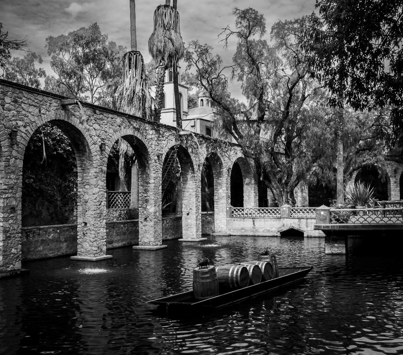
You might consider cropping strongly to a landscape orientation - maybe 40% from the top till a little over the arches on the left side, and maybe 15% from the bottom to under the boat. This would make the picture much more about the boat and arches and eliminate much of the sky and water which are less interesting. I also think the contrast is too strong, the area behind the arches goes to black or nearly black while the central brick area is nearly white. I took the liberty of doing a few edits - file attached. Posted: 11/17/2024 18:07:08
You might consider cropping strongly to a landscape orientation - maybe 40% from the top till a little over the arches on the left side, and maybe 15% from the bottom to under the boat. This would make the picture much more about the boat and arches and eliminate much of the sky and water which are less interesting. I also think the contrast is too strong, the area behind the arches goes to black or nearly black while the central brick area is nearly white. I took the liberty of doing a few edits - file attached. Posted: 11/17/2024 18:07:08
A very well-done monochrome image. I really like Sheldon's suggestions on cropping. It draws attention to the most interesting parts of the scene. Posted: 11/18/2024 02:22:44
A lot to let my eye wander over in this picture. I like the fact it is monochrome, colour could possibly be a touch confusing. I like it just the way it is. Posted: 11/18/2024 15:26:39
I like your portrait version of your Black and White Image, maybe cropping part of the bottom. Also, I like the landscape suggestion from Sheldon. I think either way is a great image. Posted: 11/21/2024 00:57:01

