Charles Bartolotta
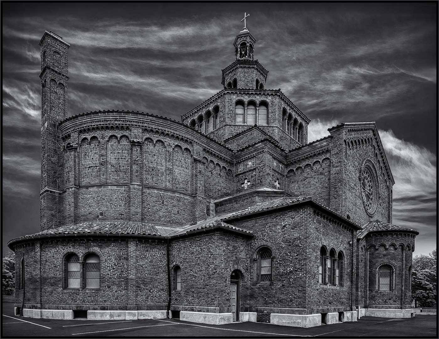
July 2026 - Blessed Trinity Church-Buffalo, NY
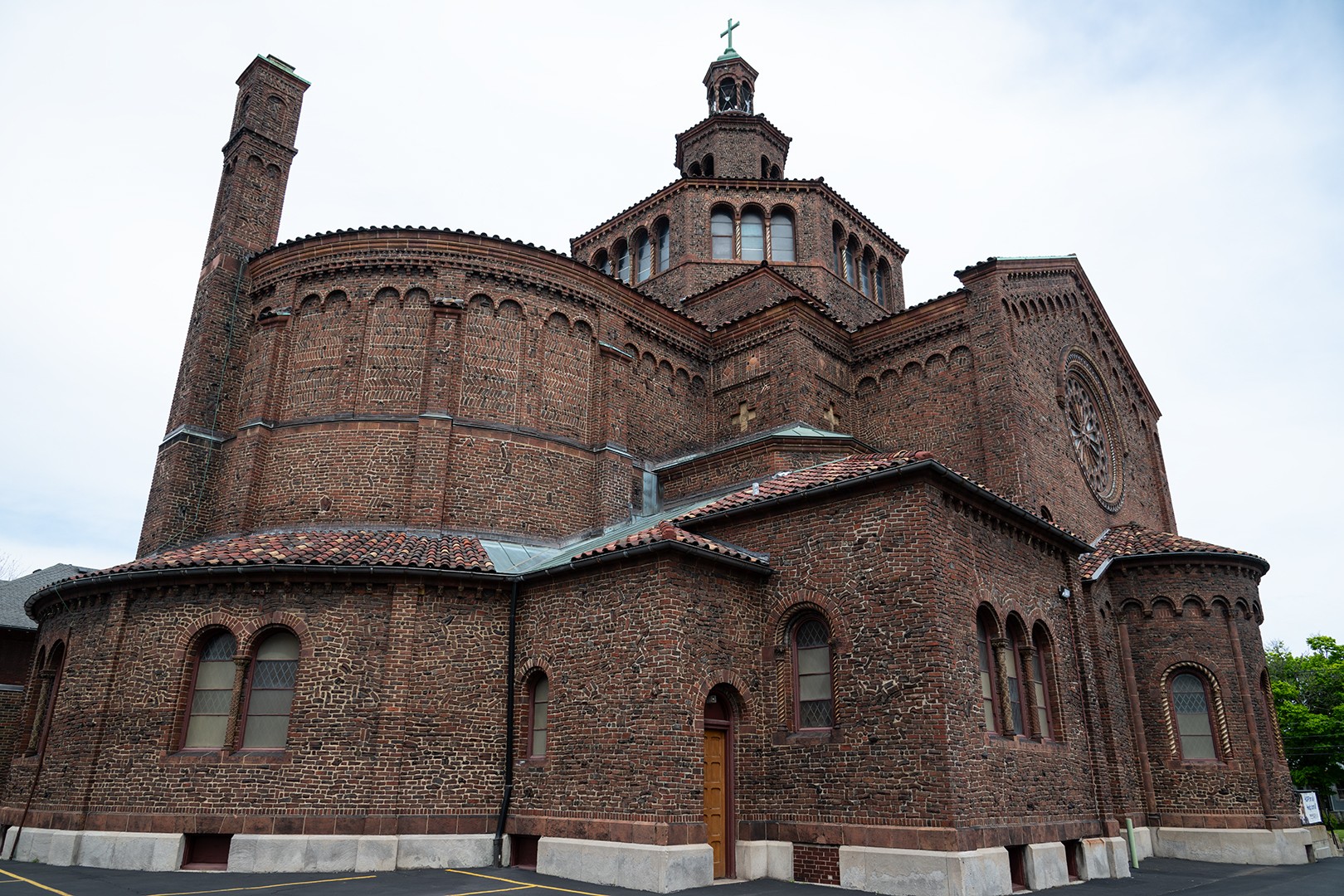
Original
About the Image(s)
I shot this image of the Blessed Trinity Church in Buffalo this past May. (My image last month was an interior shot.) The biggest challenge in processing this image was straightening the perspective. I converted the image to monochrome in Silver Effex. I removed the structure on the left and replaced it with a tree similar to what’s on the right. I also removed the white sign on the lower right of the image using Photoshop’s Remove tool. Aurora HDR brought out the sky. Sharpening was done in Topaz.
The image was shot with a Nikon Z8 and a Nikon 24-120 mm lens, f/8, 1/200 sec, ISO 160.
5 comments posted
Good composition, toning and sharpness. The sky is a bit overdone for my taste. My attention keeps being drawn to the bright spot on the right. Posted: 07/08/2026 22:58:14
(Groups 21 & 42 & 71)
Charles, this is an amazing image. I love the incredible detail and sharpness-you've captured the millions of bricks beautifully. The perspective correction to eliminate the distortion is excellent. I agree with Sheldon that toning down some of the brighter whites on the right would make it even stronger. I'd also love to see the inside of this church. Beautiful work-well done! Posted: 07/10/2026 13:28:41
Hi Charles: You have really breathed life into this church building with your monochrome conversion which is first rate in every possible way.
The brick masonry work is so sharply rendered. In some areas the bricks have been placed on odd angles which adds another dimension, have never observed this being done before.
Would prefer more breathing room on each side of the church, however I think you had obstacles in the way.
A thought I have! The very light colored concrete barriers that have been placed around the perimeter of the old artistically designed church in no way fit in with the architectural scheme of things. To me it would really help if you were to tone down these barriers so they are not so intrusive. To me they are a major distraction, along with the paint lines on the blacktop. Just my 2 cents.
Posted: 07/11/2026 04:06:34
The brick masonry work is so sharply rendered. In some areas the bricks have been placed on odd angles which adds another dimension, have never observed this being done before.
Would prefer more breathing room on each side of the church, however I think you had obstacles in the way.
A thought I have! The very light colored concrete barriers that have been placed around the perimeter of the old artistically designed church in no way fit in with the architectural scheme of things. To me it would really help if you were to tone down these barriers so they are not so intrusive. To me they are a major distraction, along with the paint lines on the blacktop. Just my 2 cents.
Posted: 07/11/2026 04:06:34
Hey Charles, another wonderful church image. I appreciate the amount of work having gone into this image. Other comments were already made and I agree a little tonal range fix of the brighter areas will top this off very well. Posted: 07/11/2026 12:37:48
Charles,
I agree with the other comments about the processing. The sky is a bit overcooked for my taste, but the detail you brought out in the brickwork is marvelous. One other thought is that while I understand you wanting to counteract the keystoning of the building, I think you went a bit too far. It almost looks like it's leaning out at the top even if isn't. I find that images like this look more natural if you leave a bit of the original keystoning in place. I include an example (that lacks your terrific processing). Posted: 07/11/2026 23:30:26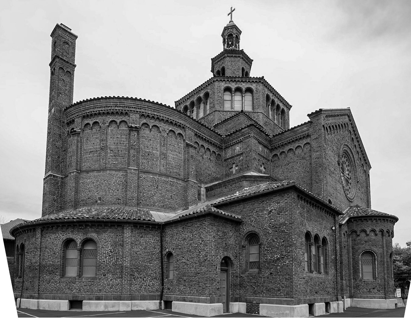
I agree with the other comments about the processing. The sky is a bit overcooked for my taste, but the detail you brought out in the brickwork is marvelous. One other thought is that while I understand you wanting to counteract the keystoning of the building, I think you went a bit too far. It almost looks like it's leaning out at the top even if isn't. I find that images like this look more natural if you leave a bit of the original keystoning in place. I include an example (that lacks your terrific processing). Posted: 07/11/2026 23:30:26