Ed Palaszynski
December 2025 - Arnarfjörður
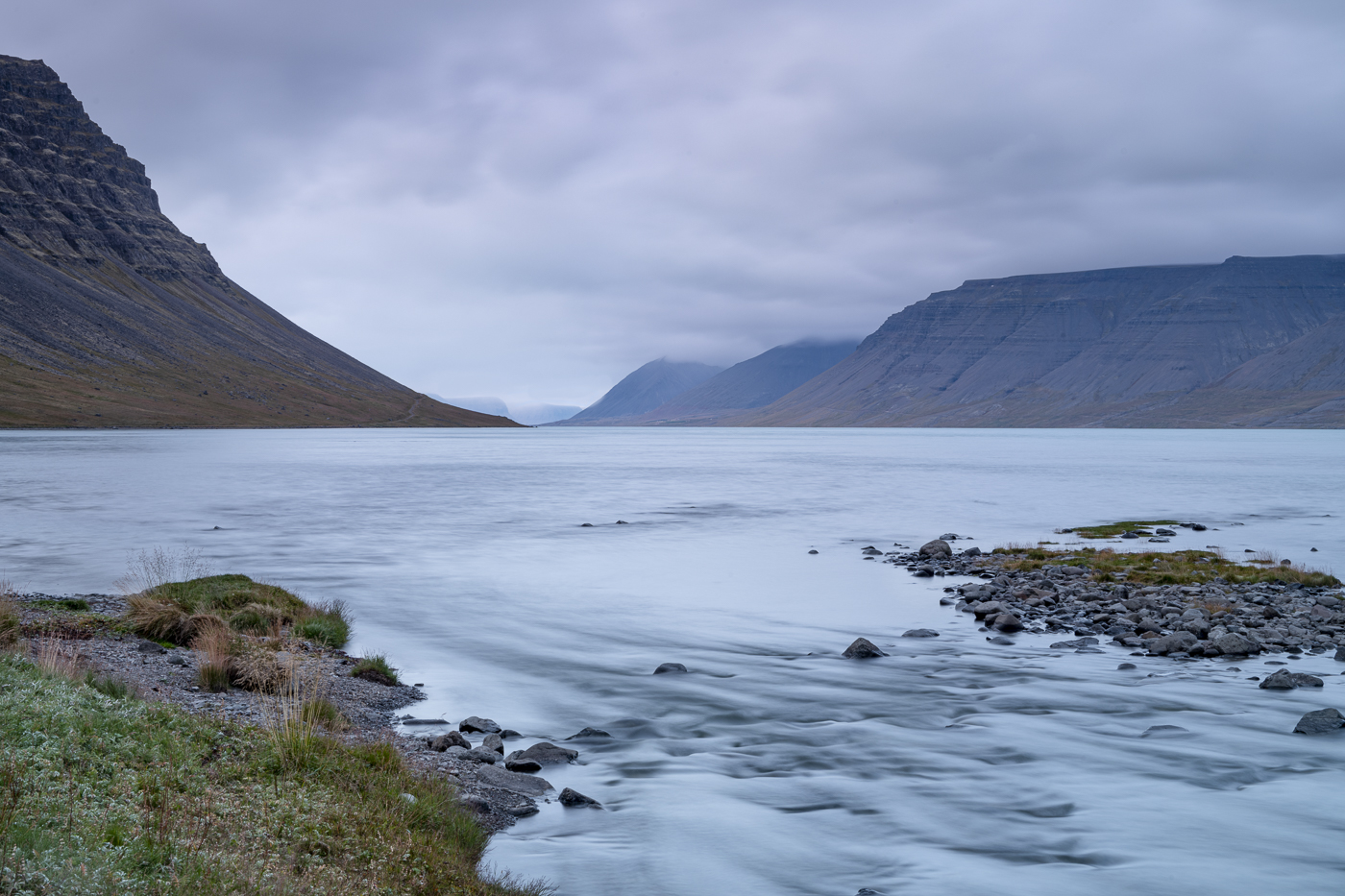
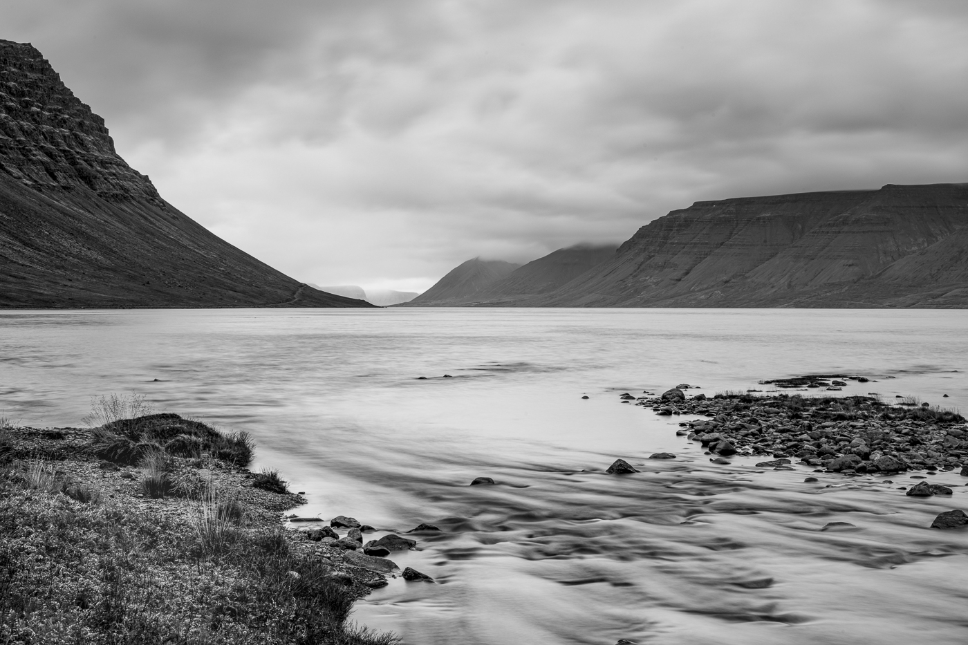
Original
About the Image(s)
Something a bit more traditional this month. During our last trip to Iceland we spent significant time in the West Fjords. We literally drove up and down numerous roads and fjords. All had unique views and compositions. The image here is from the fjord being fed from the waterfall Dynjandi (the waterfalls are immediately behind me in this image) and it was notable as the runoff was a wonderful shade of bluish-green due to the glacier melt. It’s tough to compare the color vs. the B&W but I do like the graphic elements of the converted file. This image was taken with a Nikon D850, 24-70mm lens at 10 seconds and F/22. B&W conversion was in PS. Comments Please.
4 comments posted
Very tranquil scene, composition has foreground and background interest. Nice job blurring the running water. If the tranquil mood is what you were going for, this does a very good job. Another alternative would be to go for drama, by increasing contrast and using more of the tonal range. Much of the color contrast in the scene, such as the green of the grass vs the gray of the rocks and brown in the mountain is lost in the monochrome because they are all the same brightness. And while the water and sky are different colors, they are both the same shade of gray. I took a shot at some changes, hope you don't mind. Posted: 12/07/2025 19:02:27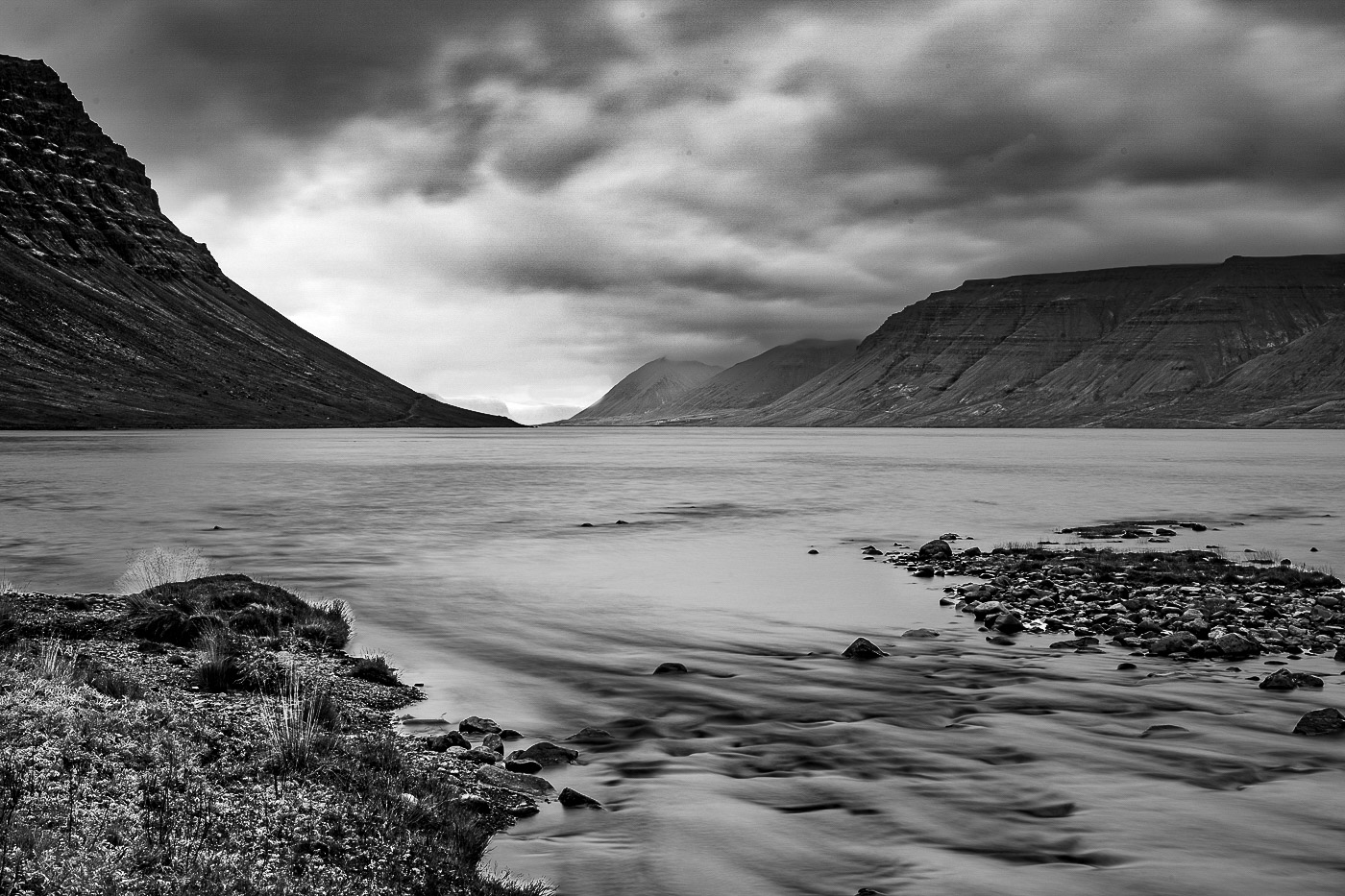
Hi Ed,
This is a lovely scene nicely photographed. Your exposure choices worked well here. My biggest concern is the bright area in the foreground water between the ground on the left and the rocks on the right. My eye keeps getting drawn to it despite the fact that it has very little detail in it. Consider creating a darker layer and masking it into that area. Posted: 12/08/2025 17:33:13
This is a lovely scene nicely photographed. Your exposure choices worked well here. My biggest concern is the bright area in the foreground water between the ground on the left and the rocks on the right. My eye keeps getting drawn to it despite the fact that it has very little detail in it. Consider creating a darker layer and masking it into that area. Posted: 12/08/2025 17:33:13
Hi Ed: I like your overall composition balance, the two large land masses in the distance, then the two small gravel areas in the foreground provide depth to the scene. The outflow stream ties everything together well. Overall a very peaceful scene.
To me the original color and the monochrome conversion tell different stories. The original is more of a nature type image while the monochrome is perhaps more on the pictorial order of things. Both Henry's and Sheldon's suggestions have merit in tweaking the monochrome somewhat.
Posted: 12/09/2025 03:24:40
A very nice scene. I've not been to Iceland; it's on my bucket list. I do think the image could use some additional detail by bringing the exposure down a bit. I think what Sheldon did with the sky adds more drama to the image. Your use of the long exposure does well with the water in the foreground. The ground in the lower left and the rocks on the right balance the cliffs on the left and right sides of the image. A nice composition. Posted: 12/10/2025 15:45:29