Yvonne Cary Carter

November 2026 - Water Lily
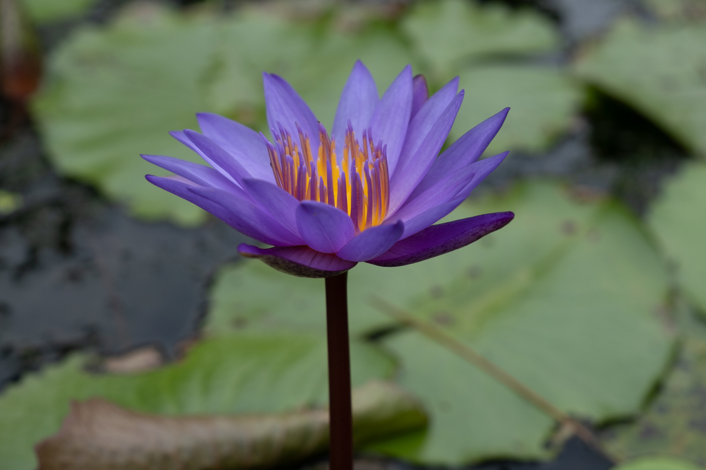
Original
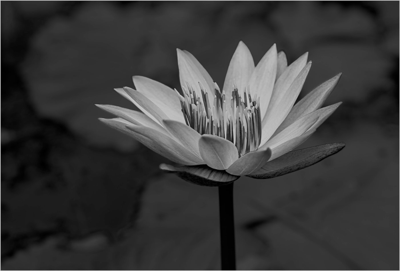
Original 2
About the Image(s)
I edited Water Lily with photoshop camera raw basic adjustments. Then placed the subject and background on different layers and masked for color. My original edit was
monochrome. Which one do you prefer?
Camera Fujifilm Camera X-Pro 3
Lens Sigma 18-50 mm
Focal Length 18 mm
Exposure 1/250 @ f/5.6
ISO 160
14 comments posted
Yvonne... Why not split the difference and simply reduce the saturation of the background to make the flower stand out more? It looks too artificial with a black and white background. Posted: 11/04/2026 18:48:38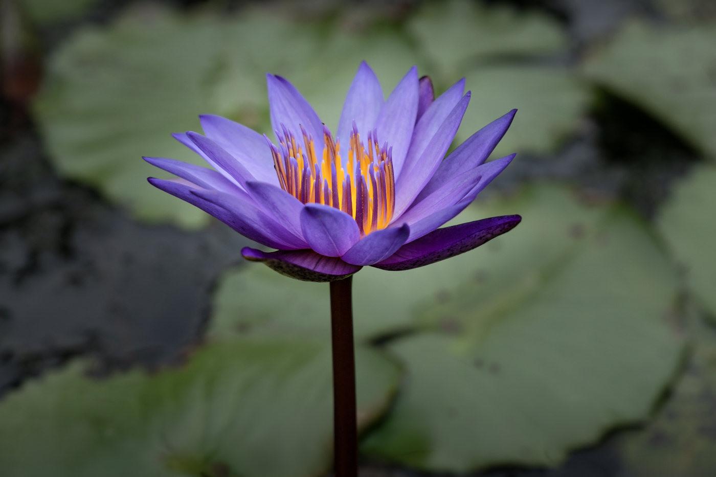
Randy, I like splitting the difference. The purple against the green works. I'll try this in my re-edits. Thanks Posted: 11/06/2026 17:17:09
Yvonne, First of all, thank you for this beautiful photo of a water lily.
What fascinates me about your photo is the luminosity
of the inner blossom, which, of course, really stands out in the two color photos.
In the monochrome image, I focus more on the details of the petals, the inner carpels, and the ovary. Perhaps a higher contrast could help reveal even more details. Or another option would be to use tone correction in Photoshop.
Just a suggestion from me. Posted: 11/05/2026 18:42:30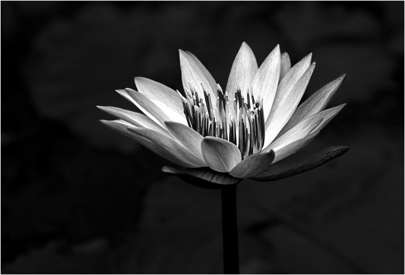
What fascinates me about your photo is the luminosity
of the inner blossom, which, of course, really stands out in the two color photos.
In the monochrome image, I focus more on the details of the petals, the inner carpels, and the ovary. Perhaps a higher contrast could help reveal even more details. Or another option would be to use tone correction in Photoshop.
Just a suggestion from me. Posted: 11/05/2026 18:42:30
Sabine, Wow ... is that my image. Your high contrasts really luminates the petals. Thank you. Posted: 11/06/2026 17:22:33
Your version is much more dramatic. It just goes to show that we all see the world through different eyes. Posted: 11/06/2026 18:31:03
We do see things thru different eyes. However, some of this is contributed to computer monitor lighting. I've just discovered ... after I edited these images ... computer monitor presets for digital and prints. On mac, display presets for digital is "photography (P3-D65) " and for prints "design and print (P3-d60)." And also soft proofing photoshop adjustment.
One more thing to take me down the rabbit hole . Posted: 11/06/2026 18:55:33
One more thing to take me down the rabbit hole . Posted: 11/06/2026 18:55:33
Yvonne,
Great image! I think I prefer Bruce's image over the one you chose, but I wonder if your would be better if it was cropped tighter.
I also like both your and Sabine's monotone - different vibes. The flower stands out more in Sabine's edit. Posted: 11/05/2026 23:48:33
Great image! I think I prefer Bruce's image over the one you chose, but I wonder if your would be better if it was cropped tighter.
I also like both your and Sabine's monotone - different vibes. The flower stands out more in Sabine's edit. Posted: 11/05/2026 23:48:33
Sylvia, I also like Bruce's and Sabine's. I'll re-edit with your comments as well. Thinking of placing both monochrome and color in my camera club competition. Thank you. Posted: 11/06/2026 17:27:07
Hi Yvonne,
I took a slightly different approach and deepened the color saturation and reduced the background to bascially black. Love the detail of the lily and wanted it front and center with nothing competing for interest. Posted: 11/06/2026 17:00:34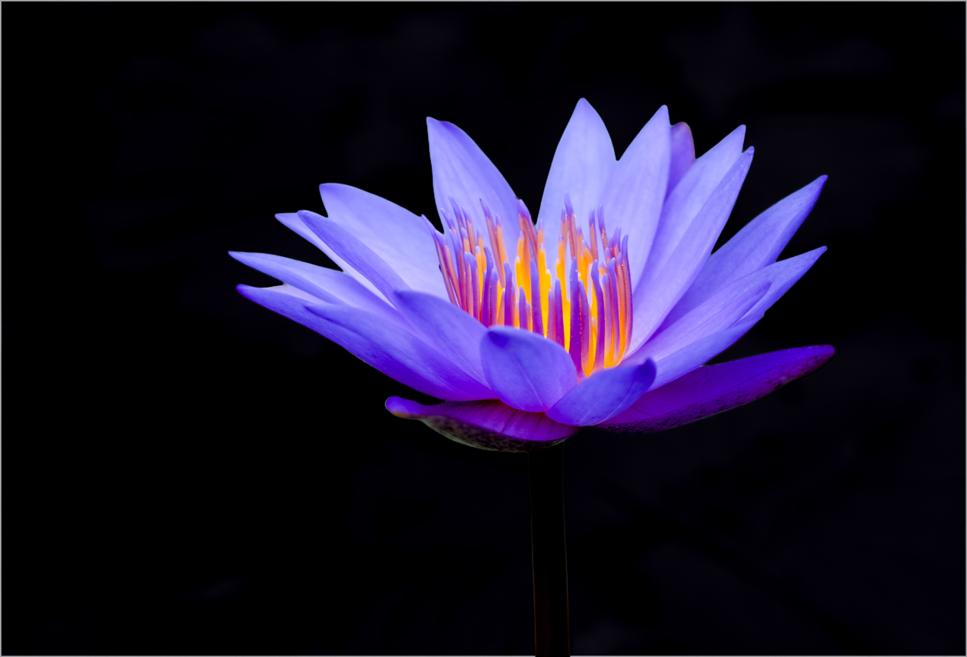
I took a slightly different approach and deepened the color saturation and reduced the background to bascially black. Love the detail of the lily and wanted it front and center with nothing competing for interest. Posted: 11/06/2026 17:00:34
Douglas, Pretty dramatic! The flower really pops. I'll include your suggestion in my re-edits. Thank you. Posted: 11/06/2026 17:29:52
Yvonne, this is lovely. Nice sharp details. I like your idea of the purple flower against the grey background. It glows from within. I think if you darkened the background the flower would pop. Sabine's image also looks great. Posted: 11/06/2026 22:57:28
Barbara, I'll try your suggestion of darkening the grey. Sabine's contrast does make the flower pop. Thank you for your comments. Posted: 11/07/2026 13:13:21
Yvonne, this is a nice photo of a water lily. I like the purples and oranges of the flower and they work well with the green of the leaves in the background. I like the black and white version, as well. It has a softness to it that is appealing to me. Perhaps, the flower could be brightened just a bit. Sabine's version is also very nice and adds more detail to the flower.
The rest of the group's suggestions are also good. Good luck with your club's competition. Both the color and black and white should do well. Posted: 11/14/2026 18:30:16
The rest of the group's suggestions are also good. Good luck with your club's competition. Both the color and black and white should do well. Posted: 11/14/2026 18:30:16
Thank you for your comments. I'll brighten up the flower to give it some vibrancy. Posted: 11/19/2026 14:06:40