Douglas Gerdts
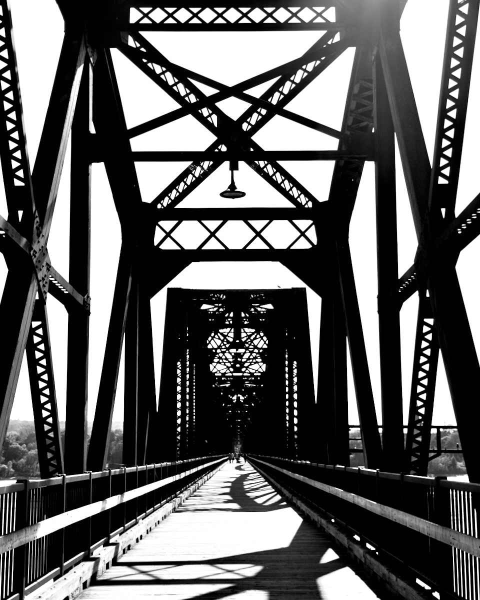
August 2026 - St John Bridge
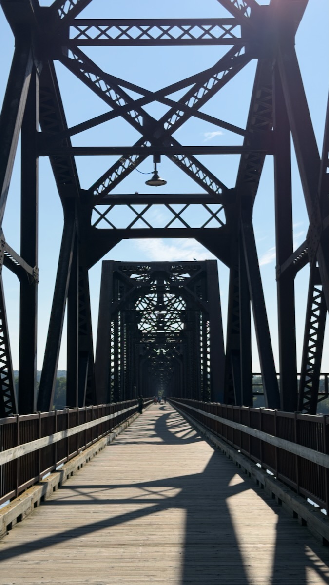
Original
About the Image(s)
I took this picture just a few days ago on a road trip through Nova Scotia and New Brunswick, Canada. The town of Fredricton, NB, has undergone some impressive redevelopment especially on its riverfront. The bridge is a re-purposed railroad crossing that is now restricted to pedestrians. I was intrigued by the steel framework and wanted to capture the intricacies of the design.
24mm, ISO 64, f/1.78
12 comments posted
Douglas... Nice perspective in this one. I did a couple of very minor tweaks. The image seemed slightly out of balance. I shaved a few pixels off of the right side so it matched the left side. The lens flare in the upper right was just a distraction, so I removed it with the dehaze tool in Photoshop. Posted: 08/01/2026 15:37:57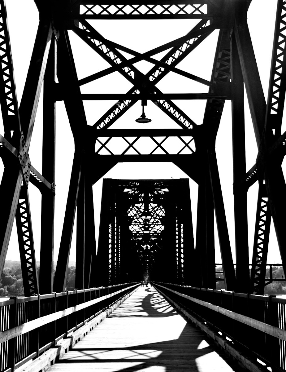
Thanks Bruce -- both of your tweaks were big improvements! Posted: 08/10/2026 21:53:05
Douglas, I like the way you captured St John Bridge. The angles and leading lines that draw the viewer's eye towards the top of the bridge create an abstract effect at the end. The composition conveys a sense of strength. I agree with Bruce's edit of removing the glare. Also maybe add a little more contrast. Posted: 08/04/2026 16:16:36
Thank you Yvonne! I do love bridges and marvel at the interplay of the steel. Posted: 08/10/2026 21:53:59
Douglas, bridges are always a challenging subject. You constantly have to pay attention to your vantage point, keep all the lines in view, and much more.
YYou did a great job with the shot of the St. John Bridge. The introductory lines are there, creating a sense of depth, and the individual struts and piers are clearly visible.
The shadows on the walkway and the people bring the image to life for me, a contrast between static and dynamic.
Bruce's minimal adjustments balance the image. I like Yvonne's suggestion to use a little more contrast.
Perhaps that will bring the finer details of the design even more into focus. Posted: 08/08/2026 20:11:20
YYou did a great job with the shot of the St. John Bridge. The introductory lines are there, creating a sense of depth, and the individual struts and piers are clearly visible.
The shadows on the walkway and the people bring the image to life for me, a contrast between static and dynamic.
Bruce's minimal adjustments balance the image. I like Yvonne's suggestion to use a little more contrast.
Perhaps that will bring the finer details of the design even more into focus. Posted: 08/08/2026 20:11:20
Thank you!
I took a surprising number of images to get the perspective I wanted. Was a bit frustrating because other people were using "my" bridge at the same time! Posted: 08/10/2026 21:55:05
I took a surprising number of images to get the perspective I wanted. Was a bit frustrating because other people were using "my" bridge at the same time! Posted: 08/10/2026 21:55:05
Douglas, I like the symmetry and perspective of this photo. Bridges can be so interesting. The people in the distance help provide scale to this bridge, which looks quite large. A couple of suggestions would be to darken the walking path a little bit to add detail of the planks. Some spots seem a little blown out (at least on my monitor). I would also suggest to brighten the structure of the bridge, especially in the distance. I would like to see more detail of the structural members of the bridge. Just my two cents, anyway. Posted: 08/09/2026 19:22:48
Hi Randy --
Yes -- you have it exactly right -- the planks do get washed out and look too smooth. In reality they were well-worn and quite interesting on their own. Posted: 08/10/2026 21:56:30
Yes -- you have it exactly right -- the planks do get washed out and look too smooth. In reality they were well-worn and quite interesting on their own. Posted: 08/10/2026 21:56:30
Douglas,
Very nice shot of the bridge. I like the people in the distance - far enough that they are not the subject. I also love the shadows on the walking path - they seemed curved to me while I see no curves in the structure. While I do like the black and white photo, I actually prefer the original because it shows more detail. Posted: 08/10/2026 20:02:24
Very nice shot of the bridge. I like the people in the distance - far enough that they are not the subject. I also love the shadows on the walking path - they seemed curved to me while I see no curves in the structure. While I do like the black and white photo, I actually prefer the original because it shows more detail. Posted: 08/10/2026 20:02:24
Thanks Sylvia -- and I don't disagree with your assessment of the color image. I've been toying with monochrome for a good while now and likely on the verge of overdoing it! Posted: 08/10/2026 21:57:36
Impressive bridge! Your perspective captured all the interesting details on the structure. Love the light and shadows. Monochrome complements the image. The lines and shapes created by the black beams pop against the white sky. I also like Bruce's crop. Well captured, Douglas. Posted: 08/12/2026 01:03:19
(Group 21)
Great shot Douglas! Posted: 08/12/2026 18:54:01