Bruce Titus
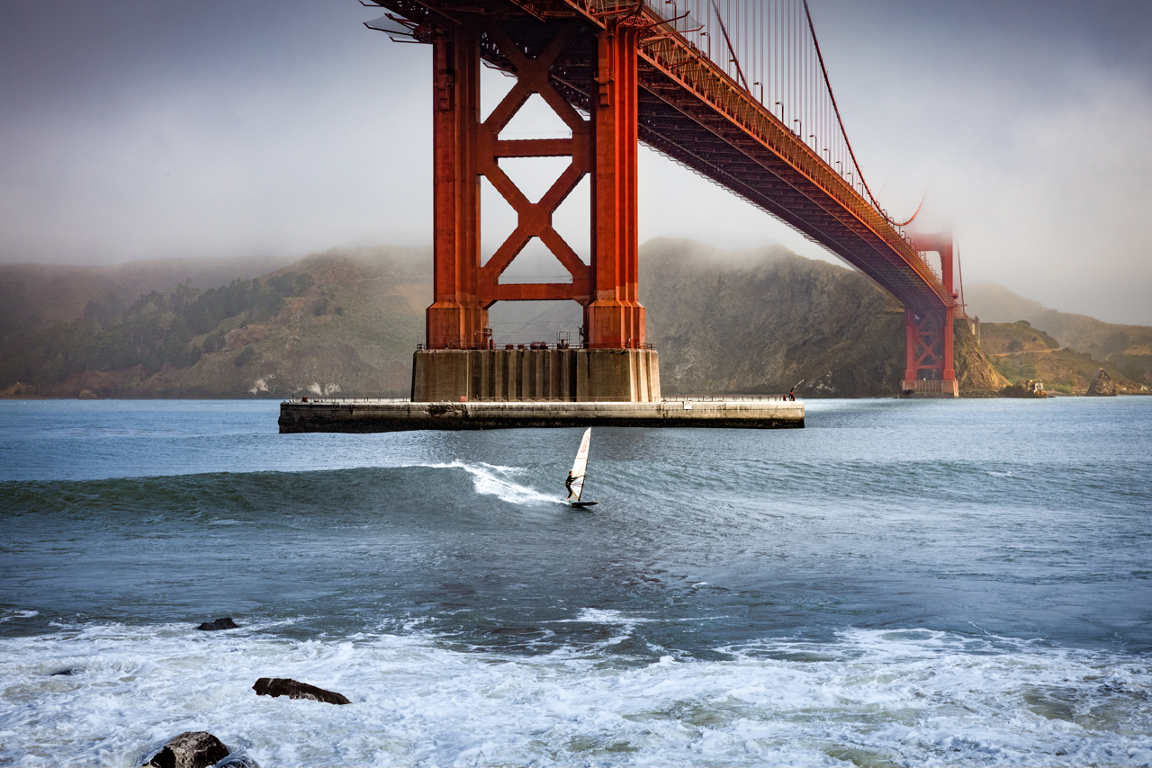
July 2026 - Golden Gate Windsurfer
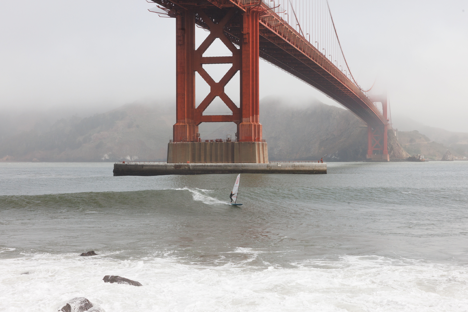
Original
About the Image(s)
I shot this photo two weeks ago. It was a foggy, crappy day but I decided to shoot anyway. Then the wind surfer appeared. He was only there for about twenty minutes but that was enough. I could go back there a hundred times and never capture that photo again.
The final is cropped from a 2 by 3 ratio to a 4 by 5 ratio.
17 comments posted
Bruce,
What a great catch! I love your edits, I kept going back and forth between the original and the edited photo.
Even with the bridge being massive, the horizontal span to the vertical pillar draw my eye right to the windsurfer.
The fog against the hills adds depth and mood.
A great photo
Posted: 07/02/2026 22:16:07
What a great catch! I love your edits, I kept going back and forth between the original and the edited photo.
Even with the bridge being massive, the horizontal span to the vertical pillar draw my eye right to the windsurfer.
The fog against the hills adds depth and mood.
A great photo
Posted: 07/02/2026 22:16:07
Thanks Sylvia!
I shot over 50 photos of the wind surfer and I had a hard time deciding which one to process. I've attached one of the others for comparison. I chose to leave most of the fog in this version. If you look close, there's a very curious sea lion in the foreground, watching him go by. Posted: 07/03/2026 00:02:01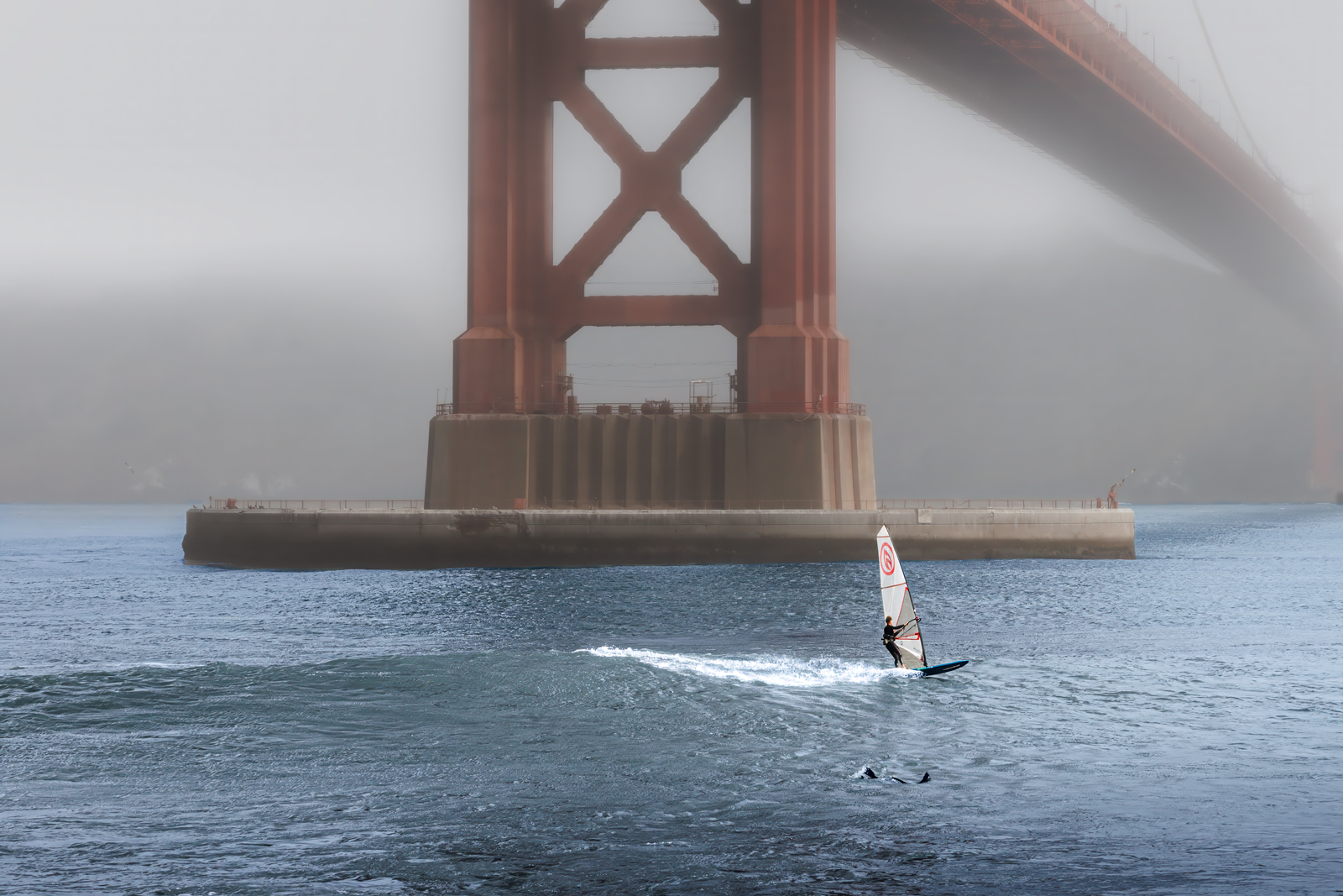
I shot over 50 photos of the wind surfer and I had a hard time deciding which one to process. I've attached one of the others for comparison. I chose to leave most of the fog in this version. If you look close, there's a very curious sea lion in the foreground, watching him go by. Posted: 07/03/2026 00:02:01
Bruce, this is pure action photography, and you've done a fantastic job. Everything works perfectly - from the calm, misty background to the color of the bridge and the waves in the foreground with the windsurfer. At first, I thought the bridge was too large in the picture and might distract from the surfer. No, on the contrary, the bridge is important for visualizing the proportions. Besides, the surfer is positioned at the center of the image.
I'm a little bothered by the partially cut-off stone in the bottom left, but that's just my personal opinion.
I'm curious about two things.
First, what were your camera settings, and second, the dimensions for a 4:5 crop. I did some research online and found the dimensions, converted to centimeters, to be 12.7 cm by 10.16 cm. Is that correct? Posted: 07/09/2026 14:41:45
I'm a little bothered by the partially cut-off stone in the bottom left, but that's just my personal opinion.
I'm curious about two things.
First, what were your camera settings, and second, the dimensions for a 4:5 crop. I did some research online and found the dimensions, converted to centimeters, to be 12.7 cm by 10.16 cm. Is that correct? Posted: 07/09/2026 14:41:45
Thanks Sabine ... here are the specs:
ISO = 1250
Focal length = 70 mm (My 24 to 70 lens cranked all the way out.)
F-stop = F14
Shutter speed = 1/800th
I left the rocks at the bottom to establish a foreground. I think you may be correct that the cut off rock should be removed. The more I look at it the more I agree with you.
I wanted the wind surfer to be dwarfed by the bridge. I think it adds power to the image. I used masks to brighten and increase the clarity of the wind surfer to draw the viewers attention to what the image is really about.
I set the shutter at "Low speed continuous" and shot over 100 frames of the wind surfer. Then I just picked the one with the best composition.
I don't know the metric equivalent of a 4x5 crop I use 4x5 a lot since it's easy to print at 16" x 20" which is probably the most common non-metric frame size. Posted: 07/09/2026 16:52:01
ISO = 1250
Focal length = 70 mm (My 24 to 70 lens cranked all the way out.)
F-stop = F14
Shutter speed = 1/800th
I left the rocks at the bottom to establish a foreground. I think you may be correct that the cut off rock should be removed. The more I look at it the more I agree with you.
I wanted the wind surfer to be dwarfed by the bridge. I think it adds power to the image. I used masks to brighten and increase the clarity of the wind surfer to draw the viewers attention to what the image is really about.
I set the shutter at "Low speed continuous" and shot over 100 frames of the wind surfer. Then I just picked the one with the best composition.
I don't know the metric equivalent of a 4x5 crop I use 4x5 a lot since it's easy to print at 16" x 20" which is probably the most common non-metric frame size. Posted: 07/09/2026 16:52:01
Sabine... at your suggestion, removed the rock. I also removed a smaller rock behind so the only two rocks remaining are pointing the same direction as the surfer.
I normally do what I call "edge patrol" to make sure there aren't parts of the image bleeding off the edges that really shouldn't be there. I missed that one. It just proves how useful these critiques are since we can't always see the flaws in our own work. Posted: 07/10/2026 15:48:29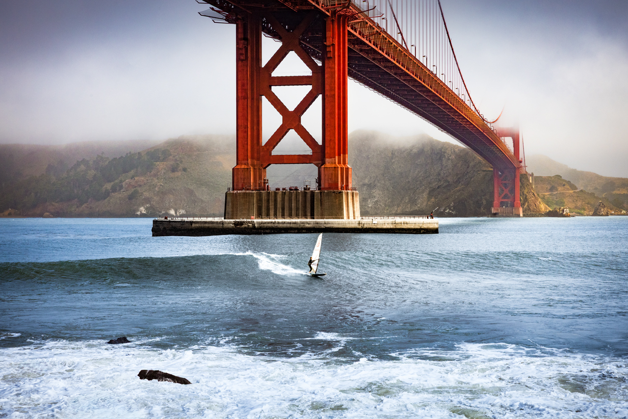
I normally do what I call "edge patrol" to make sure there aren't parts of the image bleeding off the edges that really shouldn't be there. I missed that one. It just proves how useful these critiques are since we can't always see the flaws in our own work. Posted: 07/10/2026 15:48:29
Thanks for your camera settings, Bruce. Since I suggested removing the cropped stone, I honestly feel like something's missing from the picture (sorry).
The foreground isn't serving as a leading line for me anymore. Your composition was already better.
But I've been thinking about it and flipped your image horizontally.
What do you think? Posted: 07/13/2026 13:19:43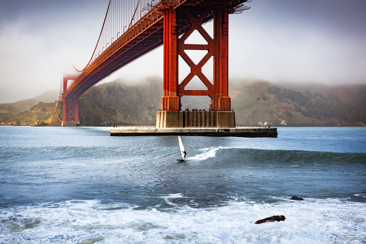
The foreground isn't serving as a leading line for me anymore. Your composition was already better.
But I've been thinking about it and flipped your image horizontally.
What do you think? Posted: 07/13/2026 13:19:43
I actually like the image better without the rock on the edge like you originally suggested. It's generally a bad idea from a composition standpoint to have things like rocks protruding off the edge of the image.
I see your point about the leading lines but I like the rocks pointing the same direction as the surfer. It makes the whole image flow to the right better.
I'm afraid that flipping the image would just annoy anyone familiar with the Golden Gate Bridge. Believe it or not, I try to edit as little as possible. Posted: 07/13/2026 17:36:06
I see your point about the leading lines but I like the rocks pointing the same direction as the surfer. It makes the whole image flow to the right better.
I'm afraid that flipping the image would just annoy anyone familiar with the Golden Gate Bridge. Believe it or not, I try to edit as little as possible. Posted: 07/13/2026 17:36:06
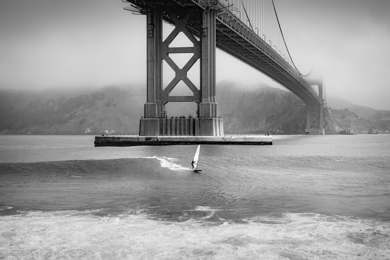
Bruce, Great shot. The bridge draws me right to the surfer! I especially like the foggy background and bridge. Just wondered what it would look like in monochrome with some texture removed to mimic the fog. Posted: 07/10/2026 13:22:48
Yvonne, I took your advice and experimented with a B&W version. I didn't want to reduce the texture on the surfer so I just applied a couple of liner gradients to the top of the image and added quite a bit of negative dehaze. I really like the result. Thanks.... Posted: 07/10/2026 16:18:57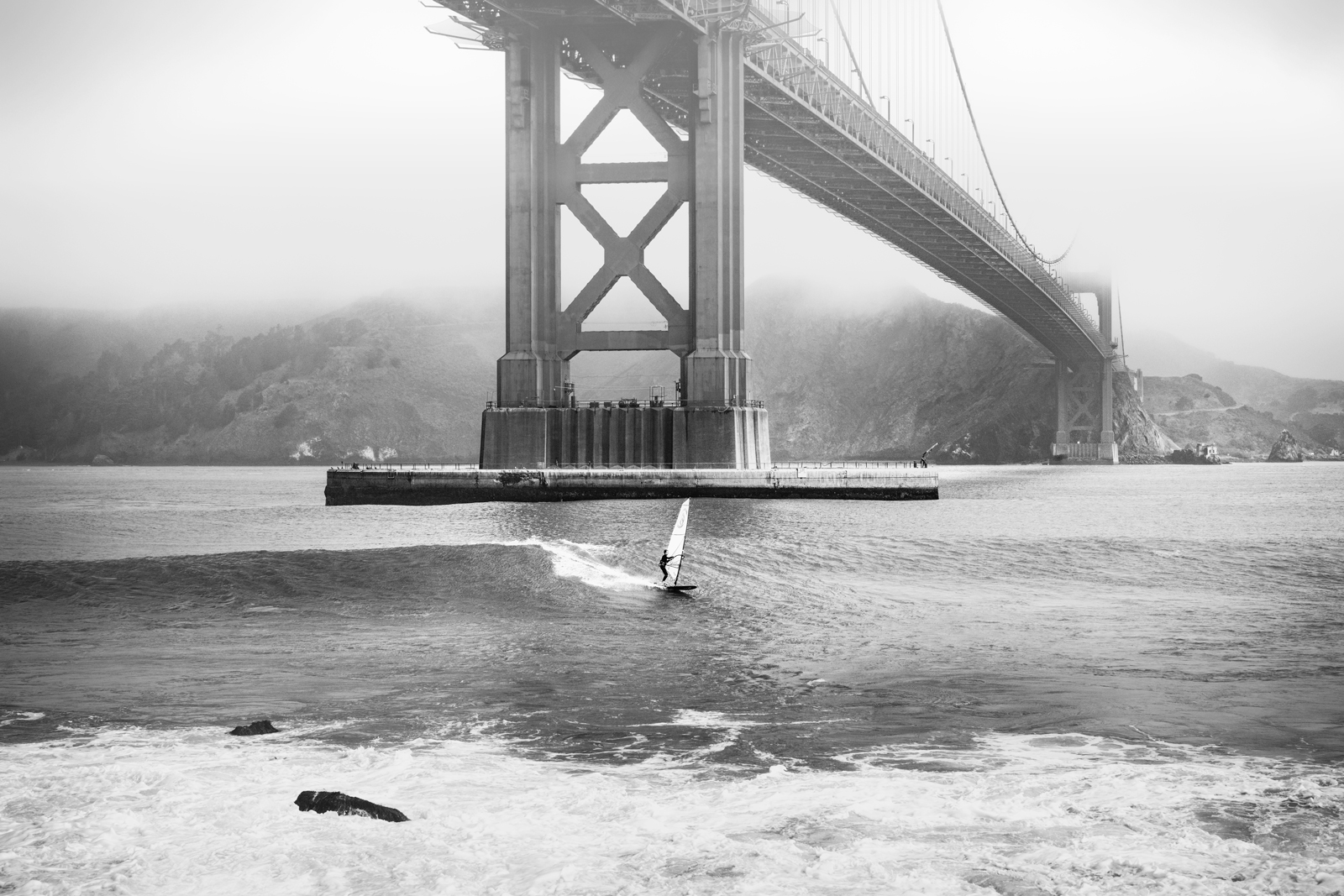
Glad you liked the idea. This was a good editing reminder for me. I experimented with dodging the surfer which didn't work. Your edit really highlights the surfer. Thanks for sharing. Posted: 07/10/2026 16:33:52
I decided to try similar edits to the color version. It definitely has a different look. I'm trying to decide which version I like better but I'm leaning toward the foggy version. Posted: 07/10/2026 16:50:54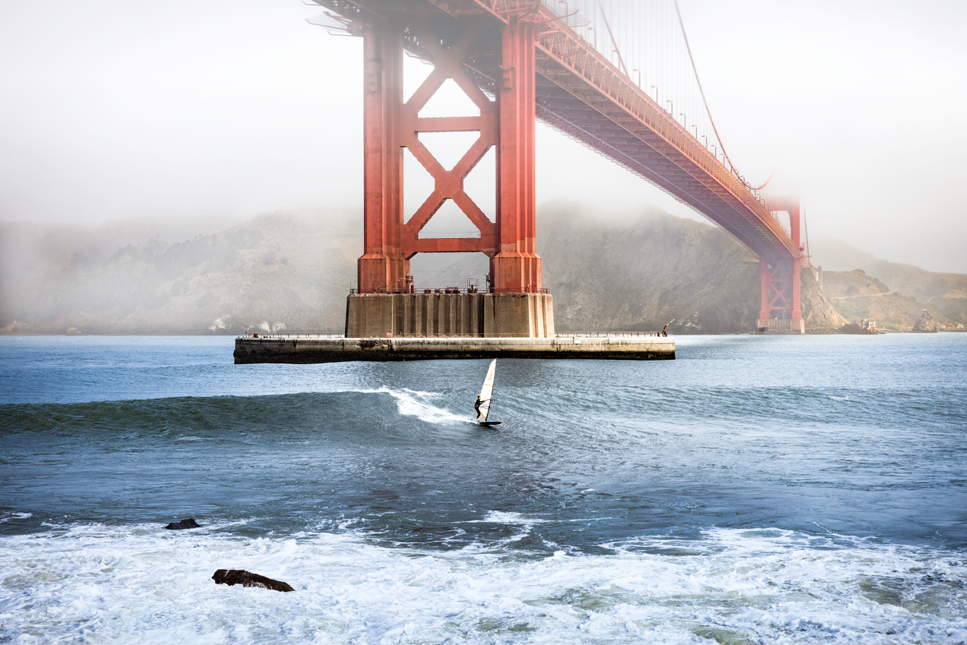
I like the new foggy version. The surfer is the true subject. Not fighting for attention with the bridge. Posted: 07/10/2026 16:56:17
Actually, the foggy version is much closer to what I saw through the viewfinder. Posted: 07/10/2026 19:21:10
You're right. There seems to be more fog in the original. Posted: 07/11/2026 00:01:00
You're right. There seems to be more fog in the original. Posted: 07/11/2026 00:01:02
I looked at the photo through fresh eyes this morning and immediately realized the top of the photo was way too bright. Posted: 07/11/2026 15:54:33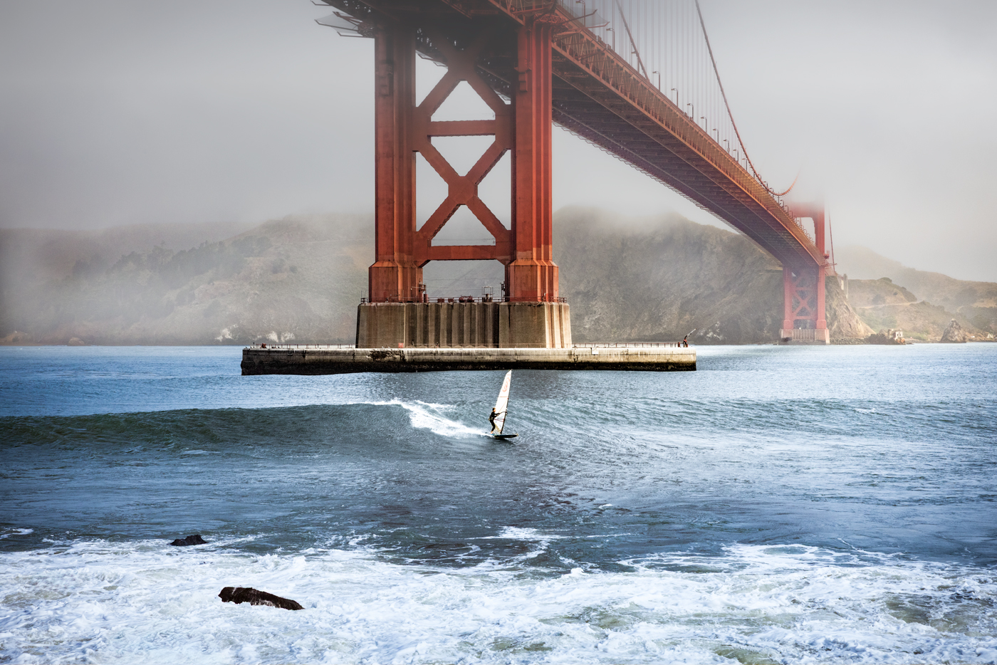
Posted: 07/10/2026 13:23:01