Douglas Gerdts
July 2025 - Front Door
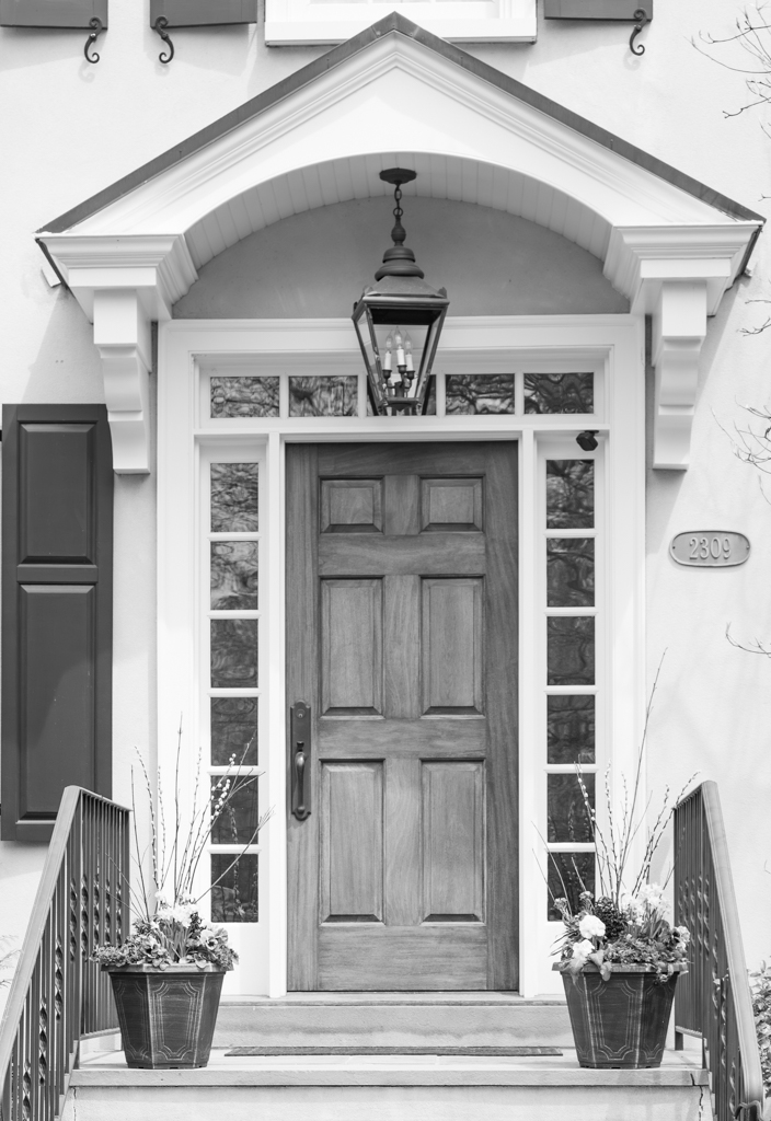
Original
About the Image(s)
I have been working in monochrome images recently after attending a webinar and am finding myself more and more drawn to them.
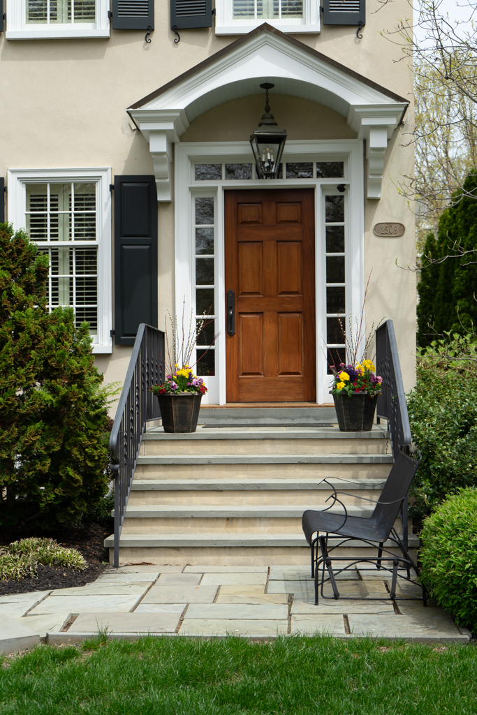
This is a photo of a home in my neighborhood that is always smartly maintained and decorated. I was intrigued by the clean lines and symmetrical placement and decided to play with it in Lightroom. The original is included so you can see what I did to it. As always, I value your feedback!
Specifics:
1/200 sec, f/5.6, ISO 50, 57mm
12 comments posted
Beautiful! I too am becoming more enamored with monochrome. As you have illustrated, it gives most photos the look of fine art. I love the symmetry, flowers on either side, the glass surrounding the door, the steps and railing leading up to the door. Both the house and photo are very nice!
I think this photo is great. To give you some feedback, the crop is a little problematic for me. There is more room on the left than on the right - but if you cut off more on the left it looks like that would cause other problems.
Additionally, I am not sure about the branches on the right side - I don't know if they give the photo character or are distracting. If I had not seen the original I am not sure I would know what they are. Posted: 07/09/2025 20:07:03
You're 100% right about the branches -- I thought they added some interest -- but realize they are more of a distraction! Posted: 07/16/2025 23:10:59
Douglas, I like the original version if cropped as you did with the B&W but I prefer the B&W conversion more. I'm immediately drawn to the design elements of the door with its detailed six panels. Your conversion was done well here. The smaller rectangular glass windows surrounding the door and the hanging light fixture above and centered within the arch and pitched roof really adds character and interest to this image. I think the crop is good when eliminating the foreground as you did. I like the flowerpots and handrails which I think add balance to the image. The window shutters above and to the left of the door are a bit distracting to me, but I understand it would be challenging to remove. The branches protruding into your image from the right side and in the lower corner are also a little distracting. I'm undecided if the reflections in the glass around the entrance door are a distraction or if they add interest to this image. In any case, a polarizing filter attached to your lens might have removed those reflections. This is a very pleasing image, and I think you succeeded nicely with the B&W conversion. Posted: 07/10/2025 13:35:37
Thanks Jim -- I also tried to get rid of the camera at the upper right of the entry but couldn't get the right mask so chose to leave it instead of a blurred mess! Posted: 07/16/2025 23:12:55
Doug, "Front Door" has a lot of interesting clean lines. I actually like the original with the brown door against the white window frames and black shutters. However for monochrome, I'd suggest adding more contrast. I tried by using one of the black and white adjustments in Photoshop. Posted: 07/14/2025 19:41:23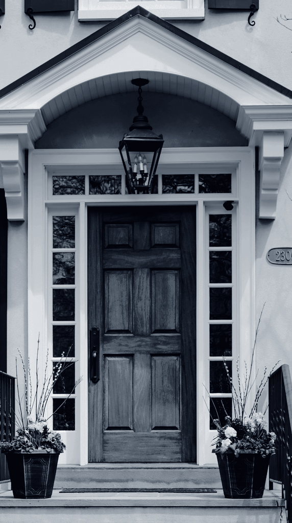
Thank you! Your comment actually gives me the idea to mask the door and let it be the one color element in the photo. I've had a little success doing that with clothing on some portraits that I've done. Thanks for the idea! Posted: 07/16/2025 23:14:25
Douglas, I can well understand your idea of converting the color image into a reduced black and white image; the many lines and structures, the symmetry are just perfect.
The crop you have chosen shows your intention, but it is not easy to maintain the symmetry. If you let the railings run into the lower corners, the distance on the right side of the roof is smaller than on the left. The problem can be solved by extending the right-hand side by 0.5 cm using Photoshop. The annoying branches were mentioned in the comments. I removed these with the copy stamp in the same way as the upper windows.
Finally, I increased the contrasts.
I'm looking forward to your opinion.
Posted: 07/15/2025 19:41:42
Wow! I really like that you were able to remove the upper windows! They annoyed me but my Photoshop skills aren't there yet. Also, finally ridding the branches really makes a difference. Posted: 07/16/2025 23:16:03
Douglas, I like your idea to convert this to black and white. I also see symmetry in this photo but I think the window shutter on the left side of the image throws off the balance, unfortunately.
I do, however, like the original image with the bench at the foot of the stairs. It is a very welcoming entrance, I think. As such, I have a different suggestion for the image. I also kept it black and white and cleaned up some of the branches in the upper right hand corner. It's just another idea to a nice image. Posted: 07/16/2025 21:41:45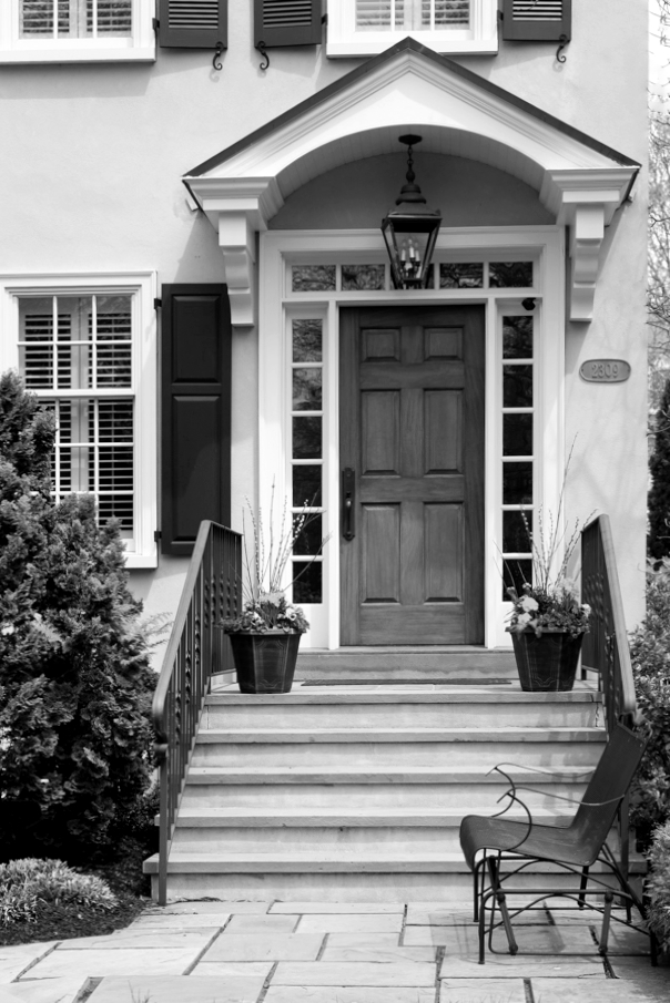
I do, however, like the original image with the bench at the foot of the stairs. It is a very welcoming entrance, I think. As such, I have a different suggestion for the image. I also kept it black and white and cleaned up some of the branches in the upper right hand corner. It's just another idea to a nice image. Posted: 07/16/2025 21:41:45
Thanks Randy! I really like your edits. I wish I would have included the entire 2nd floor of the house as the windows are quite nice as well. It's in my neighborhood so I might try it again! As for the bench and entry -- you're right -- it is inviting and also picks up the grid pattern of the walkway. Posted: 07/16/2025 23:17:51
Hi Douglas, Really like how you centered the door-it brings out the symmetry beautifully. The monochrome edit adds a timeless, slightly dramatic feel. I might like to see slightly deeper contrast, especially in the darker greys, just to give it more depth. But overall, it's a really clean and striking architectural shot. Nice work in Lightroom! Posted: 07/18/2025 12:39:07
Thanks Linda -- I agree -- door is a bit washed out and could use more definition and character. Posted: 07/19/2025 19:05:01