Sylvia Williams
July 2025 - Summer blooms
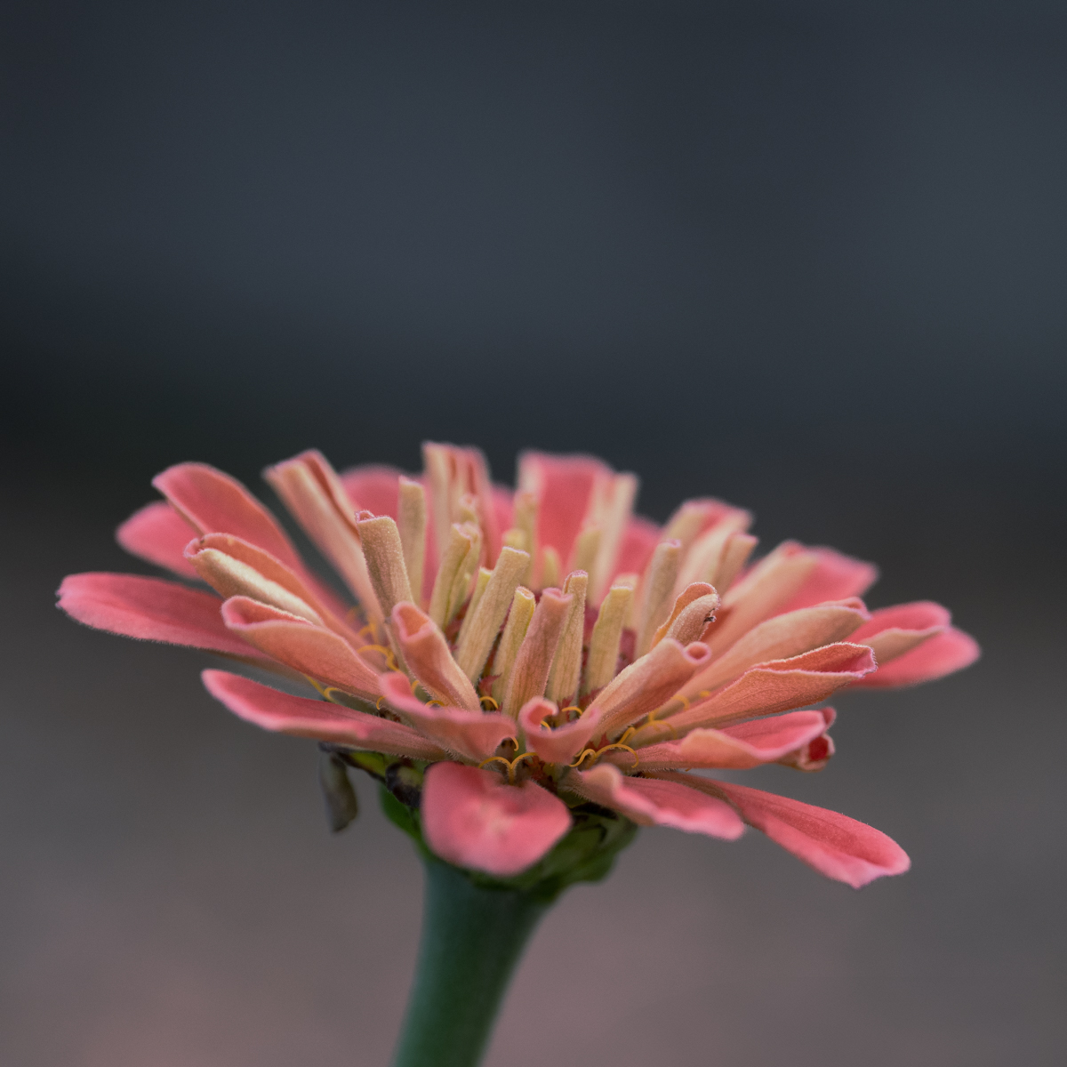
About the Image(s)
I am trying to be a little less literal. Not quite abstract but not all in focus. Thoughts?
(Hard criticism does NOT bother me).
Taken with Nikon Z7ii
1/4000 sec, f 4.0, iso 250
lens Nikkor Z 24-70mm
11 comments posted
Silvia, close-ups of flowers are one of my favorites, in particular, abstract or impressionist images. Creative blossom images captured by what the photographer sees through the lens are one of a kind, and yours does not disappoint.
I like how the colors and patterns of each out-of-focus blossom drives my attention to the sharp petals in the center of the blossom. The sharp yellow strands at the base of the pedals add additional interest and I like the soft background colors which are complementary, adding a nice balance to the image. I might consider using a mask over the sharp pedals in the center to increase the exposure, whites and/or highlights just a little. As a focal point, this might create a little more separation from the surrounding area.
This image makes me appreciate nature's work involving the opening of each pedal to form a beautiful flower. Very nicely done.
Posted: 07/09/2025 22:56:45
Thank you! I will try your suggestion Posted: 07/16/2025 13:21:46
Photos with the middle distance in focus can be a challenge, at least to me, and this photo is a terrific example of why it's fun to do it! My only comment is that you give us a lot of area above the flower and perhaps a slightly tighter crop? Posted: 07/12/2025 20:19:55
Thank you! I have to smile, I was in a bird group for a bit, and one of the members always suggested that I use a tighter crop :)
I think typically I like space around my subjects but I could see that in this image removing the space about the flower could be a good thing. Posted: 07/16/2025 13:25:46
I think typically I like space around my subjects but I could see that in this image removing the space about the flower could be a good thing. Posted: 07/16/2025 13:25:46
Sylvia, Summer Blooms captured me! Google says the name is Zinna Burst known for its colorful strips. Your gradient pink and gray background enhances the flowers soft colors. I was curious to see the flower on more of a diagonal slant to line up with the frame corners which sent me down the rabbit hole trying to edit. Posted: 07/14/2025 21:36:37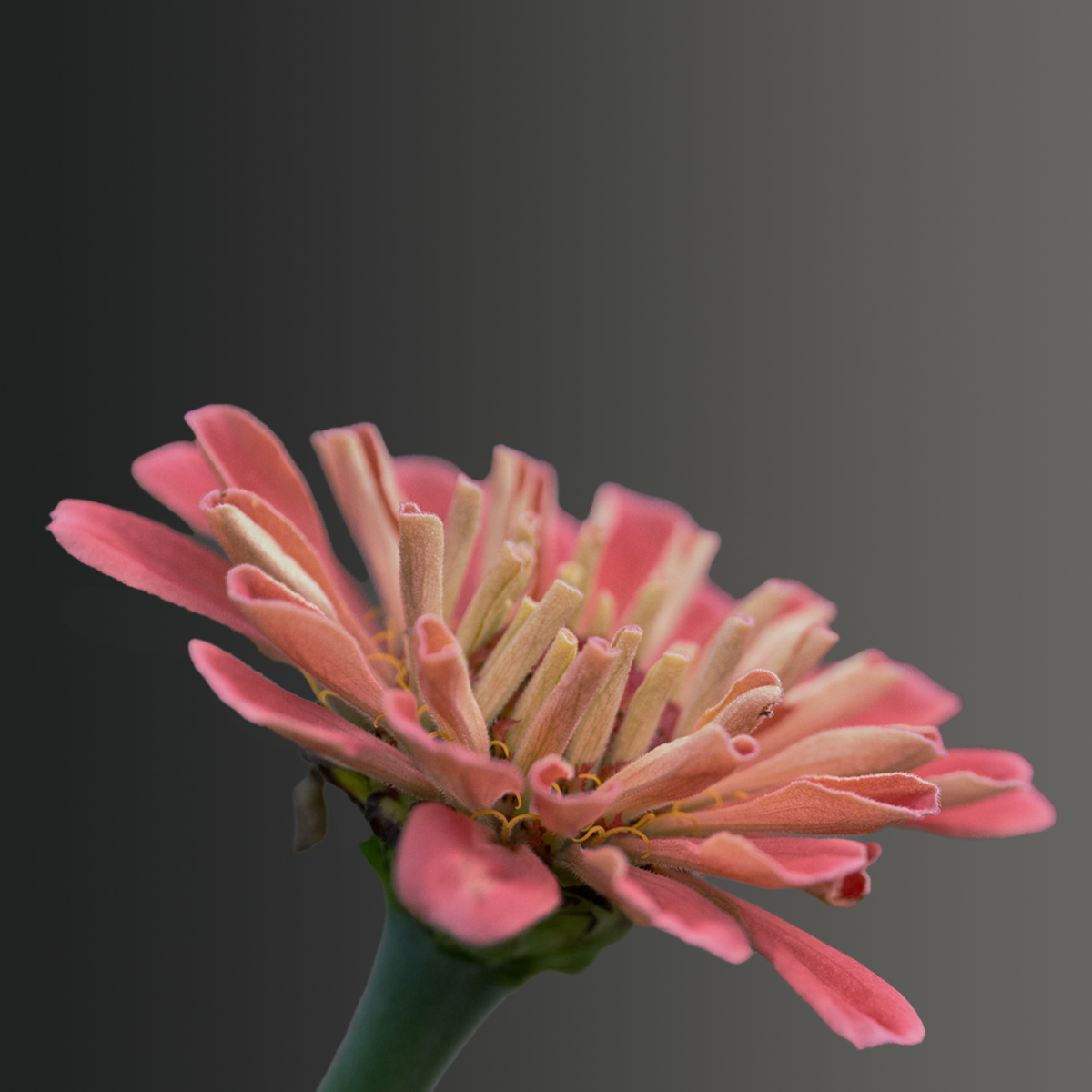
This is probably the same as yours ... but hope you get my idea of lining up the stem with the corners. Love your image. Posted: 07/14/2025 21:40:04
Thanks! Great idea, I do like what you did with my photo! Posted: 07/16/2025 13:22:27
Sylvia, Flowers are always great motifs. You have deliberately chosen a Zinnia in pastel, the foreground and background are coordinated. The cropping and composition are also right and show the beauty of the blossom. Well done!
Maybe you'll like my editing too. I increased the reds, yellows and greens and darkened the background slightly.
Posted: 07/16/2025 11:22:49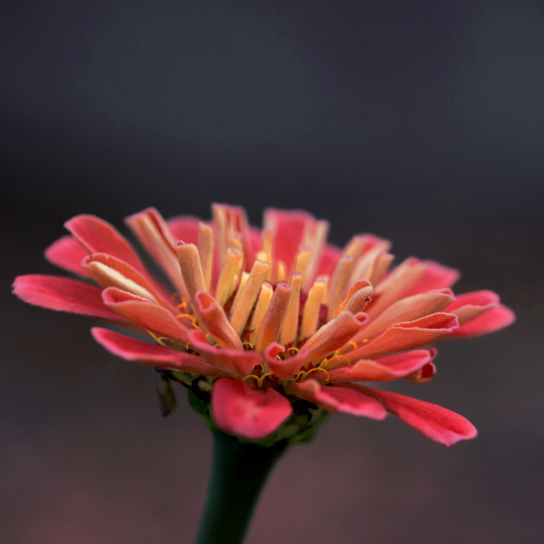
Maybe you'll like my editing too. I increased the reds, yellows and greens and darkened the background slightly.
Posted: 07/16/2025 11:22:49
Thank you! I like your edit as well. I need to try playing with the sliders in lightroom more. Posted: 07/16/2025 13:23:20
Sylvia, I think you have captured this flower well. I also play around with shallow depth of field on flowers. Sometimes it works, sometimes not. I think it works well in this photo. Personally, I don't mind how you have the flower cropped. You have given it a little room to "breathe." I do like Yvonne's suggestion of tilting the flower a little bit in the frame and Sabine's suggestion of increased saturation. I think both suggestions would enhance the image. Either way, I think its a nicely captured flower. Posted: 07/16/2025 22:32:28
Hi Sylvia, I love the soft peachy tones and the mood you're going for. The colors really stand out against the dark background. That said, the image feels a bit soft overall-maybe a sharper focal point would help anchor it more. The centered placement makes it feel a bit static; a slight shift or tilt could add more interest. You're on an exciting path exploring the not-quite-abstract style-I'd say push it even further! You're definitely onto something. Posted: 07/18/2025 12:28:58