Randy Bell
About the Image(s)
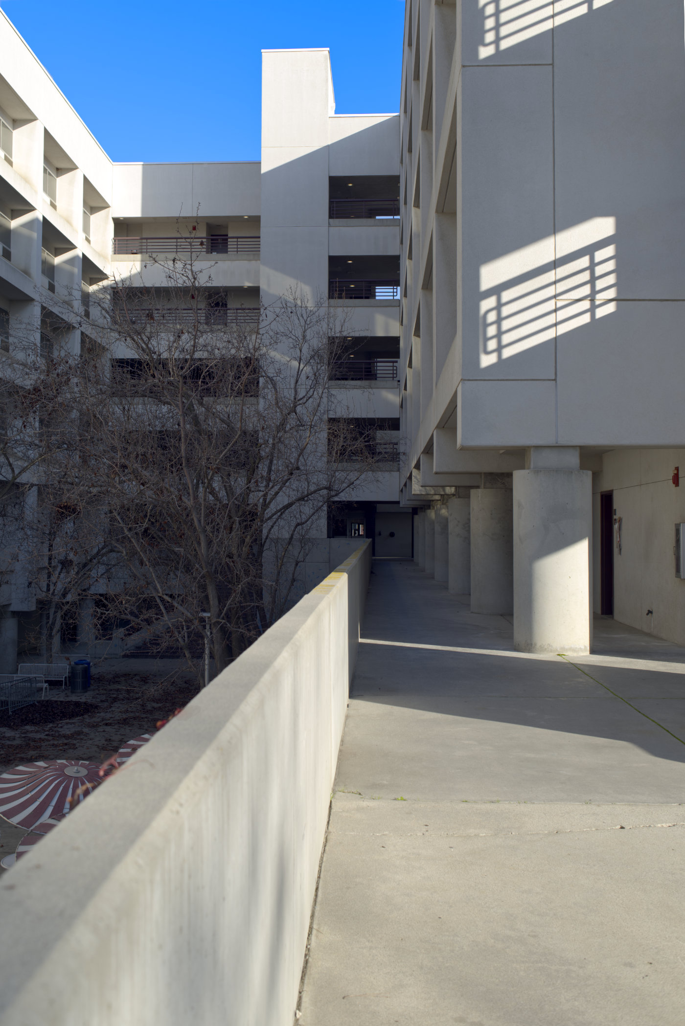
I took a walk the other day with my camera and one fixed focal length lens, a 35mm. I am
trying to carry one fixed focal length lens with my camera more often instead carrying a zoom
lens when I take these walks. I came up to this building and thought I would play with some
perspective shots for some practice. I've been to this building many times in the past and have
taken various photos with similar views. I like this area because of the architecture and
geometry of the building and the various lines and shapes that are within it.
I shot this with a 35mm lens at f/5.6, 1/125 second, ISO 64. I am trying to break away from
Lightroom especially since I have a very old version, so this photo was edited in some new (to
me) software, Affinity Photo. This software is more like Photoshop than Lightroom which I am
quite used to so there is a learning curve that I am working through.
9 comments posted
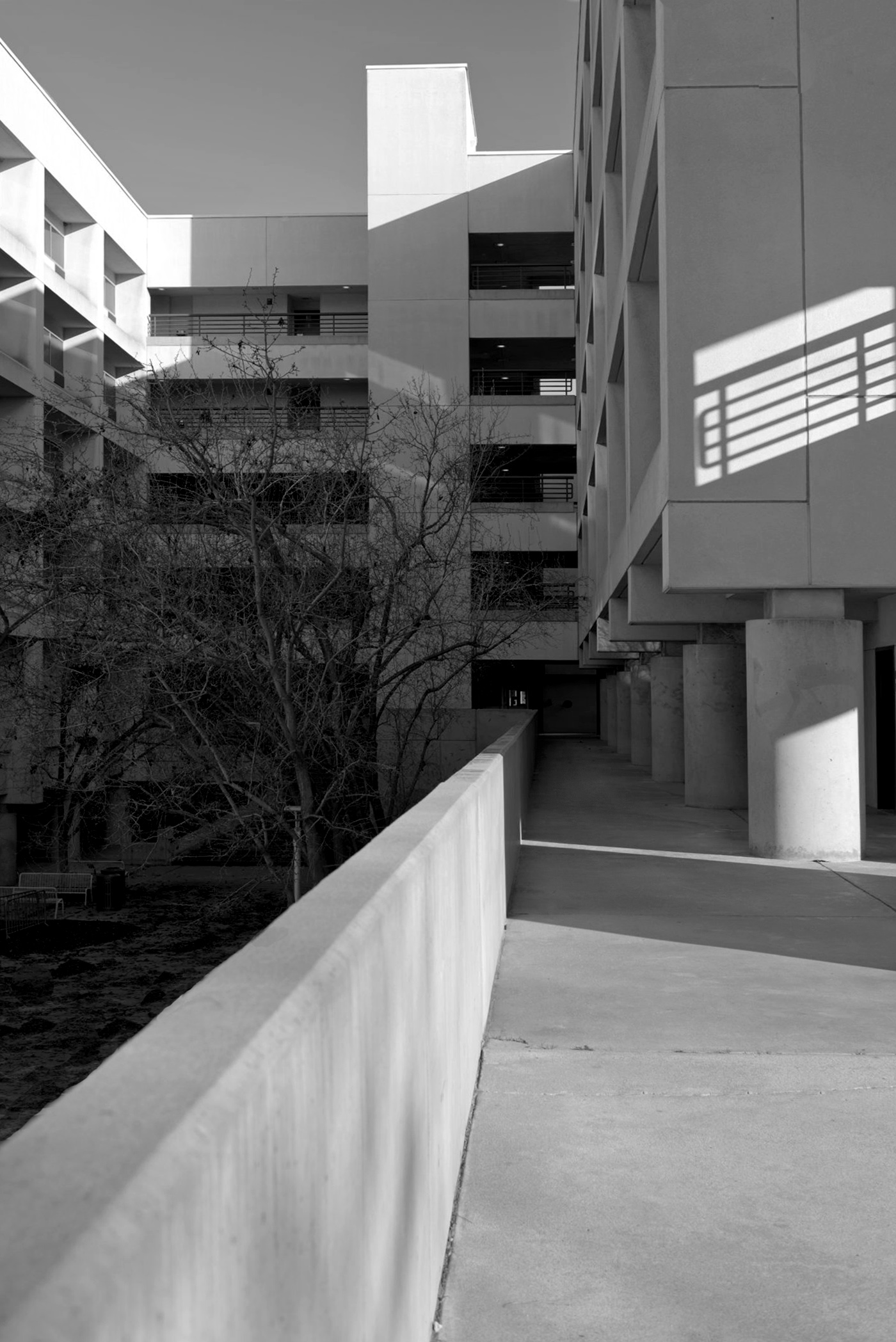
My idea was immediately, this is a black and white image. The highlights and shadows, the blue sky lend themselves well to the conversion.
I tried a conversion by taking out all the colors and adjusting the brightness and contrast with the tone correction. I removed the upper right shadow of the house so that the bright areas form a circle that leads back into the image.
Perhaps you will like my black and white conversion and it will give you an idea for further processing.
Posted: 01/10/2025 07:43:02
Using an older version of Lightroom for so many years, I rarely thought of removing portions of the photos that may be distracting. Probably because I wasn't very successful in removing them. Maybe with the new software I am using, that will change. Posted: 01/14/2025 01:27:01
I am not well versed in architecture photography so take my comments with a grain of salt. When I first looked at your photo, I loved the leading line of the wall coming into the shot. But then it kind of bothered me that the top of the building was cut off. I also was intrigued (or distracted?) by what I think are table umbrellas on the other side of the wall.
I do like Sabine's black and white conversion which makes it look more like art. I can't see the umbrellas and the missing building top does not bother me as much. Posted: 01/13/2025 14:13:46
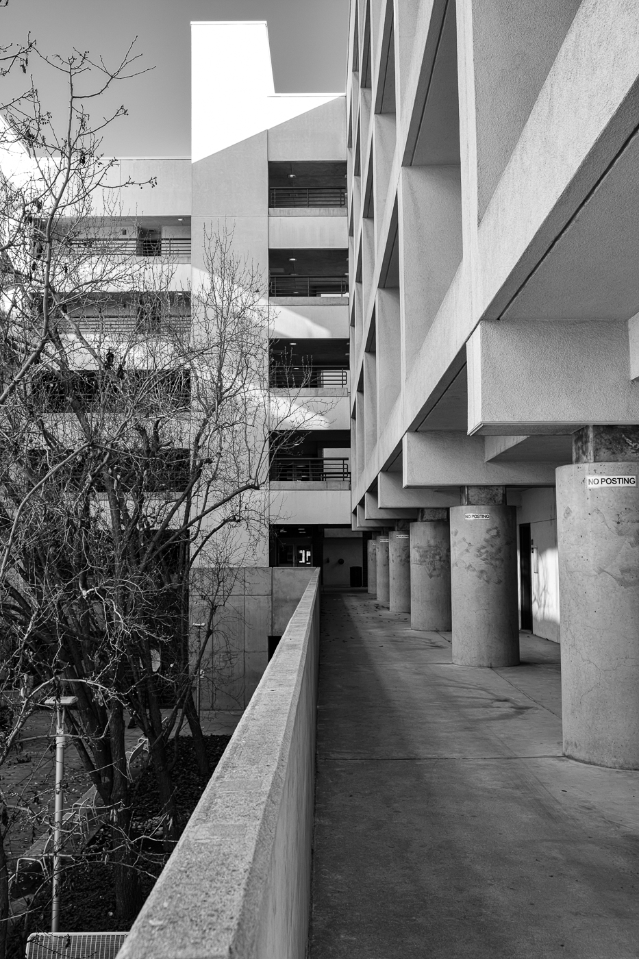
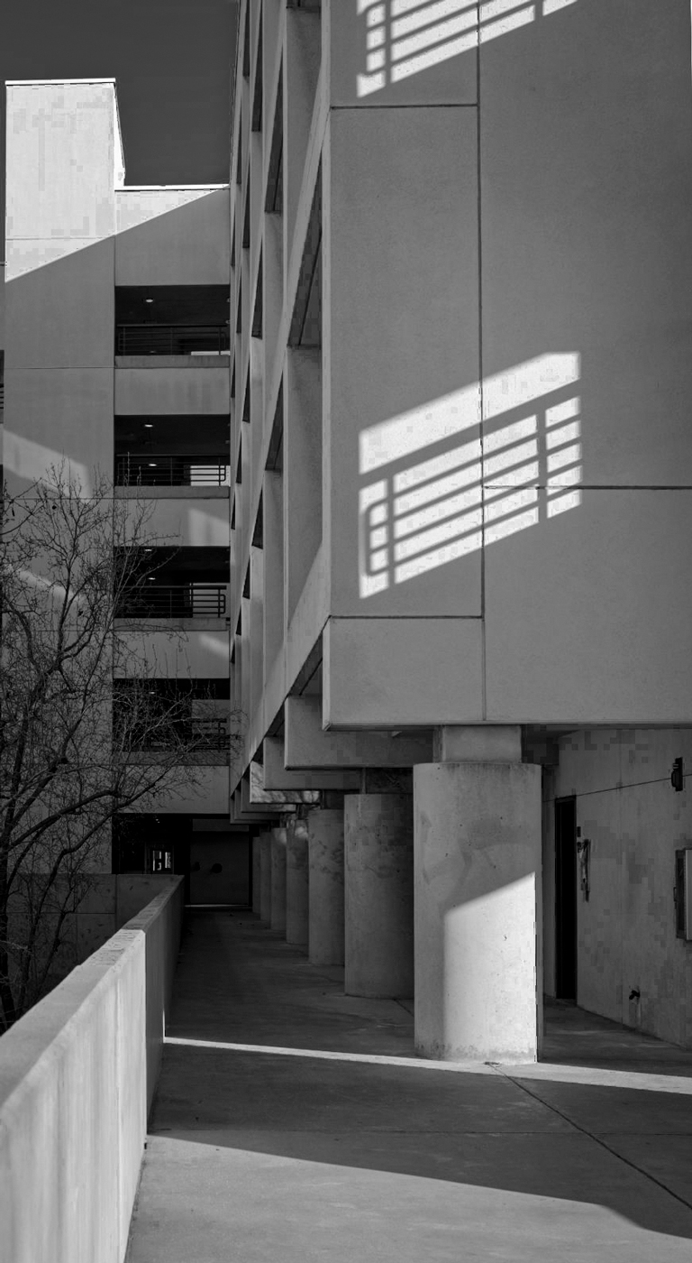
I experimented with bringing out the shadows in photoshop with curves and B&W color mix. Also cropped bit. Posted: 01/15/2025 17:38:55


