Tom McCreary, APSA, MPSA
About the Image(s)
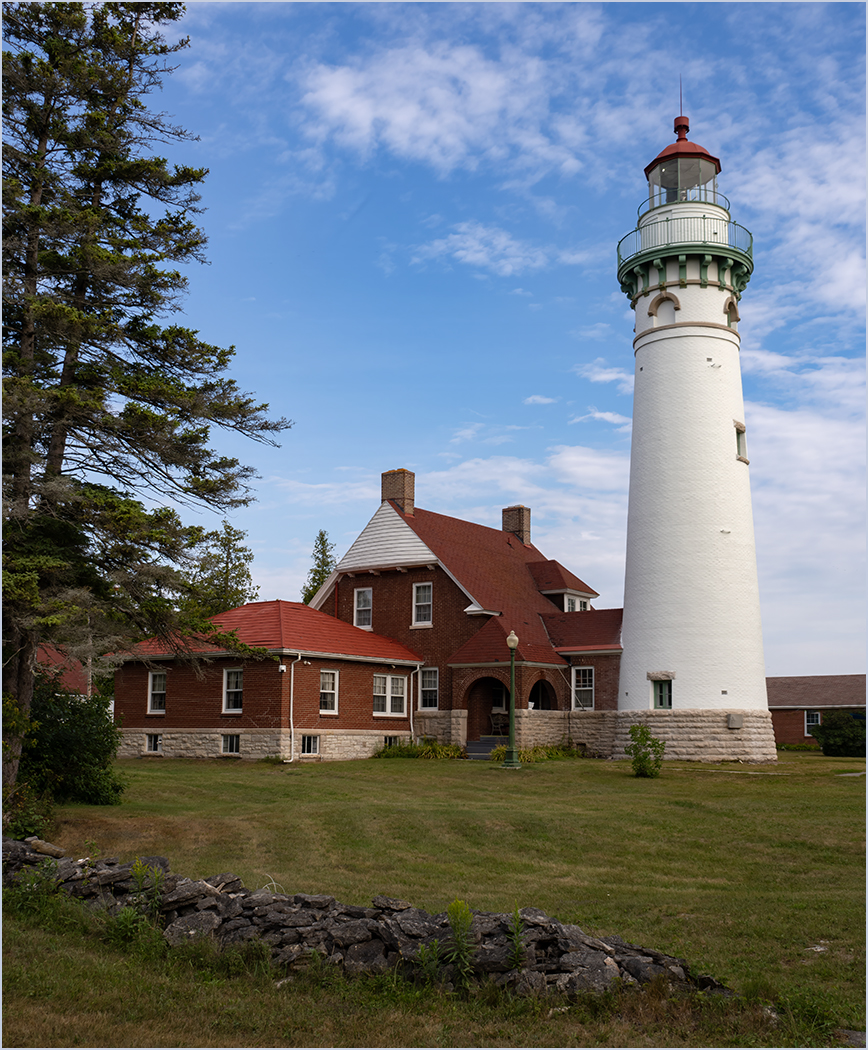
This lighthouse is on the northern edge of Lake Michigan, which is on the south edge of the Michigan Upper Peninsula. It was taken in August last year with my Olympus OM-1 digital camera, Olympus 14-150mm lens at 17mm, f8, ISO 200. I thought that it is a very pretty lighthouse, and left the small wall in the foreground to add depth. In Lightroom I did adjust the vertical slider to make the lighthouse less distorted.
This round’s discussion is now closed!
10 comments posted
Tom, this is a strong image, with a lot of powerful elements, but I think you could have chosen a title more reflective of what's in the frame. As you know, just like a watermark, the title becomes a part of the image and "A good title should reflect what the viewer (or a judge) sees in the frame; and is descriptive to the point that it piques the viewer's/judge's interest and draws him or her into the frame."
Your title is Seul Choix Point Lighthouse, so naturally my mind's eye began looking for a lighthouse, but the lighthouse itself is one of four (4) eye-grabbing features in the image, i.e., the partial fir trees on the left, the rock wall the stops the viewer's eye from going thru the frame, the red house that occupies the most prominent position in the frame, and of course the lighthouse itself.
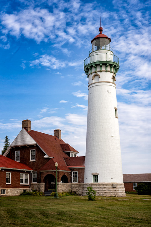
Nonetheless, this is a boffo image that captures the scene beautifully, but you might consider re-titling it to better reflect what the viewer is looking at or re-composed to reflect the current title - see my VF
This isn't nitpicking - this is a digital discussion group, and I want to initiate a discussion about an overlooked part of photography. As noted, I love the image and if it were a special place for me, I'd be proud to put the image as shot on my wall - but with a title more reflective of what's actually in the frame.
Having said all that, As a photograph, I like your image as presented better than my VF version, but would change the title. And lastly and for what it's worth, I have a 40-minute presentation called "33 Hacks to Improve Your Scores in Club Competitions" posted on Club Hubthat and this is hack #26. I hope others weigh in on topic.
Posted: 11/08/2024 13:29:01
Thank you for your comments and your VF, cropping in on the lighthouse. It is a lovely location and I was wanting to show more of the surroundings. I know that having a wall at the front of the image is one of the composition rules to avoid. But, I liked the rock wall and think that it is close enough to the bottom to not be a distraction.
As to the title, I like titles that help describe the image so that the viewer doesn't have to guess what they are seeing.
I am glad that you like the image, and am not being negative about your comments but are just explaining my thoughts. That is what these DD groups are really about, hearing other photographers ideas and suggestions. Posted: 11/08/2024 20:11:24
Nicely exposed, sharp etc. Personally, I like the composition with the framing. The wall, to me, adds foreground interest. I know nothing about this lighthouse, but you set it well in its environment. Posted: 11/09/2024 17:11:37
Thanks. On the comments on the framing, leaving it was 3, and cropping was 2. Posted: 11/17/2024 18:38:43
Some may view the small wall and the fir trees as distractions, but they frame the main subject, i.e, the lighthouse. However, Butch version is another way to compose the photo.
The photo is sharp from front to back and the exposure is ok. Posted: 11/12/2024 05:02:13
The photo is sharp from front to back and the exposure is ok. Posted: 11/12/2024 05:02:13
Thanks. On the comments on the framing, leaving it was 3, and cropping was 2. Posted: 11/17/2024 18:39:08
I like your composition. To Me The fir trees add but I would correct the perspective curvature of the photo. I also like the contrast feeling soft and pleasant. The foreground rocks have some bright spots, I would like burned down. The suggested cropping above may fly well in camera club, but I prefer the more pleasant kodachrome look of this subject! Well seen! Posted: 11/14/2024 21:47:15
Thanks. On the comments on the framing, leaving it was 3, and cropping was 2. Posted: 11/17/2024 18:39:21
Hi Tom, lovely image. Agree with Butch on the number of focal points in the image taking away the attention from the light house itself. Yes, you did well by including the other elements but the eye gets a bit distracted by the other elements. The crop by Butch is what I would have done to ensure that the light house becomes the focal point. Only thing I may have changed in Butch's version is to perhaps reduce the exposure a bit to bring out the details in the light house. Well done. Posted: 11/17/2024 06:53:39
Thanks for your comments. Posted: 11/17/2024 18:39:51

