Michael Hrankowski  


 Requiem by Michael Hrankowski

January 2025 - Requiem

January 2025 - Michael Hrankowski

Original

January 2025 - Michael Hrankowski

Original 2

January 2025 - Michael Hrankowski

Original 3

About the Image(s)

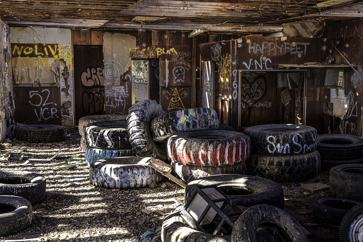
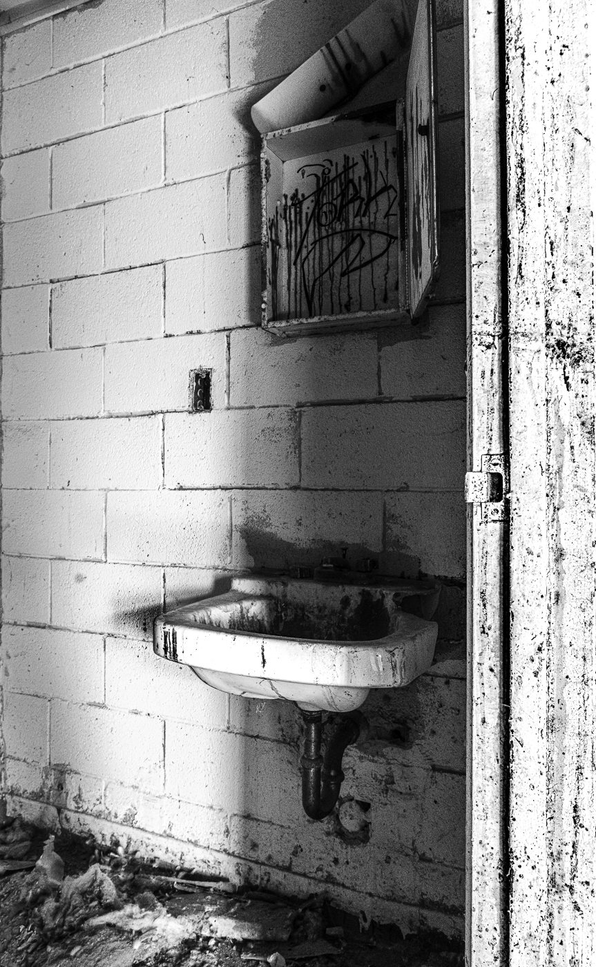
Images were registered during a visit to the Salton Sea in California. These images along with the images in Group #83 are meant to be viewed as a series. I hope you enjoy the story these images tell. The history of the accidental creation of the Salton Sea and its eventual decline is fascinating and I invite viewers to read a short history by clicking on the link below.

https://www.google.com/url?sa=t&source=web&rct=j&opi=89978449&url=https://www.route-fifty.com/management/2022/10/how-californias-salton-sea-went-vacation-destination-toxic-nightmare/378018/&ved=2ahUKEwiz4cLul9KKAxVuke4BHYScCdMQ-NANegQIHRAC&usg=AOvVaw0lnGZ1LNVzXkL9_RvOGxzu


12 comments posted


Lance Lewin   Lance Lewin
(Groups 83 & 87)
And here, a continuation of the Series of compositions you posted in DD-83 Mono: yes, a very comprehensive collection to identify this location/story with the viewer.

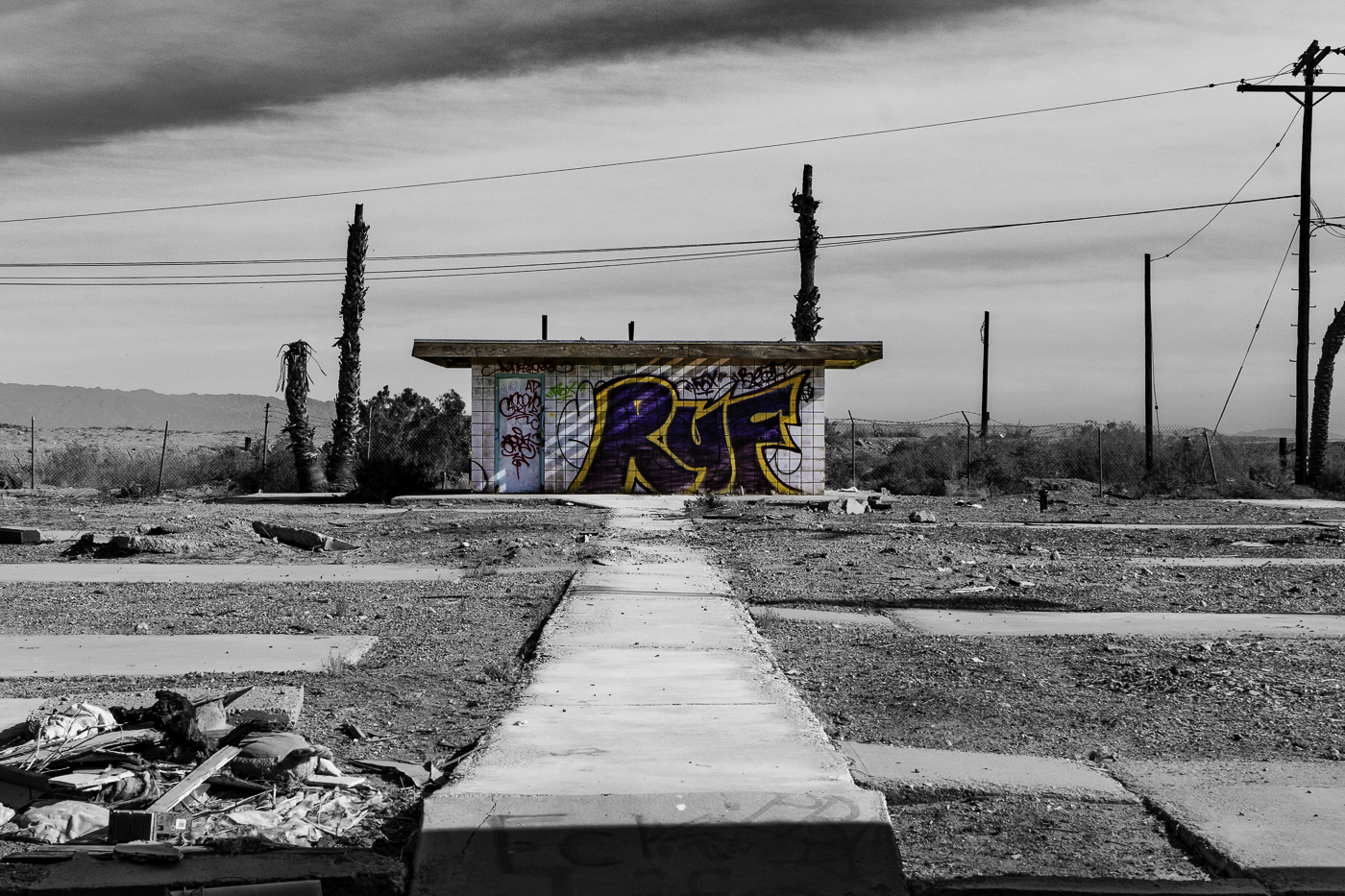
However, I have one caveat to the group of images here ... I do not think you need to employ/interject Color into an otherwise B&W composition ... in my strongest opinion, this type of (serious-documentary) work needs to remain focus on strong "compositional Structure" that stays outside the hint of Digital Art, unless of course, you employ the same artistic technique on all the compositions, thus setting a narrative/aesthetic).

In strict form, however, viewers are more prone to contemplate the work within the serious tone it deserves.

In other words, I argue, your work in this series (here and in DD-83) are well visualized, composed and presented without the need to spark interest outside of "pure" documentary style. Work that should be well received as an article .. hope you think about doing this. : )

Lance A. Lewin
PSA Global B&W Photography Mentor
PSA South Atlantic Area Membership Director   Posted: 01/02/2025 17:50:29
Michael Hrankowski   Michael Hrankowski
Lance, thanks for the comments…and I knew you'd not be a fan of the one mono/color hybrid image…but…. I did it with intention and not just as a gimmick. I wanted to contrast the depression I felt at the overall state of decay of the site (the B&W portion calls attention to that)…AND contrast it with the amazing, colorful graffiti that allowed me to change my focus of attention towards the beauty in the midst of the surrounding decay.

I thought a similar visual technique worked particularly well in the Wizard Of Oz. The movie's introduction is in monochrome which ads an aura of bleakness to the scenes in Kansas. Contrast that to when Dorothy awakens after having been transported to Oz where everything is in brilliant Technicolor.   Posted: 01/05/2025 15:59:03
Lance Lewin   Lance Lewin
(Groups 83 & 87)
And this idea is perfectly fine, but then I do suggest such hybrid illustrations become part of a theme ... and present the whole body of work in the way you described it to me.

"Points to Ponder"
"Continuity" is a key attribute in enjoying a successful exhibiting of any type of serious (documentary & Artistic) work ... such as maintaining a certain Tone (if toning is prescribed in the final B&W version) throughout all the prints, and also framing, for another example, needs to be all the same in most circumstances.

I can see your hybrid (color/BW) work doing well in telling a powerful story ...it just needs to be clearly presented as a core aspect of the work, and not an interjection or anomaly.   Posted: 01/07/2025 22:17:55
Michael Hrankowski   Michael Hrankowski
Ahhh…yes. Thank you for that piece of advice! Noted and taken to heart. A question: Does that advice extend to presenting a series that includes both color and monochrome images in the same exhibition?   Posted: 01/08/2025 16:46:26


Joan Field   Joan Field
Your discussion of what makes the best series is a little too esoteric for me. I understand that two are colorful and Michael wants to emphasize the graffiti as an art form. My critiques is more boring. I like the idea of the colorful graffiti. In the mail picture, I would lose the foreground that is so bright and takes ones eyes away from the good stuff. I also wander if we shouldn't. see at least one photo that shows the actual Salton Sea as part of the picture. To bring it all together. Boy, I sure do't envy the people living near this area which has gone from beautiful to not only horrible looking but also dangerous to the heath of all those living in the area. I think the photos that you have shown, Michael , are excellent and truly depict the horror to which the Sea has sunk   Posted: 01/11/2025 00:53:28
Michael Hrankowski   Michael Hrankowski
Thank you, Joan, for your comments. Please clarify which picture is "the mail picture" where you feel the foreground is too bright. I don't understand. Regarding showing the Salton Sea itself…it would be REALLY boring. There is truly nothing beautiful about it! But perhaps a drone picture would put it best into context, but, alas, I don't own one - but a good suggestion anyhow.   Posted: 01/13/2025 04:31:53


Ruth Sprain   Ruth Sprain
Michael, your series of photos capture the look and feeling of a unique place. These 4 photos as well as the images you posted in Group #83 could definitely be the foundation of a documentary photo essay. I am not bothered by the mixture of color and b&w images. I agree with you that monochrome photography can emphasize the drama, or in this case, decay of a scene. The color of the graffiti highlights change, but with sparks of life. I especially like your use of color combined with b&w on Original 2 that illustrates this combination of decay and life. Thought-provoking collection, Michael.   Posted: 01/11/2025 15:31:02


Mary Ann Carrasco   Mary Ann Carrasco
Michael, I had never heard of the Salton Sea..what a catastrophe. And you have documented it well. I read the article and I looked at the images in Group 83 as well. I do tend to agree with Lance as to the use of color in that I think it needs to be consistent rather than just one image. I find the monochrome images more powerful.   Posted: 01/14/2025 00:20:59


Kieu-Hanh Vu   Kieu-Hanh Vu
Hi Michael,
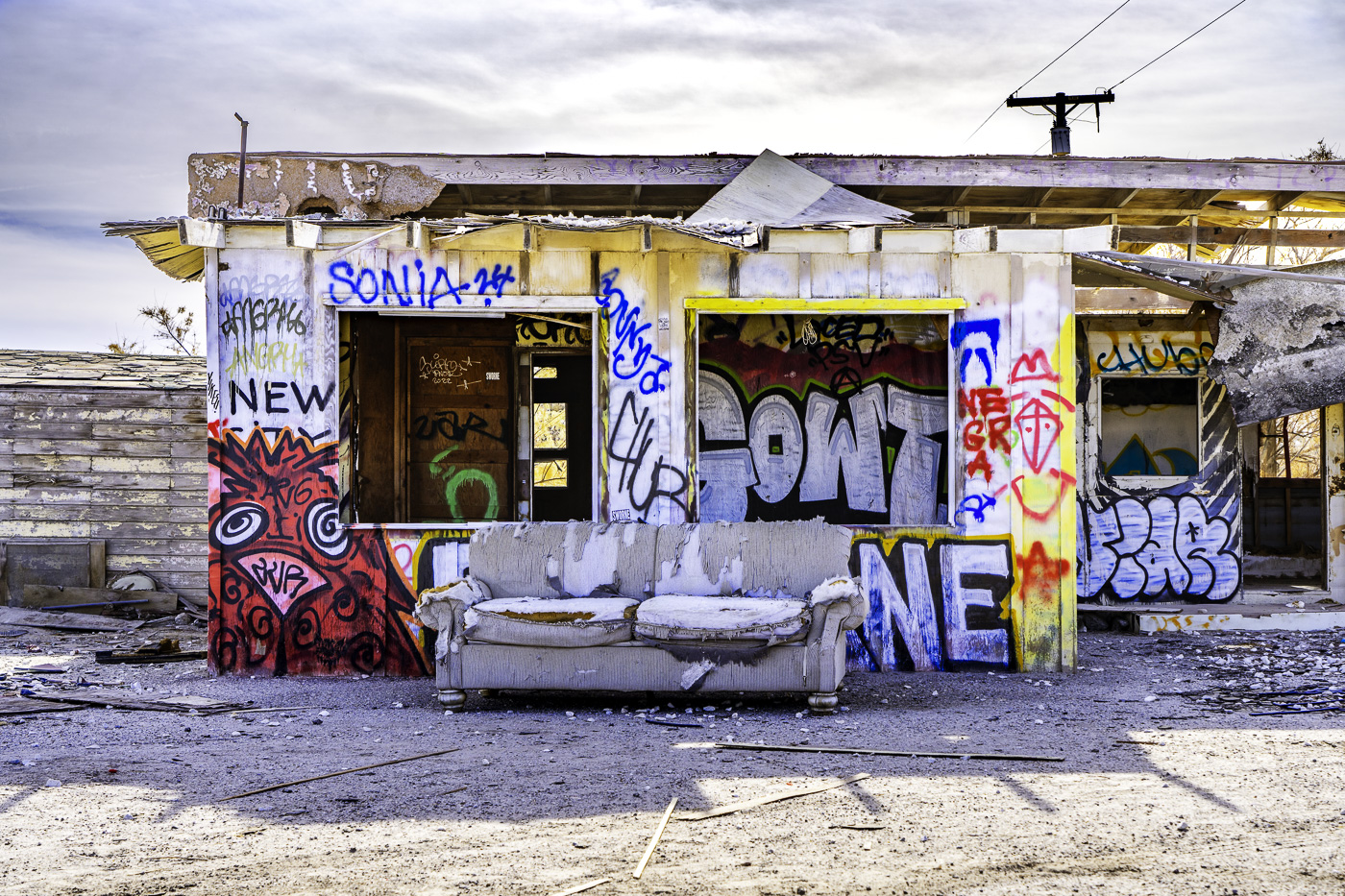
The abandoned shop with graffiti is a storytelling image. It creates viewers' engagement with your accompanying story. Thanks for sharing it! With a series of images captured in this location, you can use them in a photography portfolio or social documentary of the Salton Sea.
For the context of the image "Requiem", the composition and the color version work well to me. My question is: Why are the colors so vibrant like new paint, although the incident happened over 20 or 40 years ago? I'd prefer to tone down the colors a bit to create more impact to the abandoned location.   Posted: 01/16/2025 18:24:42
Michael Hrankowski   Michael Hrankowski
Kieu-Hahn, I'm glad you like the story my images tell. I'm sorry you do not like the vibrancy of the colors. I have documented them exactly as they appear, your preferences notwithstanding. The graffiti art is not 20-40 years old!

A large part of the story is how people have come in and painted these old buildings with bright, colorful graffiti art to create something beautiful that, in a way, is reminiscent of the proverbial Phoenix rising from the ashes.   Posted: 01/16/2025 21:19:17


Robert Coleman   Robert Coleman
Interesting story about the Salton Sea and good job of bringing out the colors of the graffiti   Posted: 01/17/2025 23:27:01


Andres Valdespino   Andres Valdespino
Thank you for the photo series and the link. Really interesting. Knowing the backs story of the area helps understand the photos. I am not bothered at all by the color/mono combination photo or by combining color and mono in one series. These are powerful and stunning in either format. Well done.   Posted: 01/19/2025 21:20:38


Please log in to post a comment