Ruth Sprain
About the Image(s)
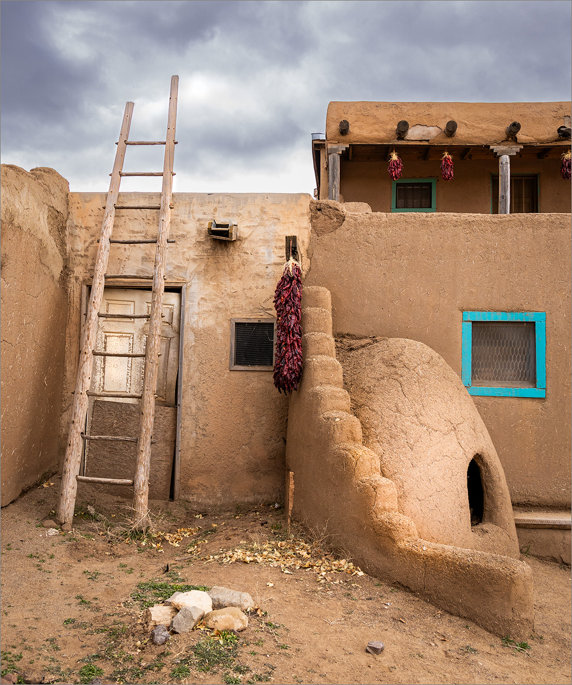
At the end of November, my husband and I visited Taos Pueblo. I found the history of the pueblo and the homes there fascinating. I took this photo of one of the homes. I used my Canon EOS R6 at 1/80 sec., f/9, ISO 800.
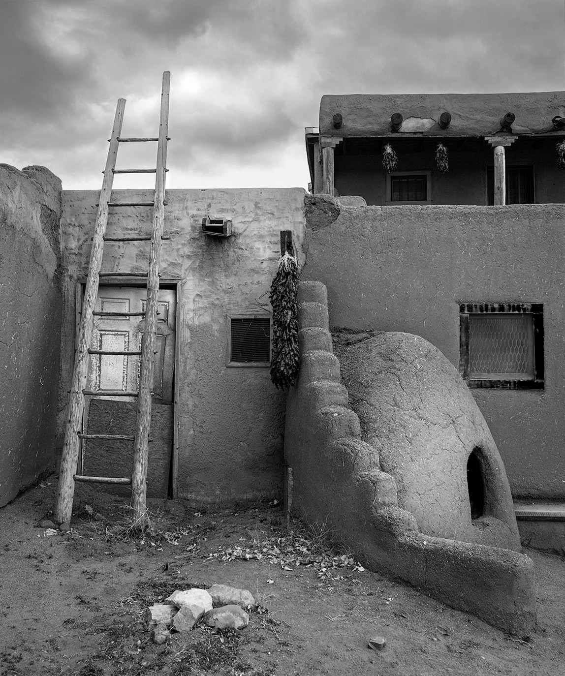
In Lightroom and PhotoShop, I adjusted the white balance, added contrast, brought down the highlights in the sky, and dodged and burned. Although I considered converting the image to b&w, I liked the bright colors of the window frames and red chiles. What suggestions do you have?
12 comments posted
Ruth. Excellent job with the sky. I prefer the image in color and like the contrast between the window and the peppers against the adobe walls. Posted: 12/03/2024 02:20:49
(Groups 83 & 87)
Good day, Ruth! One of my favorite locations to wander and enjoy amazing history as well as photographic opportunities.
The initial, what I term, "Compositional Structure" is engaging. However, I must suggest the R6 registered the scene with natural color (and pleasant) detail and the featured versions more Saturated aesthetic loses this aura of authenticity, in my opinion.
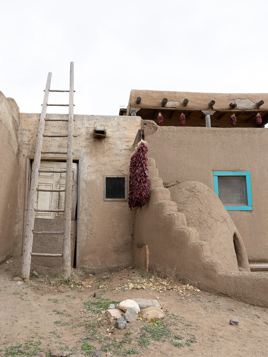
Questions: 1. the Sky appears to be a replacement? 2. using a full-frame sensor, why is your original not a 2:3 aspect ratio? 3. Why did you use ISO-800, as this most likely instigated the blown-out sky on the original, as well, maybe, a (-)2/3 or more Exposure Compensation. Thank you, Ruth.
Lance A. Lewin
PSA Global B&W Photography Mentor
PSA South Atlantic Area Membership Director
lance.visualizingart@gmail.com Posted: 12/11/2024 14:52:45
Lance, thank you for visiting Group 3. I appreciate your comments. We visited Taos Pueblo on a very overcast day, in fact it rained while we were there. By the time we left, it was about an hour from sunset. For those reasons the higher ISO was helpful. The sky was real. Clouds were revealed as I adjusted for highlights and shadows. The warming of the colors was personal preference, since the lighting was flat with all the clouds.
I'd never visited Taos Pueblo, but I can see why it's a favorite for you to wander. The history is fascinating. Posted: 12/19/2024 21:57:58
I'd never visited Taos Pueblo, but I can see why it's a favorite for you to wander. The history is fascinating. Posted: 12/19/2024 21:57:58
Hi Ruth. Overall I like the composition. There are some strong leading lines and you've brought out some nice contrast, especially in the sky. The photo documents the architecture well, but things seem to me to be somewhat askew and I can't tell if it's due to the focal length you used or if the structure is like that.
The sky, while interesting in and of itself, is the brightest part of the picture and draws my eye while the structure and foreground elements are in subdued light and appear rather flat to me. In Lr and ACR one has the ability to increase the luminosity of colors which, had you done, might have brought more attention to the main subject.
Not having ever been there, I can't relate to Lance's comments about the colors being "authentic" or not… I tend to like more saturated colors, while Lance's work is more frequently in monochrome which makes his comments understandable in that context. For fun, you might try a re-edit in monochrome.
Alternatively in lighting situations such as this, you might consider turning your lens to capture architectural details instead of capturing the structure as a whole. Posted: 12/11/2024 15:38:26
(Groups 83 & 87)
Yes, I understand. Indeed, these lighting situations make things difficult, but of course, as mentioned in my comments many of these (exposure) difficulties can be remedied from behind the viewfinder .. at least making a terrible exposure a bit more tolerable and manageable when in post-production.
Thank you, Michael. Posted: 12/11/2024 17:39:48
Thank you, Michael. Posted: 12/11/2024 17:39:48
No argument there! Posted: 12/11/2024 17:41:05
Michael, thank you for your helpful comments. I did a bit of straightening. However, the lines of the building were not straight as shown by the uneven line of the foundation. Thanks for your comment about adjusting the luminosity.
I did take photos of details as well as shots of other buildings. I must admit that my go-to in this type of photo is a conversion to monochrome. The colors of the window frame and chiles are what me keep the color. Posted: 12/19/2024 22:04:07
I did take photos of details as well as shots of other buildings. I must admit that my go-to in this type of photo is a conversion to monochrome. The colors of the window frame and chiles are what me keep the color. Posted: 12/19/2024 22:04:07
Hi Ruth. Overall I like the composition. There are some strong leading lines and you've brought out some nice contrast, especially in the sky. The photo documents the architecture well, but things seem to me to be somewhat askew and I can't tell if it's due to the focal length you used or if the structure is like that.
The sky, while interesting in and of itself, is the brightest part of the picture and draws my eye while the structure and foreground elements are in subdued light and appear rather flat to me. In Lr and ACR one has the ability to increase the luminosity of colors which, had you done, might have brought more attention to the main subject.
Not having ever been there, I can't relate to Lance's comments about the colors being "authentic" or not… I tend to like more saturated colors, while Lance's work is more frequently in monochrome which makes his comments understandable in that context. For fun, you might try a re-edit in monochrome.
Alternatively in lighting situations such as this, you might consider turning your lens to capture architectural details instead of capturing the structure as a whole. Posted: 12/11/2024 17:41:56
I like what you have done to the original. The details of the building pop out a bit more and I like the colors as well. I agree with you adding some detail to the sky but might have gone with something a little lighter. Overall, nice work. Posted: 12/12/2024 21:44:47
Hi Ruth,
It's an intriguing image that makes me study more. The long, wooden ladder is the most significant item in the Taos Pueblo village. I learned that people had to climb up to the roof to get into the house because there was no standard doorways.
The mud adobe outdoor oven, with the shape of a beehive, is also an interesting part.
Your post processing is great by making the cloudy sky, and the sun-dried clay of the houses more beautiful. It's amazing to see that in the original image, there are no signs of clouds at all! How did you do that ? Posted: 12/16/2024 13:59:16
Hi Ruth, what a great place to visit and learn. I like your composition but somehow the saturation of the colors feel like something is off. I took your edited image and converted to black and white in photoshop and then did some adjustment with the color sliders. I look forward to your thoughts. Posted: 12/16/2024 22:10:48


