Ed O’Rourke

November 2026 - Lettuce
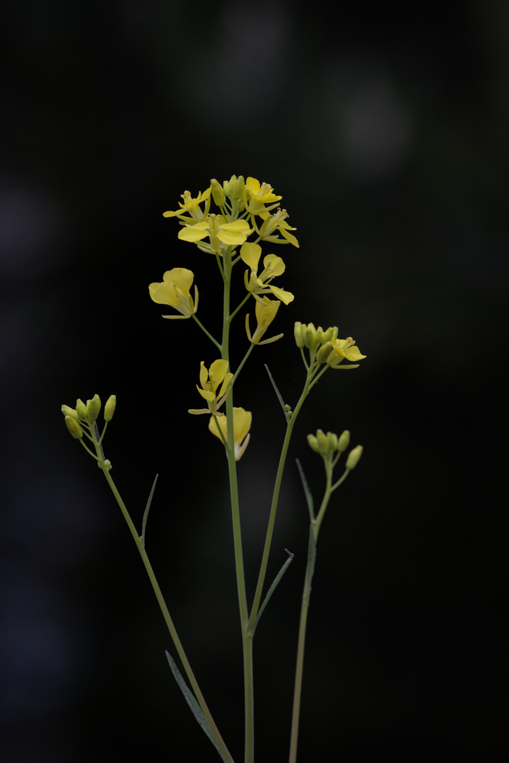
Original
About the Image(s)
This is the same flower I shared in July and I apologize if any of you think I should have gone with a different flower so soon. However I tend to be less creative and more technical in my thinking and I'm trying to improve my creative approach to things.
Two things lead me to work on this image in this manner. First, I'm very impressed with the artistic creativity that Mo always shows in his work, and I'm trying to learn from that; second my local camera club had a contest with a "low key" theme and this is what I worked on for that theme.
I obviously cropped differently as I wanted the vertical presentation with the light dropping off as I went from top to bottom. I then made a major hue shift to change from the yellow to the more subdued color you see and I decreased the highlights so I could keep the understated presentation.
I'm interested in what everyone thinks and am I moving in the right direction to being a bit more artistic?
5 comments posted
You have matched the border color very well to the color of the flowers, a very interesting color. The border does two things, it frames the flower grouping very well and separates the picture from the black webpage.
Then holding the exposure down adds a nice mood. Posted: 11/14/2026 06:05:18
I also like the gradation of light in the stems.
Some more highlight could improve the picture, to have more contrast. Posted: 11/16/2026 09:14:26