Vincent Cochain, EPSA
About the Image(s)
As usual I don't know the name.
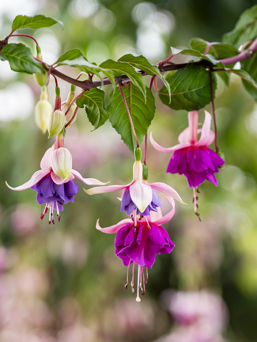
1/200; f/3,2; ISO 1000 at 75 mm (FF). Increased the texture, the clarity and the white
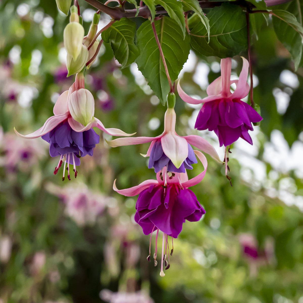
The "original" is not the original, but it is the same subject but at f/10 and ISO 6400, just for the comparaison.
Taken in the Royal Greenhouses in Brussels. It is open every year during about 3 weeks in April/May. The are plenty of flowers.
For your eyes and your pleasure: https://www.monarchie.be/en/heritage/royal-greenhouses-in-laeken
6 comments posted
Hi Vincent: From viewing the pictures on the link the Royal Greenhouses would be a place I would want to visit in the spring when they were open.
Very artistic shape to the main Fuchsia branch at the top of the frame. Composed nicely with the 3 flowers at different heights, I much prefer this format as shown over the square format in the original.
There are some very bright highlights in the background at the top of the frame, these need to be toned down. If you wanted to I would darken down the entire background in post processing, this would place a lot more emphasis on the 3 flowers. This would be kind of a tedious process but certainly achievable, also in my humble opinion it would improve your picture a lot
Posted: 11/02/2024 18:11:00
Thanks Murphy for your comments and suggestion. Posted: 11/20/2024 22:11:45
I think it's called Fuchsia. There's 110 different "flavors" of the plant. I agree with Murphy on the background. Posted: 11/04/2024 13:30:10
I agree with both Murphy and Mo, a simple darkening of the highlights will IMO make this even more compelling. Posted: 11/04/2024 23:00:40
Vincent, and I agree as well. Given that. the flower on the right is out of focus which detracts from the composition, but what is due to the f-stop used. The center leaves are gorgeous. I am bothered just a little by the fact that the middle lavender flower sits over in part the larger pink flower but I appreciate it is what it is - it just made me wonder if a different angle might have helped to separate them more. Posted: 11/07/2024 00:14:21
The flowers and leaves are sharp but the background is causing a mess. Darkening the background would improve the image. Posted: 11/12/2024 05:33:15

