Melanie Hurwitz
July 2024 - Douro Valley 2
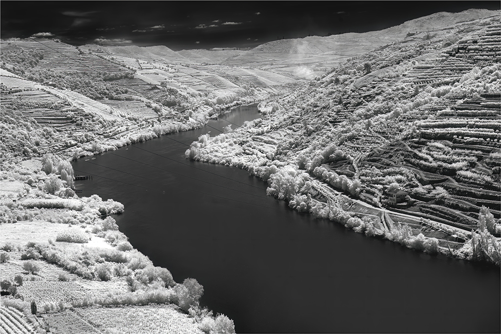
Original
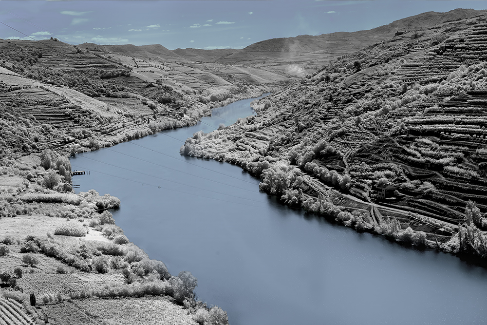
Original 2
About the Image(s)
could not resist another view of the Douro Valley. I present a mono version along with another showing the blue water and sky to match last month's image. I'm interested to hear which you find appealing.
This was taken in the late morning on a very bright day presenting with a lot of contrast. The fields of grape vines as far as the eye could see was quite overwhelming . It is no wonder that UNESCO has preserved this valley.
I converted using a life pixel action. Again spent some time trying to get a fairly natural blue in the color version. I used levels to add contrast and to brighten the whites. Finishing with select color to get tone separation.
Looking forward to your comments
70mm, F10, 1/800, ISO 200
This round’s discussion is now closed!
13 comments posted
Hi Melanie. Beautiful scene captured from a high vantage point. I looked at both versions and I like them both. I can't pick one over the other. Your processing is done well. The picture has fine details and needs to be large to really enjoy it. I wonder what the thin lines that cross the water are. Posted: 07/01/2024 12:05:55
Thanks Arik. The lines are electrical. Posted: 07/06/2024 16:32:10
Hi Melanie
I prefer the mono version. But, the second version is just as nice. Your processing and the viewpoint complement each other. Great work!
Posted: 07/02/2024 06:03:08
I prefer the mono version. But, the second version is just as nice. Your processing and the viewpoint complement each other. Great work!
Posted: 07/02/2024 06:03:08
Thanks Palli. I always appreciate your comments. Posted: 07/06/2024 16:32:53
Hi Melanie,
I think I prefer the blue colored version. It seems to have more total impact that the all-mono version. Those lines would need to be eliminated in a large print in my opinion. Nicely seen, composed and processed. Posted: 07/03/2024 12:19:31
I think I prefer the blue colored version. It seems to have more total impact that the all-mono version. Those lines would need to be eliminated in a large print in my opinion. Nicely seen, composed and processed. Posted: 07/03/2024 12:19:31
Thanks Gary, I agree about the lines. Wanted to hear from everyone about how much they detracted before doing all the work! Posted: 07/06/2024 16:34:40
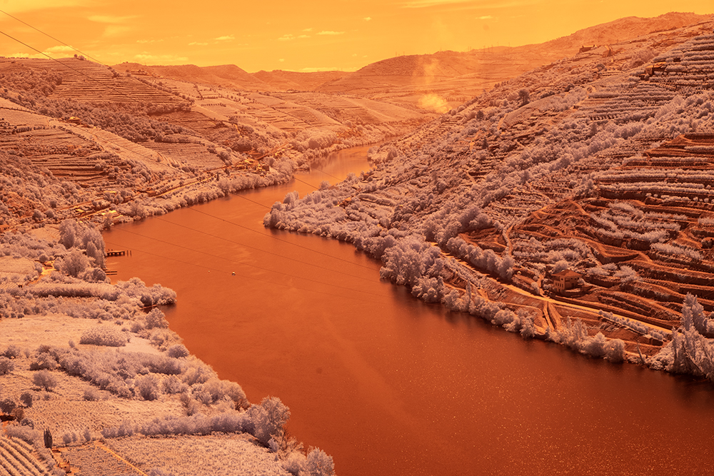
Nice vantage point Melanie. I like the black for the sky, but the blue for the river. I like that the river makes a jog here. I keep imagining the beautiful greens of the vineyards and think perhaps for me, the best version would be natural color. Posted: 07/03/2024 19:18:00
Don't worry Jack, I do have numerous color versions too. You have surprised me by saying that to liked the blue. Posted: 07/06/2024 16:36:59
Melanie,
First of all, you found a terrific location for an IR landscape. The riverbend is perfect here and you included just enough sky for interest without it pulling the eye away from those wonderful hills. As to which version I prefer, I vote for the BW version. I find the blue in the color version draws my eye away from the textures of the vineyards while the monochrome version underscores them. Posted: 07/04/2024 16:17:49
First of all, you found a terrific location for an IR landscape. The riverbend is perfect here and you included just enough sky for interest without it pulling the eye away from those wonderful hills. As to which version I prefer, I vote for the BW version. I find the blue in the color version draws my eye away from the textures of the vineyards while the monochrome version underscores them. Posted: 07/04/2024 16:17:49
Thanks Henry, I think the mono is better here, but I wanted to show the match to last month too. Posted: 07/06/2024 16:38:20
Melanie
I like this version.
I wondered if you dodged the land mass just a bit it would bring a little more detail.
I used an adjustment brush in LR. Reduced the Highlights, increased the shadows, added some Dehaze and contrast.
Regards
Emil
Posted: 07/05/2024 18:01:03
I like this version.
I wondered if you dodged the land mass just a bit it would bring a little more detail.
I used an adjustment brush in LR. Reduced the Highlights, increased the shadows, added some Dehaze and contrast.
Regards
Emil
Posted: 07/05/2024 18:01:03
Thanks Emil. I thing you have done a great job on my image. Posted: 07/06/2024 16:39:12
Melanie, I like the mono version too. However, I have found the Camera Raw filter useful to tweak colors after channel switching has been done. Sampling and resampling custom white balance helps finding the tone of blue you need. Fine tuning can be done with the Color Mixture sliders. Posted: 07/08/2024 20:20:50