Palli Gajree, HonPSA, PPSA
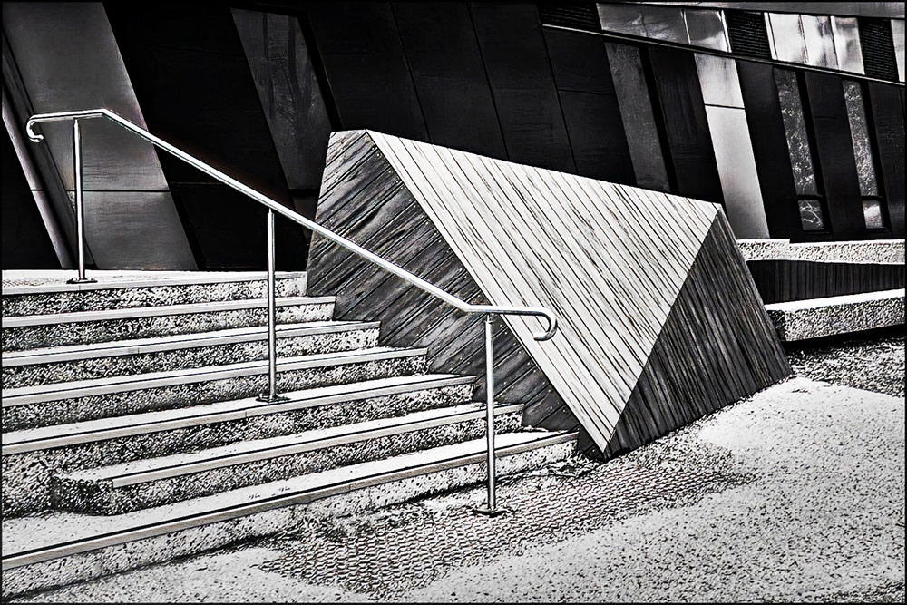
July 2024 - Design Image
Original
About the Image(s)
Pictured outside the local Community Center which was erected a couple of years ago. The building is quite attractive, offering a number of IR opportunities. This is one such example shot with my converted IR 40D Canon.
Sun was shinning on the day and the IR medium brought out both texture and form. Original converted to B&W using High Structure (harsh) filter from NIK’s Silver Efex Pro. Cloned out some of the unwanted debris. Applied Detail Extractor and contrast to get strong blacks and white (as Gary would say!). Then used Luminosity Masking tool from Raya Pro 6.0 for targeted adjustments. Finally added some vignetting. Would welcome your views!
This round’s discussion is now closed!
8 comments posted
Hi Palli. Very nice work with this high contrast image. You saw and captured beautiful geometrical shapes with interesting textures and tones. Well done. Posted: 07/01/2024 12:13:55
Greetings Palli...
My kind of image, almost graphic in the presentations of elements and strong blacks and whites. It's a unique perspective, and I feel it moves into the 'fine art' category quite easily. Well done, sir! Posted: 07/03/2024 12:29:10
My kind of image, almost graphic in the presentations of elements and strong blacks and whites. It's a unique perspective, and I feel it moves into the 'fine art' category quite easily. Well done, sir! Posted: 07/03/2024 12:29:10
You've got some great graphical images, Palli. My eye goes round and round the main object. The windows upper right are a little bit distracting to me, I could see a tighter crop all around working. The harsh filter works very well for this image. Posted: 07/03/2024 19:33:57
Palli,
Wonderful study of shape and texture. IR, plus use of my favorite Silver Efex Pro preset came together beautifully here. One suggestion might be to crop in a bit on the right side to remove that light spot in the rightmost window. I find it draws my eye to it. Another, more ambitious thing to try is to remove the railing. It's a the least interesting part of the scene and I think the overall composition would be strengthened without it. Posted: 07/04/2024 17:09:26
Wonderful study of shape and texture. IR, plus use of my favorite Silver Efex Pro preset came together beautifully here. One suggestion might be to crop in a bit on the right side to remove that light spot in the rightmost window. I find it draws my eye to it. Another, more ambitious thing to try is to remove the railing. It's a the least interesting part of the scene and I think the overall composition would be strengthened without it. Posted: 07/04/2024 17:09:26
Palli,
Your image looks at first glance to be a pen and ink drawing, "almost graphic" as Gary noted.
My thought is that the foreground is a touch hot and clipping the whites in spots. So lowered the image exposure about 1 stop and then I placed a radial gradient over the foreground, inverted it, 905 feather and reduced the exposure with affected the background. The high contrast is retained just different tonality
Regards
Emil
Posted: 07/05/2024 18:09:40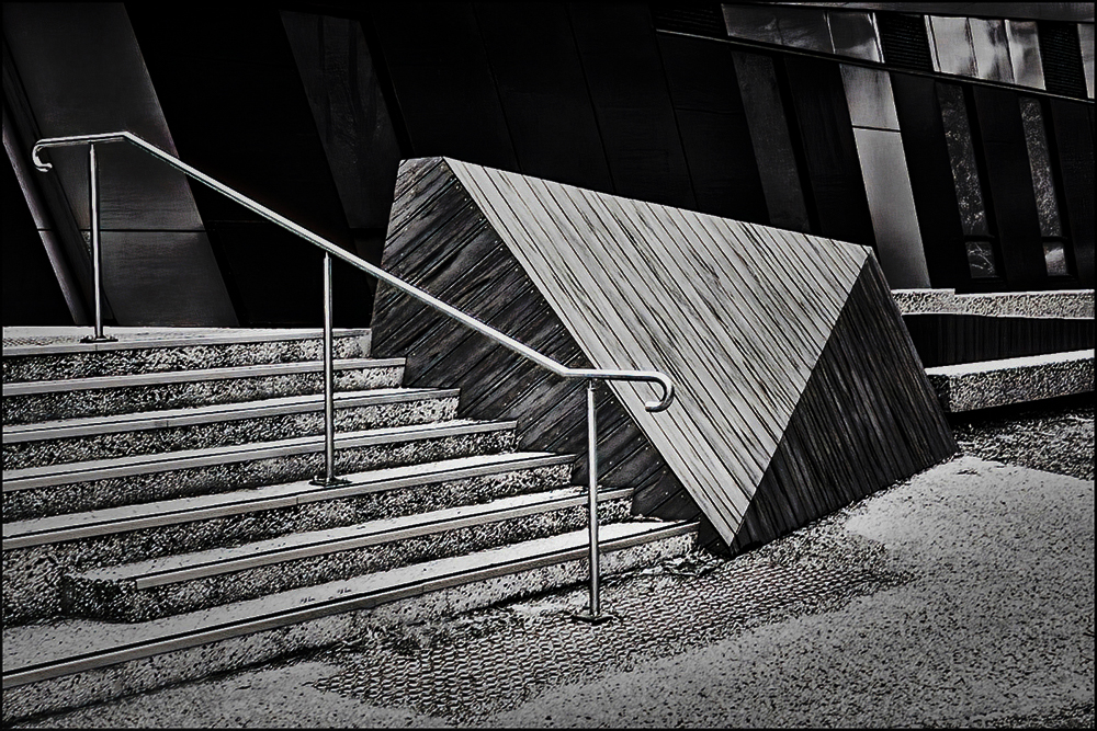
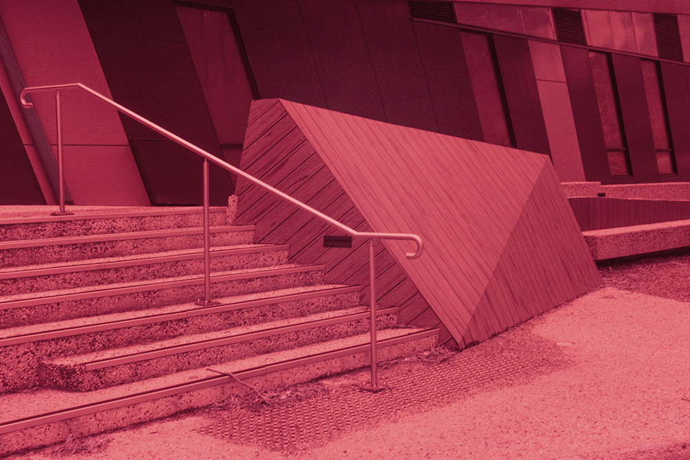
Thanks Emil, for sending your version which I do like. Thanks also for including the little description of how you processed the image. I'll certainly work on that! Posted: 07/08/2024 04:55:59
Hi Palli, You always manage to find interesting perspectives. This is a simple capture that you have managed to turn into a wonderful graphic. Love the processing, but the whites may be a little hot and could use some toning down, Posted: 07/06/2024 16:17:51
Thank you all for your comments which are most welcome. I'll certainly keep them in mind when visiting the image next. Posted: 07/08/2024 04:52:55