Jack Florence Jr
About the Image(s)
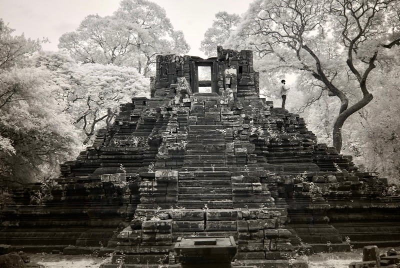
Another from My Cambodia images. I liked the tree on the right of this temple, and the man, for scale. I welcome your thoughts.
4 comments posted
Hi Jack. The tree on the right and the person are important elements in this picture. Nicely composed scene. I may lighten the very dark areas in the lower part of the image. Posted: 11/04/2024 17:45:49
Jack,
I really like the tree and man. Very good choice to leave them in. I do wish you'd stepped back further (assuming that was possible) to include the entire tree, but what you've included works well. I would darken the two light areas at the bottom of the frame and agree with Arik that you might bring out the shadows a bit just above them. Posted: 11/04/2024 20:49:56
I really like the tree and man. Very good choice to leave them in. I do wish you'd stepped back further (assuming that was possible) to include the entire tree, but what you've included works well. I would darken the two light areas at the bottom of the frame and agree with Arik that you might bring out the shadows a bit just above them. Posted: 11/04/2024 20:49:56
Jack
I like your camera positioning here with a straight on shot of the Temple framed in the background by trees. The person adds scale so it was nice of him to have modeled in your shot.
I think a bit more sky at the top of the frame would have created space for the tall tree on the left that is touching the edge and provided more of the nice tree on the right.
Regards
Emil Posted: 11/08/2024 19:14:47
Hi Jack, You have certainly got a lot out of your Cambodia images. That's always satisfying after a trip. This is well captured. I love that you have given scale with the inclusion of the person. It seems to be such a large structure that needs more room around it if that was possible.
Nitpick- there does seem to be a color shift in lower left. Posted: 11/10/2024 18:15:33
Nitpick- there does seem to be a color shift in lower left. Posted: 11/10/2024 18:15:33
