Erin Lamb
November 2025 - Untitled

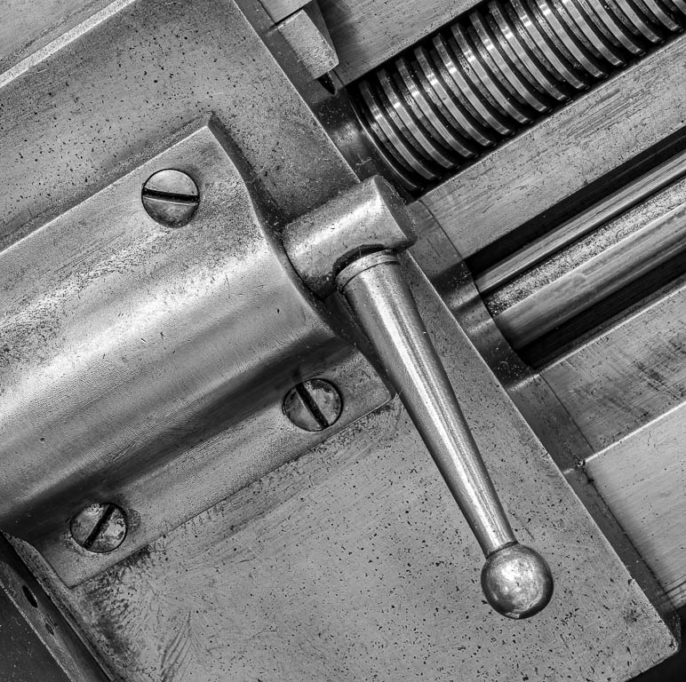
Original
About the Image(s)
The original was shot while on a field trip with my camera club to the Museum of Industry and Innovation in Waltham, MA.
It was taken with my Olympus OMD-EM1 markii using my 60mm f2.8 macro lens on a tripod.
Settings were : !SO 100, 60mm, f16, 20 sec
I liked the shapes of this simple machine and even the color of the original. However, I think I prefer the B&W version and plan to submit it for a B&W club competition. As you can see, I cropped a bit from the top because I didn't include enough and it looked awkward with a small part of the rounded edge missing. I did minor cropping elsewhere, as well.
My questions are :
1. Does the composition work?
2. Is it an interesting subject?
3. What more could be done to improve it?
3 comments posted
Erin,
One of the challenges when taking pictures of machines or devices is which parts or sections to include or omit. Although I can't see the entire device, I think your choice for the composition is appealing. I like the diagonal orientation/lines which are intermixed with the long thread and screws. The handle and thread make me wonder what the purpose of this machine was. The original lends itself to a b/w treatment although I too like the color and rust of the original. I think it is a pleasing image and don't have any suggestions for change, other than I might go with the original. Posted: 11/07/2025 00:25:13
One of the challenges when taking pictures of machines or devices is which parts or sections to include or omit. Although I can't see the entire device, I think your choice for the composition is appealing. I like the diagonal orientation/lines which are intermixed with the long thread and screws. The handle and thread make me wonder what the purpose of this machine was. The original lends itself to a b/w treatment although I too like the color and rust of the original. I think it is a pleasing image and don't have any suggestions for change, other than I might go with the original. Posted: 11/07/2025 00:25:13
Diana Edelman
Erin,
The composition works well with the intersecting diagonals. The B&W has a good range of grays, with some black and some white as well, as is desired. The subject is interesting, and the entire photo is in focus, thanks to the tripod. The element with the threads tells me it is some sort of machine: like Dean, I wonder what cranking the lever does. I can see it is important and well used, due to the worn area on the outside of the lever's casing. So it does hold the interest of the viewer as (s)he tries to work out what 9S)he is looking at.
Your original photo has a merge, where the corner of the piece holding the lever and its casing abuts the upper edge of the photo. You needed more space there to avoid the merge. Your current cropping has eliminated the problem, and since we are not allowed to use AI to expand a photo we enter in competition, your solution is the logical one. You have left the merge in the lower righthand corner intact and maybe need to rethink that. Posted: 11/11/2025 00:09:08
Erin Lamb
Thanks to you both for your good comments. Diana, you're correct about metge , or near merge, on te lower right corner. I need to work on that...the angle take the eye out of the picture. Maybe another crop in from the right. The competition theme is machines and I like your comment about making the viewer wonder what the entire machine as and how might work. Posted: 11/13/2025 00:56:30