Erin Lamb
February 2025 - Old Gas Tank
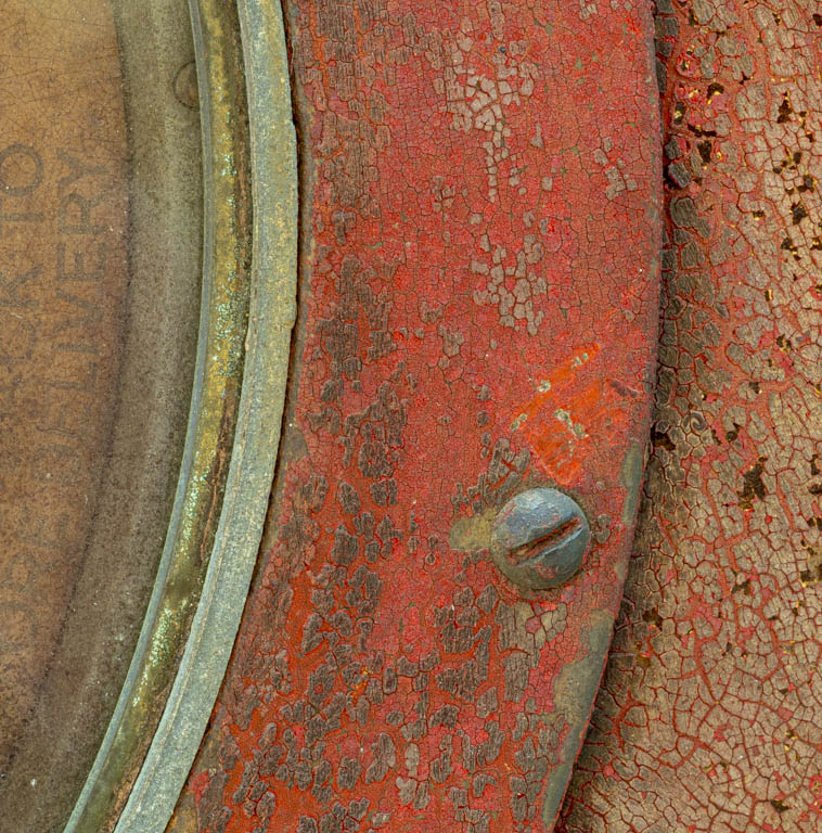
Original
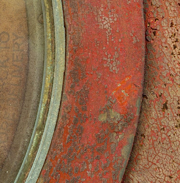
Original 2
About the Image(s)
I do not have all the metadata, Dean. I'm not sure I set up LR to capture it all but will work on that for the future.
Camera is Olympus Mirrorless OM-D E-M1mII
Lens is an Olympus 60mm macro 1:-2.8 Macro
I used Aperture priority and most likely shot at .19mm
I was with my camera club on a field trip to the Charles River Museum of Industry & Innovation in Waltham, MA. It was an overcast day and little light came through the high windows.
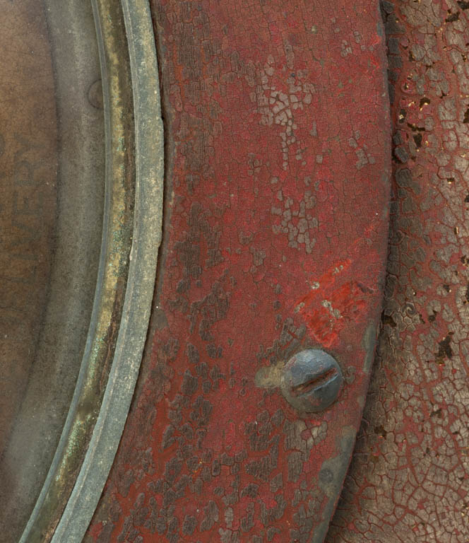
The old gas tank grabbed my attention with its color and texture. I tried to capture that as well as the curves around what was the large dial. I tried removing the screw in one edit but decided that the composition was missing something without it. I wonder if others agree. Does the image hold enough interest? Should I have shot wider?
I used LRC sliders for initial edits:
Exp: +.83
Highlights: -59
Blacks: -47
Texture: +30
Clarity: +13
Vibrance: +28
I used Topaz AI
Denoise at 0.15
Enhance Sharpness 0.15
Recover Details 0.00
10 comments posted
You have captured what caught your eye, certainly, Using a macro setting facilitated that. Great clarity and detail. The photo functions as an abstract; the only hint about what it could be from is the faint writing on the left, but that really does not help.
The screw definitely adds interest and should be left in. Your slight cropping off the top helps. Have you played with rotating the image using the angle leveler crop tool ? Since it has an abstract quality, I am wondering if a different angle of presentation might generate additional interest. Posted: 02/05/2025 17:10:44
Thanks for your insights! Posted: 02/05/2025 17:27:09
There are lots of eye interesting aspects of this image - the faded and contrasting colors, the texture, the curved vertical lines. The screw adds a bit of asymmetry, which also adds interest. I wouldn't remove the lettering since it is not distracting (to me) and provides a bit of context. Posted: 02/07/2025 22:33:42
I really like the textures in this image. I think the including the screw adds to the image. Nice capture! Posted: 02/11/2025 13:34:27
I really appreciate your comments.
Posted: 02/11/2025 13:51:11
(Group 54)
I love the colors and textures, Erin. The composition is great, especially with the placement of the screw. The words are very faint and don't distract me; I personally think they add interest to the careful observer.
I like the suggestion to rotate the image. I have a preference, but that doesn't really matter, what matters is what you prefer.
Well done! Posted: 02/21/2025 18:52:07