Rita Johnston  


Houston by Rita Johnston

January 2025 - Houston

January 2025 - Rita Johnston

Original

About the Image(s)

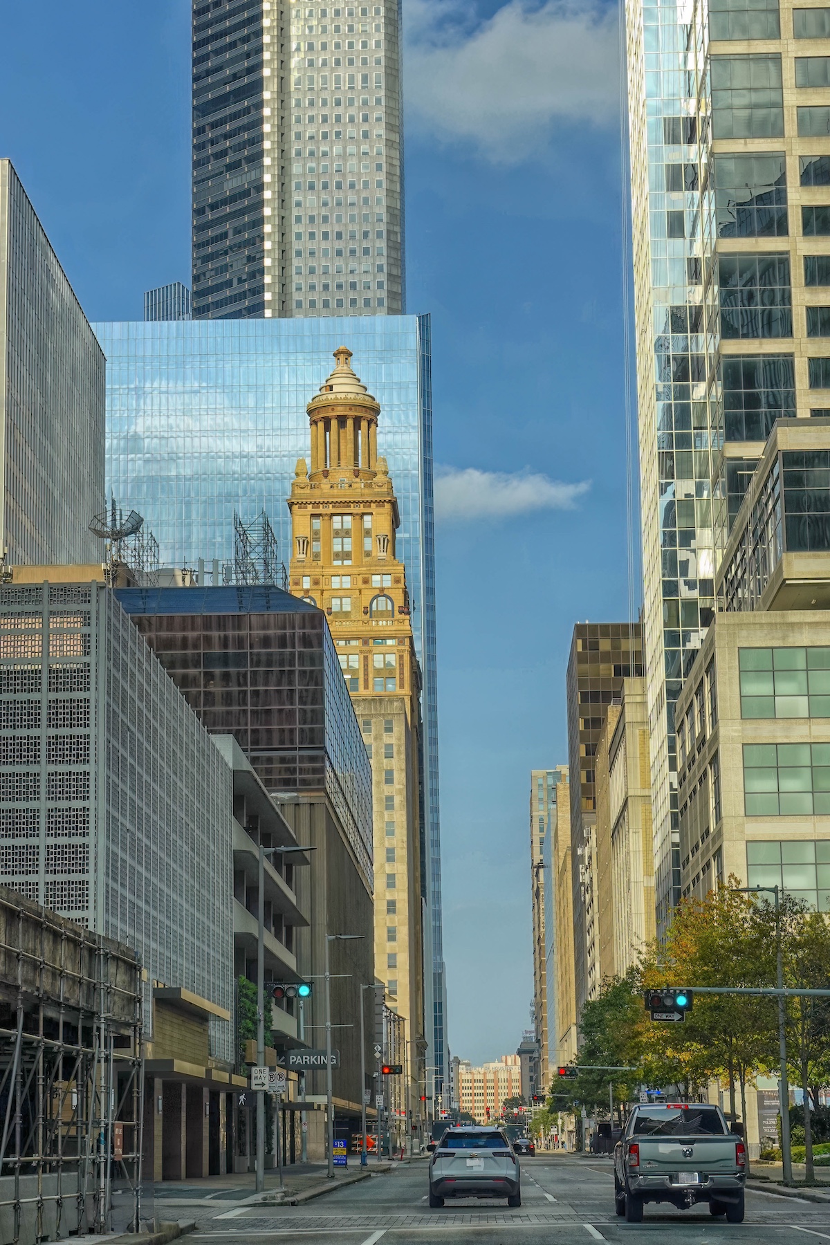
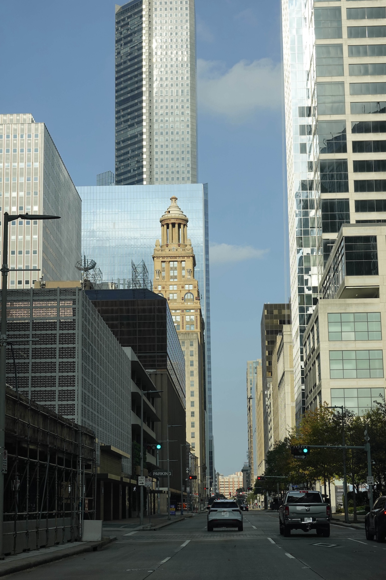
This photo was taken in Houston, Texas in December. I was struck with the current architecture in the city and the open space on the drive. I was also trying to show the older buildings vs the newer skyscrapers. Data on it: Exp 1/800, F 4.0, taken with a Sony RX10iv. I tried a B&W conversion initially, but I thought the color better showcased the buildings. I could be persuaded to try the B&W if any of you think that is the way to go? I am considering putting it in the Architecture/City scape category in a Texas contest coming up, and it could go in either color or B&W. Any and all suggestions for improvements to make it more competitive are appreciated.

Rita


8 comments posted


Dean Ginther   Dean Ginther
Rita,
The lines and reflections and color make this an interesting architectural image. Your editing definitely improves the image. I particularly like the left center building with the glass structure behind. I might have walked a bit closer and moved to the right side of the street to see if I could get an image with more of that building in it. Of course, if you get too close then you start to get an image where the lines and buildings start looking distorted. Maybe a bit like the attached without the better vantage point.   Posted: 01/06/2025 23:40:21
Comment Image


Rita Johnston   Rita Johnston
Thank you!   Posted: 01/07/2025 03:49:50


Diana Edelman
You did a nice job toning down the upper parts of buildings and opening the shadows in the lowers buildings.   Posted: 01/11/2025 03:21:30
Erin Lamb
I agree with your edits also re the highlights and shadows. The color of the reflected building adds to the inage so I'm not sure B&W would make it better.
I like the cropping Dean did to focus more on the architecture but maybe a little less tight on the right.
Perhaps that and cropping up to just under the street sign to eliminate the cars would keep the sense of city without the car and street distractions.   Posted: 01/19/2025 16:33:54
Rita Johnston   Rita Johnston
Thank you!

  Posted: 01/20/2025 20:35:41
Rita Johnston   Rita Johnston
That's what I was trying for. Thanks.   Posted: 01/20/2025 20:36:15


Kyle Gillis
Rita, I love the tack-sharp front-to-back focus,the silver and gold tones against the blue sky, and the wonderful reflections. A tighter crop is a viable option, but I'd suggest something closer to the original uncropped version, except for trimming the top to make it appear that the skyscraper in the back continues upward. Leaving more detail on the sides would increase the wonderful variety of textures and patterns that enhance this shot. More importantly, leaving more space at the bottom will make the car on the right less of a focal point, helping the eye to move up where the real action is and giving the picture a more solid base to support the vertical structures. If you are willing to add elements, I suggest continuing the top white cloud so that it also appears on the left side of the rear skyscraper It currently looks a bit oddly truncated. I would also straighten the building on the right to match the other perfect verticals. Nice picture!   Posted: 01/20/2025 19:29:58
Rita Johnston   Rita Johnston
Thanks so much for the detailed suggestions. Straightening I think is a must, and I will play with your other suggestions.   Posted: 01/20/2025 20:37:15


Please log in to post a comment