Bob Crocker
July 2024 - Black Rock
About the Image(s)
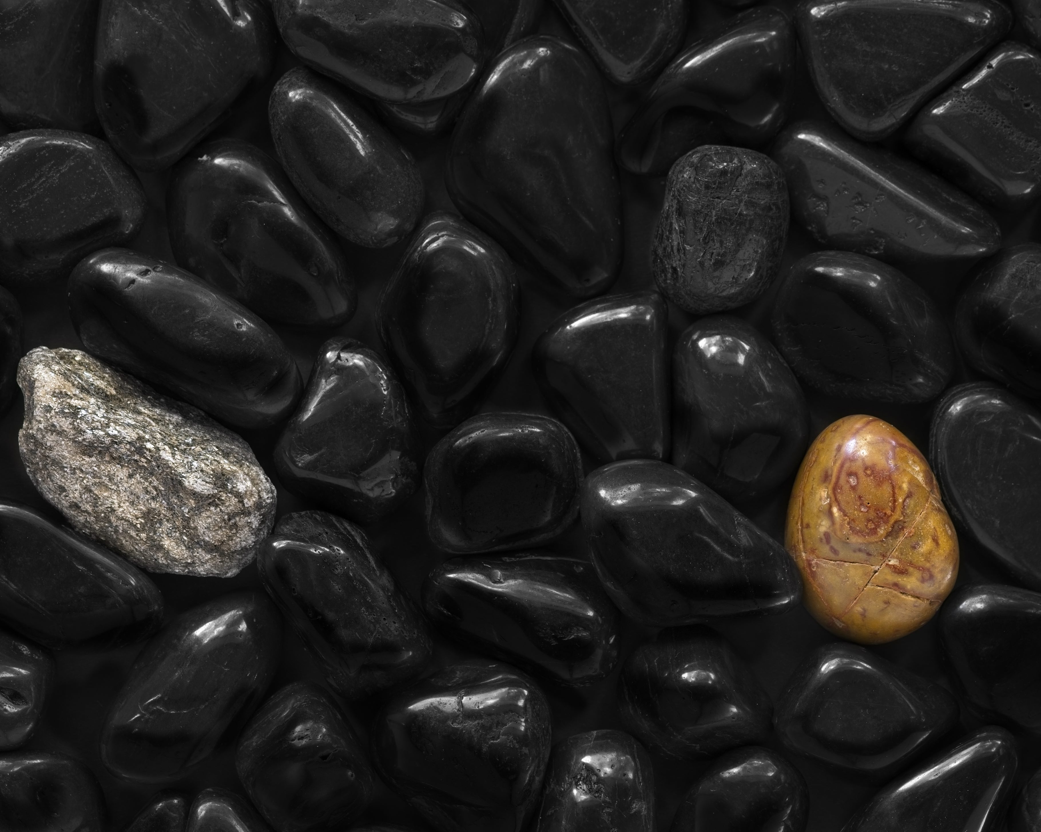
Thought these black stones would make an interesting image although I didn't want it to be a monochrome shot. So to add a little color and texture, I added the other two stones. Not sure if they are in the best place for a strong composition. What do you think?
Shot with my Sony a6500, 90mm macro lens with tripod at f7.1, ISO 200 for 1/5 sec, window light from the right and a white board on the left to reflect back into the shadows
This round’s discussion is now closed!
7 comments posted
I love this image. There is something very serene about the black stones on black background. I do like your addition of the 2 colored stones to the composition. I think where you chose to place them is fine. I think the one black rock that shows more texture also helps balance out the image. It is almost as if that one was a different color as well. Posted: 07/21/2024 22:46:08
Hi Bob - like Jessica, I think your placement of a triangle of three stones with different types of contrast really works here. I really like what you have done. Posted: 07/24/2024 23:02:27
Very nice image of the black stones, and the one you added. I would like to see the grey rock moved over to the right a bit, I think it's a little too close to the edge. Posted: 07/25/2024 15:40:17
You did a nice job of focusing the black stones so well. An interesting and zen photo. I would suggest eliminating the grey stone on the left. With two focal points, I find my eye jumping back and forth. I think it would be a stronger compsition with just one bright "star of the show" where I can rest my eye. Posted: 07/25/2024 16:49:09
Excellent job of taking the photograph of black stones. The highlights on the stones really help the image. It was a good idea to add some other color to the image, but I think that you have too much. The grey and the brightly colored stone are too far apart. You should crop off the grey stone. If you try this again, leave out the grey stone and move the colored stone over about one stones width. Posted: 07/25/2024 20:53:29
Thanks folks; appreciate the comments. I made a crop to a 8x10 print format and also posted that file here. After reading some of the comments, I realized that the crop really did crowd the gray stone on the left. I am posting the original formatted image which does give more breathing room on the sides. I still like having both stones, giving the triangle area of interest effect for the composition. Posted: 07/27/2024 21:43:09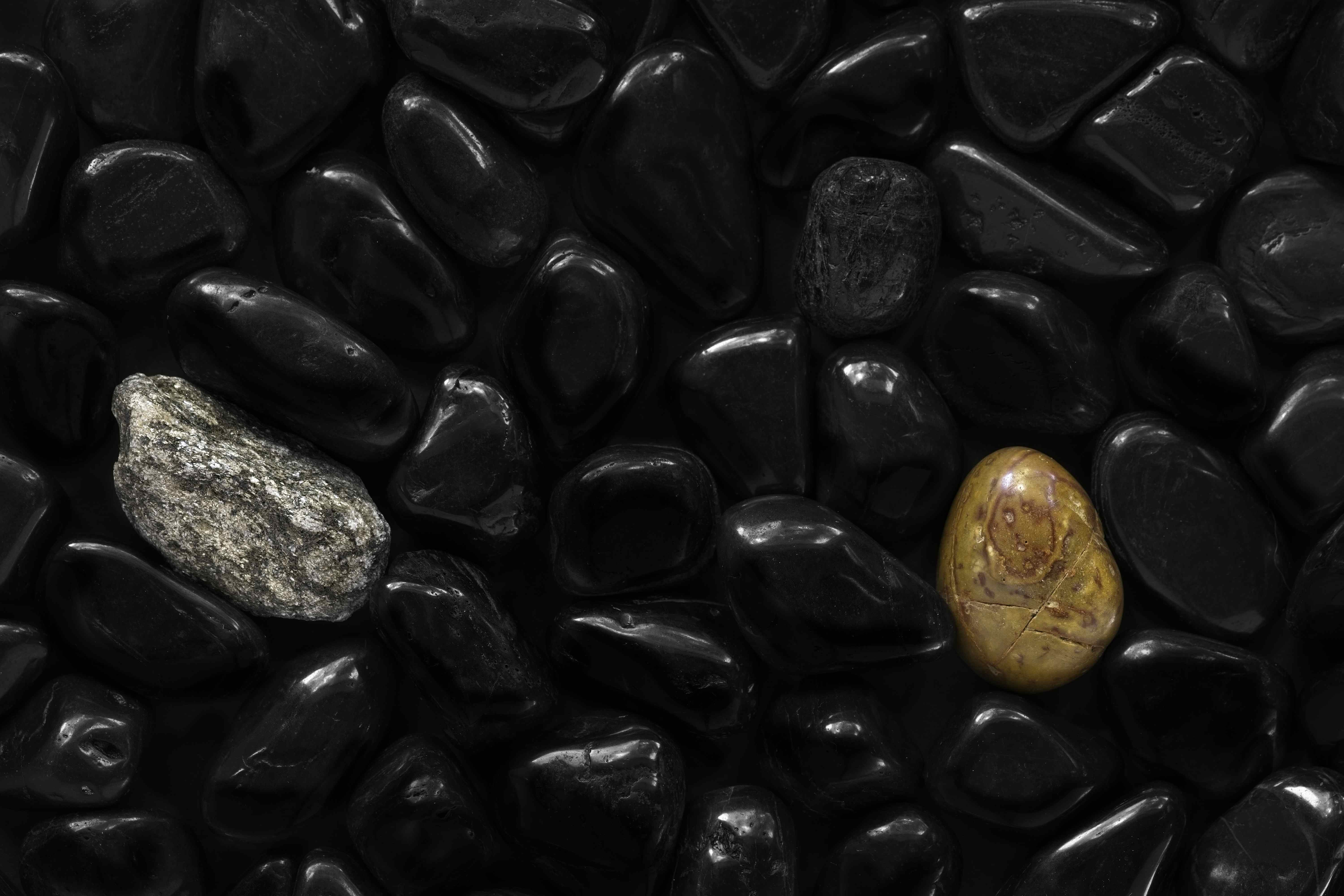
Very interesting. It's a dry rock garden yet reminds me of water with the rounded stones and reflections. One more light colored stone to surround the black rock would give it more symmetry. Posted: 07/31/2024 05:56:31