Tom McCreary, APSA, MPSA
July 2024 - Well Used Door Handle
About the Image(s)
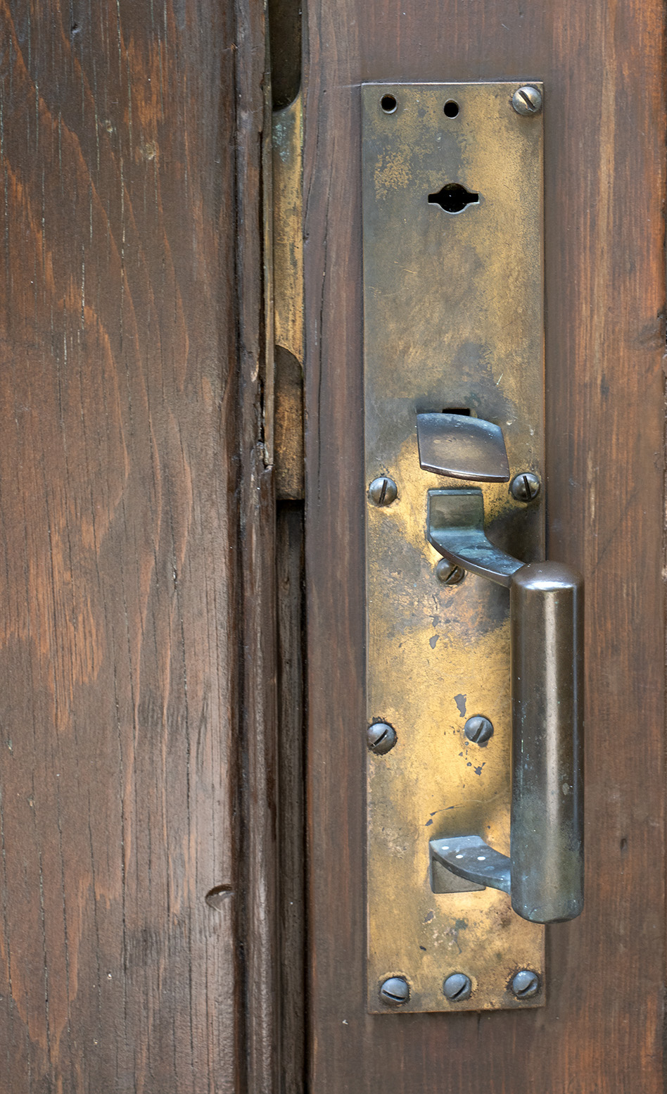
I was out exploring the countryside near my home and I came across an old church building. It is St James United Church of Christ. The church building was built in 1896, and an interesting fact is that at that time, the sermon was given in German, but soon changed to English. I liked the well worn latch and the colors and texture of the old metal. The wooden area to the left of the metal looks like some damage and repairs. I used my Olympus camera and 14-150mm lens at 25mm, 1/25th second, f8, and ISO 200. I am showing the full metal plate area, but I think that the most interesting part is the worn and angled thumb latch. Do you think that I should crop in on that area?
This round’s discussion is now closed!
7 comments posted
This image has a nice contrast of textures between the wood and the brass handle. I would try to increase the contrast a bit. It may give more depth to the image. Everything is about the same color tone, so it feels a little flat. Posted: 07/21/2024 22:47:26
Nice capture, I like the interplay of textures between the wood and metal. I agree with Jessica, maybe a little bit micro contrast adj. on the wood could bring some more detail. Posted: 07/22/2024 23:45:22
Hi Tom. I like the contrasts of straight lines with the angles of the screw heads and the latch, which is on an odd angle from many years of use. I agree with Bob and Jessica, that a little micro-contrast on the wood might enhance. Posted: 07/24/2024 23:05:31
Very nice image, I also would like to see maybe a bit more contrast. Posted: 07/25/2024 15:49:48
I think you have a great subject and nice composition and subtle colors. I do think that since it is described as well worn, the texture and details could be enhanced/exaggerated. I increased the tonal contrast, details and clarity and then added a vignette. Posted: 07/25/2024 16:53:37
Thanks, that is a big improvement. Posted: 07/25/2024 17:18:34
No suggestions and don't change a thing. I like the story behind the subject. The lighting is soft at the top and stronger at the bottom which directs your eye towards the handle - latch area. Posted: 07/31/2024 06:13:20