Gabriele Dellanave, PPSA, BPSA  


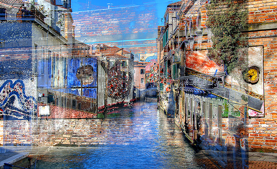
Venice impressionism by Gabriele Dellanave, PPSA, BPSA

November 2024 - Venice impressionism

About the Image(s)

Here is my humble contribution for the November 2024 image. Is NOT a AI image. I do not know if these images are allowed or not. If the PSA does not allow these imagery, just let me now and I will send to you another one. Do not even ask me how I did the processing, I do not remember the process. I’m sorry but it is a consequence of the stroke I had last July 2023. My short memory is compromised, particularly working with my computer.
Keep in mind that the image was created and developed in my computer starting with an image of Venice and a handful of sovran-impressed image. I titled the image “Venice impressionism.” Nothing much to add.
6 comments posted


Art Jacoby   Art Jacoby
I really like the artistic treatment. I think it captures the feeling of Venice. For me, very painterly
but a bit too bright. I darkened it and also pushed the colors. Just my take on an interesting and engaging image.   Posted: 11/04/2024 20:22:22
Comment Image


Kurtis Sutley   Kurtis Sutley
I really like the colors and textures. The imagery is wonderful. I have no reason to change anything.   Posted: 11/04/2024 20:58:33


Regine Guillemin
Wow!!! what an interesting piece of Art. Very creative !!!! I really love it. To make it perfect and it is purely subjective, I would try to keep the sky with less texture, or to reduce the opacity. I am not sure the bricks are the right blending for the sky. I hope to see more of your creation in the future. Congrats! and thanks for sharing this outstanding composite.   Posted: 11/08/2024 02:59:53


Marge Barham   Marge Barham
Gabriel I love what you created. I can't stop looking at it. At first I thought it was a double exposure but then so much more pops up while looking around. I do like Arts version of a "little darker", it deepens my thoughts. Very nicely done Gabriel.   Posted: 11/09/2024 01:33:11


Sunandan Ghosh   Sunandan Ghosh
The effect resembles multiple exposure. Reflection of wall lead to think that the depth of water is less, as if the roads are water logged. It reminds me of few streets of my Kolkata during monsoon. It is indeed a nice result of experiment.   Posted: 11/09/2024 14:43:04


Sylvia Bacon   Sylvia Bacon
Gabriele, I love the colors in your picture plus the combination of vertical and horizontal lines throughout. You did a very nice job editing, I really like this picture! I would not change anything except maybe crop about an inch on the right where part of the red brick building keeps drawing my eyes away from the rest of the image.   Posted: 11/19/2024 14:24:32


Please log in to post a comment