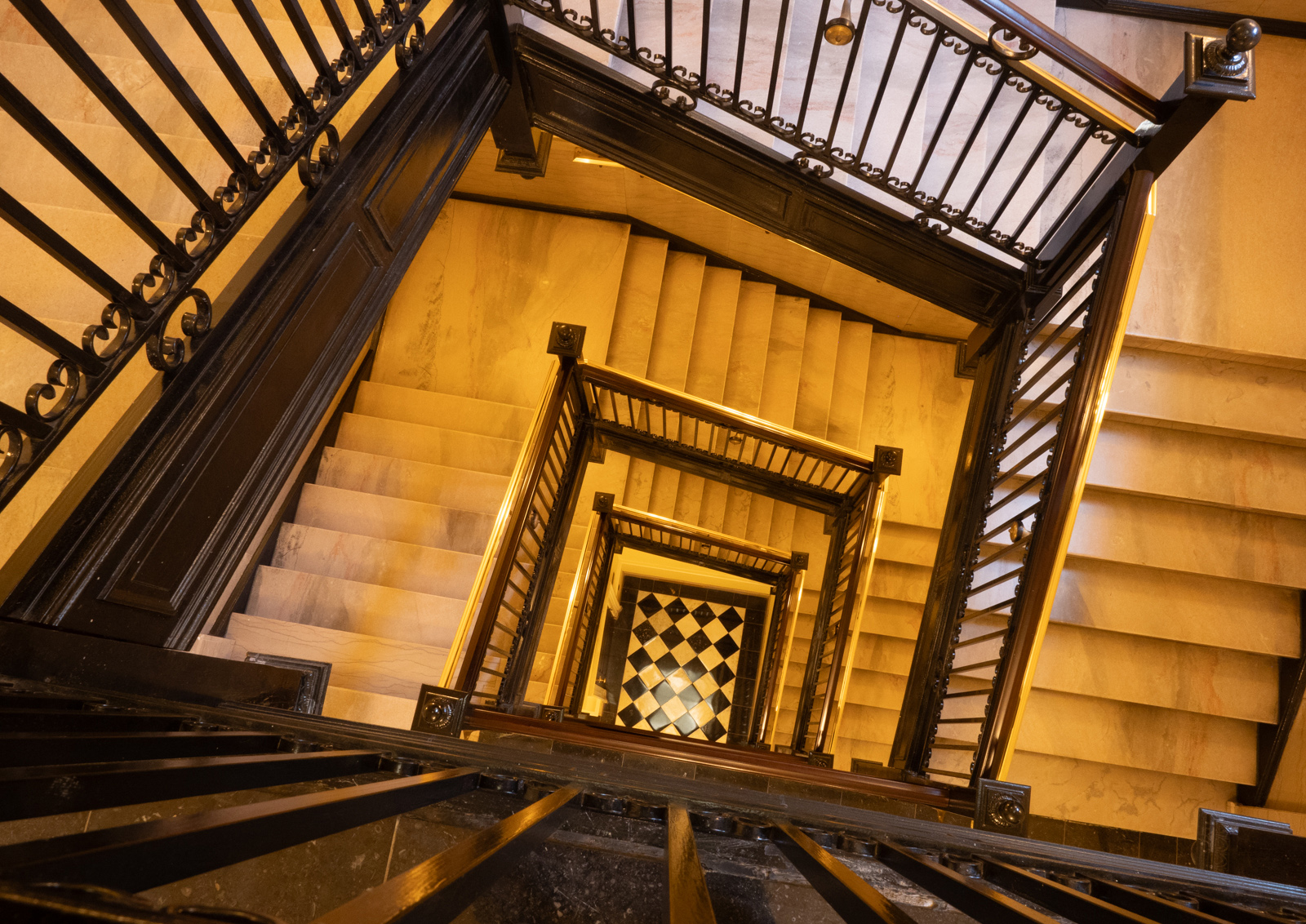
This was taken in the Capitol building in Richmond . We gave ourselves a day for exploring the city but the weather was horrendous. It had torrential rain all day â⬓ we got soaked twice when we ventured out.
We spent a long time inside this building trying to take some worthwhile pictures. I liked the angular spiral staircase, but I didn’t have a tripod with me, so I was balancing the camera on the handrail and using a high ISO. I also forgot to change the WB so the first task in processing was to click on fluorescent to remove the overall yellow colour.
This actually produced a good level of contrast, although I have lightened the shadows a little. I did take another shot while someone was walking down the stairs but I didn’t like the ghostly effect as it broke up the pattern. I added a touch of clarity, and cropped off my toes! I altered the crop angle to make the square at the bottom line up horizontally, even though this removed some of the steps etc all round. Maybe I should have left it at an odd angle.
ISO 100, 12mm, F11, 0.8 sec
This round’s discussion is now closed! 8 comments posted
Manel Puigcerver
Dear Diana, I was waiting for comments from other members of the group to follow the same line. But since no one except you has left their comments, I'm going to dare to leave my opinions. I hope I get the tone of my interventions right!
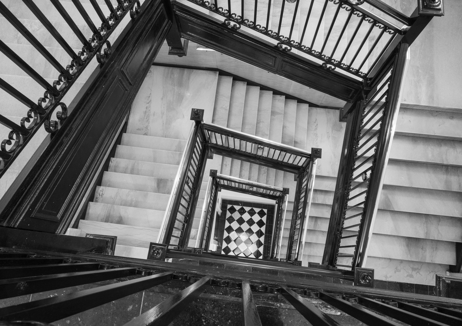
From my point of view, this is a nice B&W photo, with black areas with the righ tonal density and without overexposed areas. All in all, the whole photo has harmonic grey scales.
I understand your intention to alter the crop angle to make the square at the bottom line up horizontally. However, when doing it you cut the upper corner of the stairs; in fact, you still cut it a little bit in the original photo, but it's more visible in the B&W version. I know, I'm very strict with symmetry issues, so probably that's my problem. Anyway, I agree that this is also a matter of opinion. Besides, you had no other option when capturing the photo :-)
Posted: 07/15/2024 17:22:20
Diana Magor
Yes I agree that the corner should have been included, but it wasn't possible with the lens I had and the necessity of using the banister to support my camera.
Should I tone down the bright areas on the banisters and on the strip lights which show in a couple of places? Posted: 07/15/2024 18:59:51
Manel Puigcerver
At first, I didn't notice about the bright areas of the banisters, so I think they don't need to be toned down. At a second glance, maybe I would tone down the upper part of the banister located at the right side of the photo. But this is a small detail, almost irrelevant. Posted: 07/16/2024 07:50:30
Tom McCreary
You have a very interesting image, which is very sharp with great depth of field. Well done at 0.8 seconds and f11. I would not change the angle, you have so many angles that the only thing that you made straight are some of the stairs. You have more interest in leaving nothing straight. You also have lost some of the effect of the leading lines coming into the image. I would not tone down the banisters or the strip lights as leaving them gives them more separation. The floor has given you a great center of interest. I would say that you made the most of a rainy day. Posted: 07/15/2024 21:03:17
Diana Magor
OK thanks. I'll go back to the odd angle and see if I like it better. Posted: 07/15/2024 21:54:29
Stephen Levitas
Yes, I also agree that the original more angular image was more interesting. I've often struggled with hand holding long exposures, so you did a great job with this one. I know that this is what you had to shoot and there were no choices, but for staircase shots I think at least one additional turn would make a stronger picture. Posted: 07/16/2024 06:58:48
Wes Odell
Avoiding "too much of the same" ie perfect squares and rectangles, makes for a nice and unique photograph. Posted: 07/16/2024 21:27:19
Jennifer Doerrie
I've attempted many times to take photos of staircases like this one, but I've never done so very successfully. The angle of the staircase and railings and pattern on the floor add interest here. I think I agree with Manuel that the large banister railing on the right would benefit from being a bit darker. However, the other brighter banisters seem fine as they are to me. Unless you're entering this image in a category/competition where altering is not allowed, I think I'd also be tempted to just clone out the light that partially shows below the wood near the top of the image. Posted: 07/26/2024 06:22:19