Diana Magor, MPSA, APSA

February 2022 - Alien spaceship approach
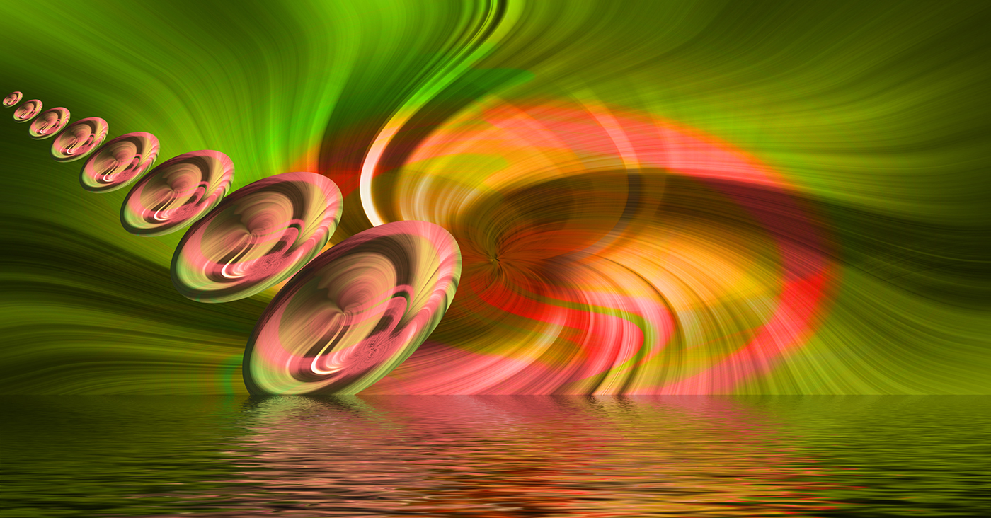
Original 2
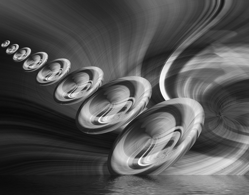
Original
About the Image(s)
I love playing with creative images even when they don't all work. This started out life as a railway station sign in Tasmania. I did my usual double twirl technique and then I used another technique which creates 'bubbles' of the altered image. I had to blur the join line to make it less obvious and then I coped the original bubble multiple times , reducing the size each time and placing them further and further away from the centre. I added a flooded base and cloned the straight line to make it not show, then converted to mono -this is Nik wet rocks and then cropped to a nearly square shape.
It didn't take very long to do and I like the effect. So do you all like it as well? I can let you know more detail if you want to have a play yourselves. Not everything works but I have a variety of different, mostly colour pictures now
This round’s discussion is now closed!
13 comments posted
1. The colors.
2. The spirals.
3. The background.
4. The flooded base, with its straight line.
5. The interaction between the colored spirals and the background.
As to the monochrome version, I like the spirals and background just fine, but I preferred the straight horizon line of the colored version, so I don't care for the softened line of the monochrome version. I really liked the full view of the colored version, so having seen that, I don't care for the cropped monochrome version.
These are strictly personal reactions, coming from my eye as I look at each version. Posted: 02/03/2022 16:54:38
I would love to know your technique. Posted: 02/12/2022 07:59:13
(Group 5)
Posted: 02/20/2022 12:10:40