Diana Magor, MPSA, APSA

August 2026 - Contrasting styles
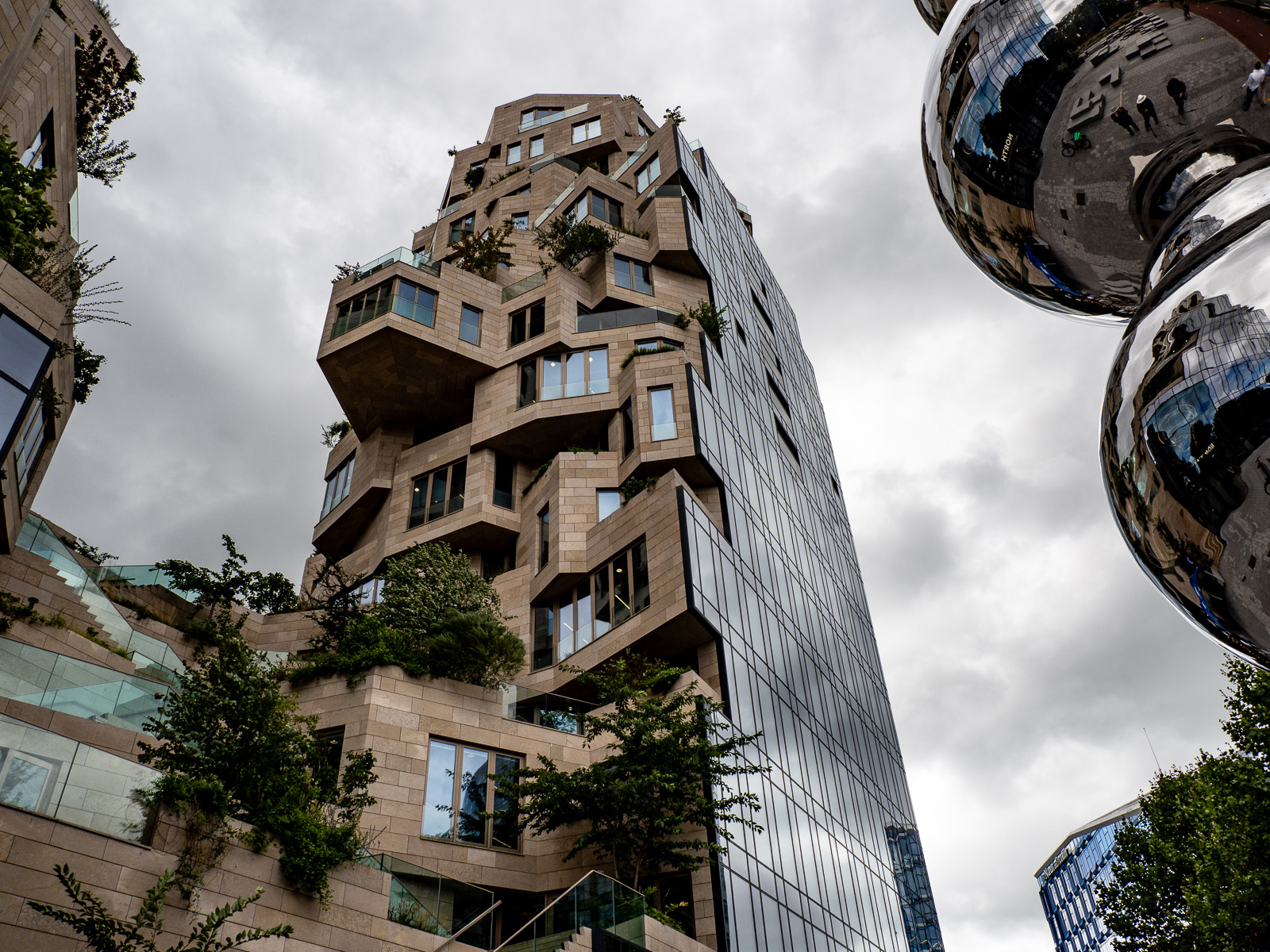
Original
About the Image(s)
This is a residential building in Amsterdam called The Valley. I have used a photo of the sculpture which is outside and can be seen on the right of this picture. It is obviously modern and very angular in style in direct contrast to the sculpture which is all rounded globes. I liked the contrast.
I converted in Lr to mono and brought back the shadow detail, also darkening the blacks and increasing the clarity and dehaze so there was detail in the cloudy sky. Then I exported to PS, cropped off the left hand building and resized.
Do you think this works?
7 comments posted
An interesting subject, full of angles, and I like the vertical tapering perspective. Could you have included more of the curved sculpture? Posted: 08/12/2026 06:15:49
Maybe, but I didn't have a wide angle lens and stepping back meant more of the left hand building. Do other people think I should have included more? Posted: 08/12/2026 08:56:44
Very interesting architecture image. I seem to recall seeing the curved sculpture in an image you submitted a while back. I'm guessing you are one of the people reflected in the sculpture. I might like if more if the sky was more dramatic but then you would have had to match it in the various reflections. I wonder what it would look like if you had captured the building reflected in the sculpture with a long focal length lens. Posted: 08/14/2026 17:18:44
Yes I did have a picture of the sculpture on its own. It was something you couldn't ignore! I'm the one with a big white hat reflected in it. It didn't stand out well when taken against the building as it was too busy. Posted: 08/15/2026 08:09:39
Diana,
Very interesting architecture and composition. I do agree with Stephen that if you could have included more of the sculpture, it would probably look better. Was it possible to take two shots and stitch them together? Or possibly do a phone pano? I fid current phones do a good job when I am not carrying a wide lens. Just an idea. Posted: 08/17/2026 15:40:26
Very interesting architecture and composition. I do agree with Stephen that if you could have included more of the sculpture, it would probably look better. Was it possible to take two shots and stitch them together? Or possibly do a phone pano? I fid current phones do a good job when I am not carrying a wide lens. Just an idea. Posted: 08/17/2026 15:40:26
I like all of the angles of the building contrasted with the round parts of the sculpture. The angle of the building and sculpture add interest. I agree with Stephen and Somdutt that you should have shown more of the sculpture. Posted: 08/17/2026 19:36:10
OK - general consensus says I should have had more included. Posted: 08/17/2026 22:27:05