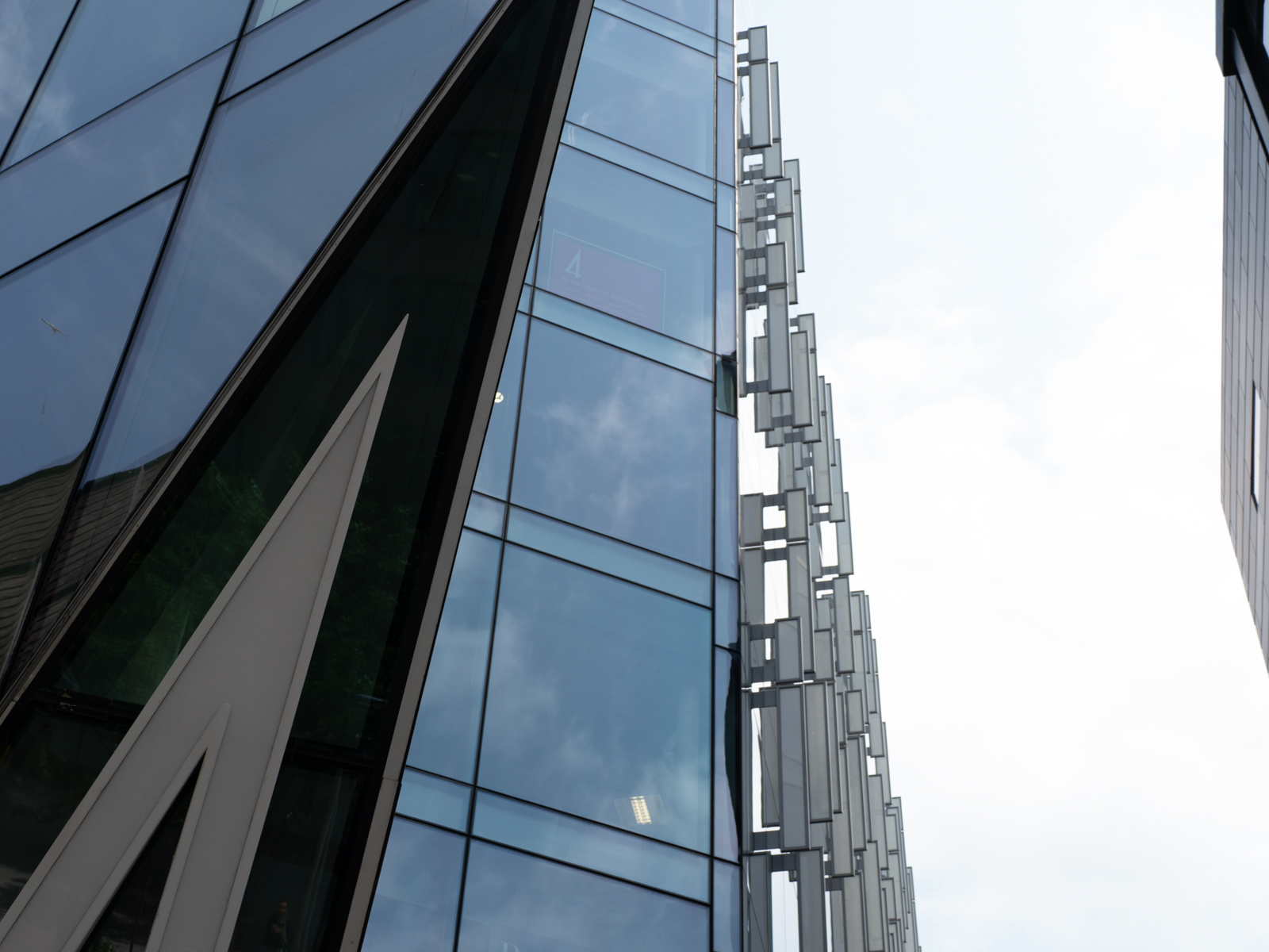
This was taken in Liverpool. One of our members is very knowledgeable about all the buildings and he took a small group of us to look at the modern ones. I liked the part of this one, which had fanciful additions on the side, which were in theory designed to cool the exterior glass. The point on the left is the top of the number 4 which is part of its address.
I changed it to b&w in Lr then increased the shadows and the whites to 67% and reduced the blacks to minus 67%. That increased the contrast dramatically.
The I went to the colour sliders and decreased the blue to -20
Then back to clarity, which I upped to +32 and the dehaze to +18 which brought back some of the cloud patterns.
I liked the greater starkness of the patterns. I cropped a small amount from the top which had a light patch on the frame edge and a larger amount from the right hand side to decrease the large area of white sky.
I like the pattern. Should I clone out the two white blobs in the glass? Not sure what they are-perhaps something inside the windows.
7 comments posted
Stephen Levitas
This came out very well. Yes, I think the two bright spots should come out.
The perspective interests me. You know I like perspective. I can see this this building has triangular shapes emphasizing the upward soaring perspective. Posted: 07/05/2025 17:54:51
Diana Magor
I like perspective shapes as well. I used a mono pod for stability and put the camera down low, with the view screen swung round so I could see what I was getting -I can't get down and up again so easily these days so this method means I can still get the low shots! Posted: 07/06/2025 09:43:48
Ed Ogle
Nice leading lines. I think the white spots in the windows should be removed and I would like more texture in the reflection of the clouds in the windows as well. Posted: 07/06/2025 16:39:38
Wes Odell
So many GOOD leading lines upward. It's too bad the capture doesn't go to the top or to something to take advantage of the lines. Otherwise: Very nice. Posted: 07/07/2025 01:32:49
Tom McCreary
Good perspective image, and think that going to mono was the way to go. I especially like the v coming out of the lower left corner as it points us up into the image. I think that you should remove the white areas on the windows. Posted: 07/12/2025 18:56:40
Stephen Levitas
Wes has a good point about the leading lines not going to the top. On the other hand, cutting off the pinnacle leaves a visual tension. Posted: 07/19/2025 09:08:15
Jennifer Doerrie
This is interesting, and initially made me think of inverted benches like are found on some amusement park rides. I wonder if they really help with cooling? Maybe I should try some on my house! I agree going up some more at the top would be nice, but it works as you have it. Posted: 07/28/2025 05:50:33