Jennifer Doerrie

July 2025 - Oregon coast and sea stack
About the Image(s)
Oregon Coast and Sea Stack
ISO 100
f/8
1/160 sec. exposure
24-105 mm lens at 24 mm
It was very foggy the afternoon I briefly drove along the southern Oregon coast, so seeing the sea stacks was difficult. But I did attempt a few images anyway. I don't feel like I'm very skilled at editing images with fog, however, as they either end up very bright, or rather grainy. I left this image darker, although it's a bit grainy. Would brighter be better? Is there a way I can get a nice effect with fog without it being so grainy? Thanks!
7 comments posted
I think you are overthinking this image. It is fantastic. I love the way the view emerges from the fog. I find that an interesting inversion of shots that I like in which the central feature emerges from blackness. Posted: 07/05/2025 17:59:50
Your questions require answers beyond my experience or knowledge. I can say, however, that it's a nice rendition of the coast on a foggy day. Posted: 07/07/2025 01:38:57
I like the moody effect of the image with the distance going white with the fog. The curve of the seashore on the right is very nice. I don't think that you want the image any brighter, and the grain does not bother me and looks natural. I have no idea about getting the grain out of a foggy image -- never is much fog where I have ever lived. Posted: 07/12/2025 19:59:54
Nice image but I wish you had submitted the original. It looks great in black and white but I'm wondering if it would look better in color. Posted: 07/13/2025 15:55:27
Thanks. I felt like the color image had a lot of distractions, but here it is. Posted: 07/18/2025 06:55:38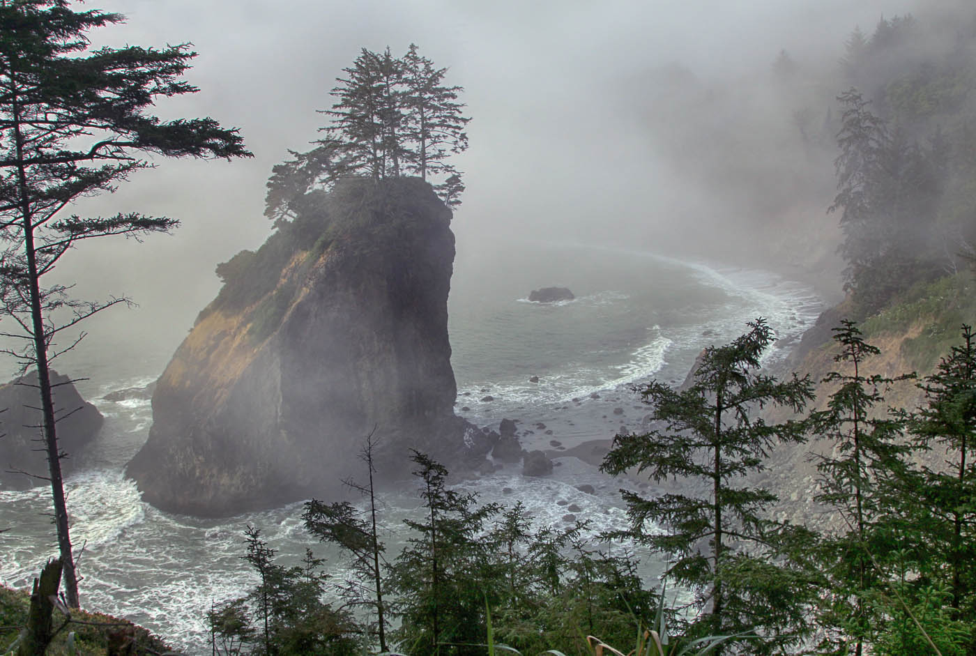
The monochrome is better, but thanks for showing us the color. The color image has to me, some distracting colors, especially the brown areas. Posted: 07/21/2025 19:22:47
Ooohh. The color is quite different in mood, and very interesting on its own. Posted: 07/19/2025 09:10:49