Stephen Levitas
About the Image(s)
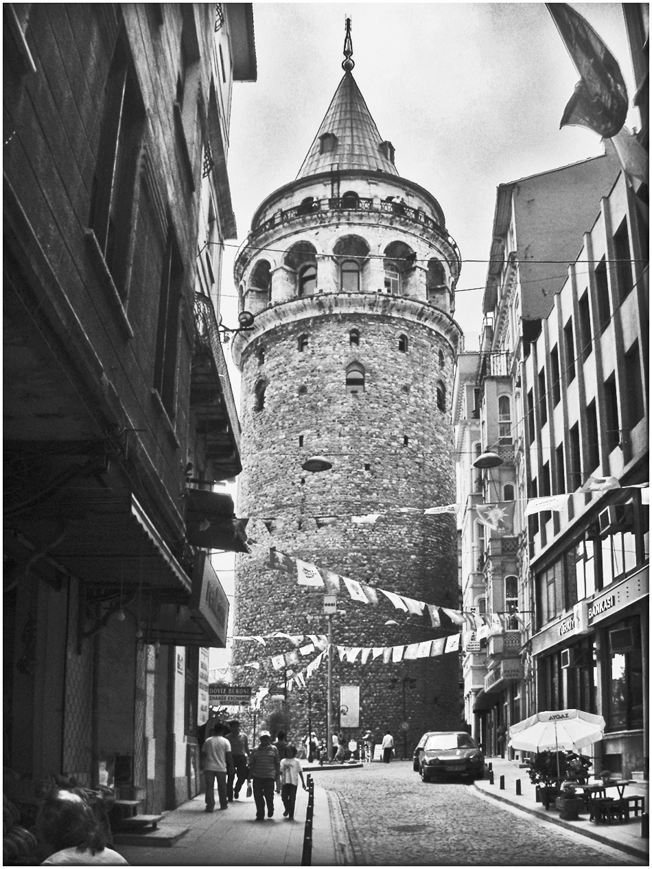
Istanbul Galata Tower
This is the famous Istanbul landmark (European side), the Genoese Galata tower. It was a military watch-tower, built in the form you see here in 1348. It is now a museum. The neighborhood is a charming destination of quaint old buildings and shops. There are no good views of the tower close up, except like this up a street. Any panorama of old Istanbul usually includes the tower, several mosques, and the inlet of water, called The Golden Horn, dividing the northern and southern European parts of Istanbul.
I straightened this only slightly, but even that has taken a bit away from the tower’s vertical sense. I lightened the shadows to bring out the buildings on the left, darkened the highlights, and increased contrast. I repaired a few bright spots where the sky peeked through on the sides too brightly.
That’s a flag on the upper right. Should I remove it? Is the building on the left too big? Should I crop it a bit? Should I then crop a bit from the bottom to keep the image proportions?
7 comments posted
Coming back to the photo,I see a nice grey scale, without burnt high lights nor too dense shadows.
From my point of view the flag should be removed and the crop would help you to improve the photo. Besides, have you tried to correct the perspective to avoid vertical lines falling? I think it will improve the photo.
Posted: 11/05/2024 15:01:50
Thanks for confirming my questions about the flag and cropping.
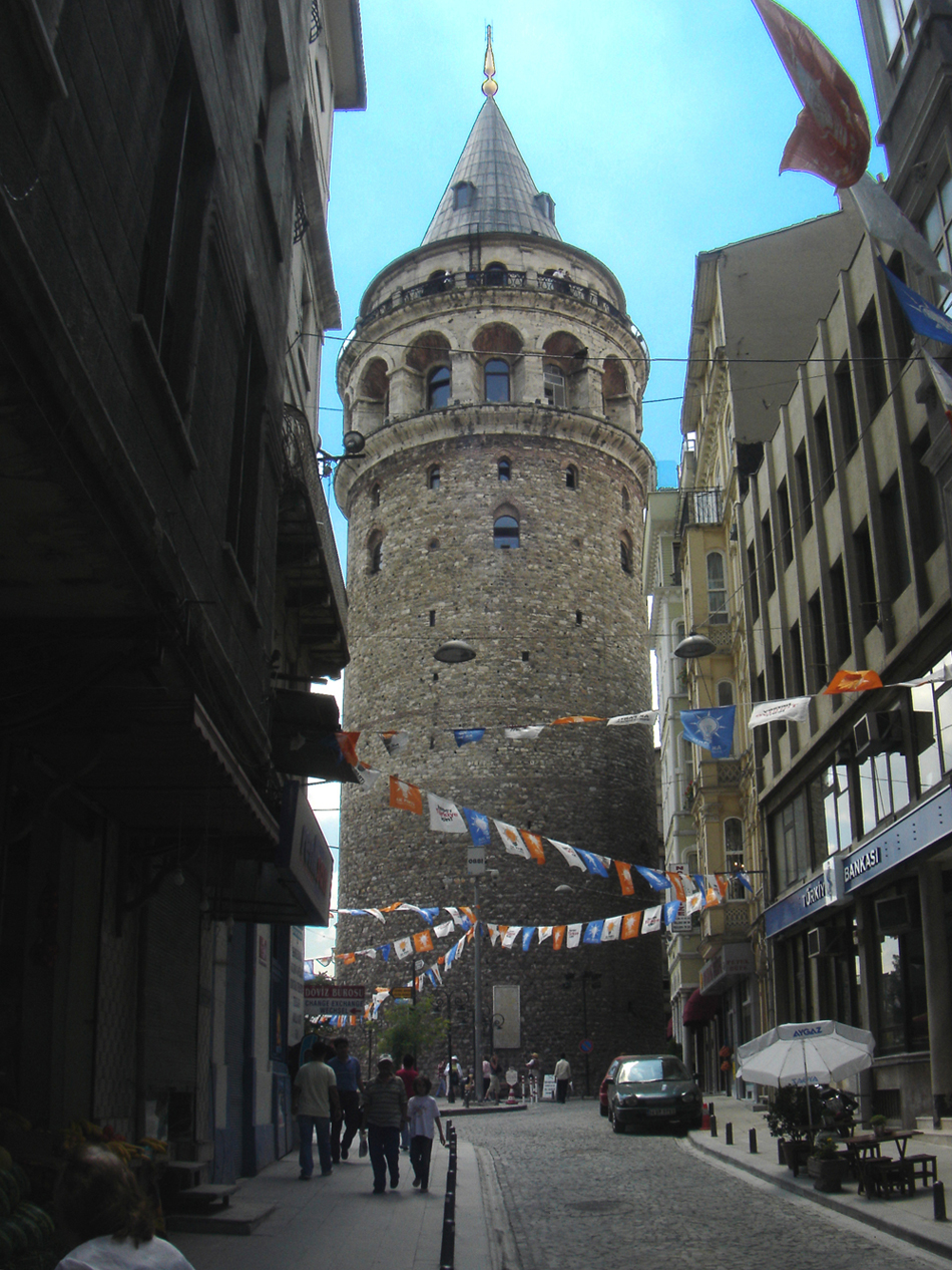
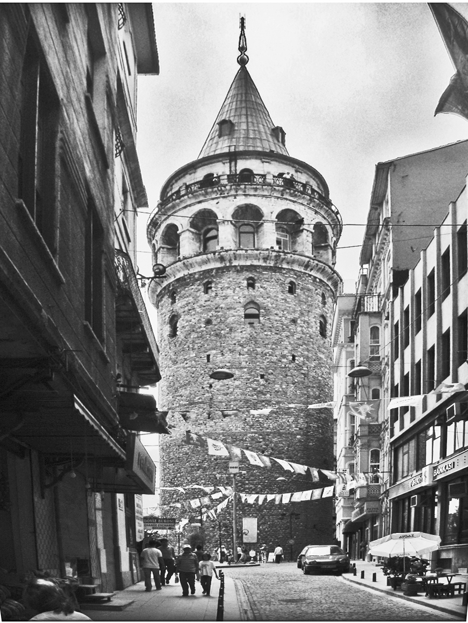
About the perspective, I did do a small amount of alteration of the vertical perspective, but if you compare the original color shot to the monochrome, the perspective change tends to fatten the tower, and it loses a little its vertical soaring. If I did more perspective alteration, to make all the vertical lines parallel, it would considerably fatten the tower. See below the example, that I definitely do not like.
Therefore, I generally do not do much adjustment of vertical parallels, so as to retain the sense of soaring upwards. Of course, some situations might work well to do this. Commercial architectural photographers almost always adjust their vertical parallels.
Note that we photographers never adjust parallel lines that are in the horizontal plane, like roads or railroad tracks. We all like that those parallels converge. So I do not think it should be automatic to adjust vertical parallel lines. Posted: 11/05/2024 17:40:29
(Groups 71 & 92)
this is a very nice image is definitively better in monochrome of the color version. To me the flag doesn't create any distraction, and on the contrary I believe it creates some balance to the building on the left.
best
Michele Posted: 11/10/2024 23:09:43
Your image with the vertical lines corrected makes the tower look too squatty. Posted: 11/15/2024 18:41:45


