Ed Ries
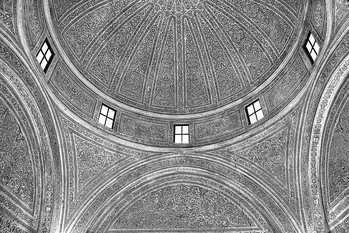
July 2024 - Ceiling of the Mosque
About the Image(s)
No processing was necessary. It is an abstract image utilizing textures and shapes. The image is the dome of a Mosque in Kairouan, Tunisia.
Technical: Canon EOS 5R, 240mm, f4.0,1/160, ISO 1600. Processed with Nik CEP Pro Contrast and detail Extract. Cropped to the present format. Burning and dodging to even the exposure across ceiling due to variations in ambient light. Sharpened with a high pass filter.
This round’s discussion is now closed!
6 comments posted
Ed: I love the symmetry in your image. Interesting lines and textures which kept my attention for a long time. My only thought was that your image seems a bit flat to my eye which I did note that you did do some burning and dodging. Thinking out loud, I'm wondering if a slight vignette might add? Posted: 07/08/2024 13:03:22
Ed - I too like the symmetry in the image although a crop off the LHS would help in this respect. The delicate textures of the ceiling are very attractive, but as the original colours were no doubt muted the question of contrast is a sticky one.
On balance I feel that a moderate increase in contrast would be beneficial. Having said that I wonder if the image would be more successful in colour. Posted: 07/11/2024 09:45:34
On balance I feel that a moderate increase in contrast would be beneficial. Having said that I wonder if the image would be more successful in colour. Posted: 07/11/2024 09:45:34
Ed Ries
Thank you Peter. Both you and Ella suggest contrast improvement. Regarding the original colors, The ceiling was all in white carved plaster. Posted: 07/11/2024 21:12:51
Hi Ed
When I first looked at this I thought it was a very very good highly detailed architects drawing.
Beautifully cropped wonderful shapes and this effect has so brought out the quality textures and patterns something different which I really like. Posted: 07/15/2024 19:51:07
When I first looked at this I thought it was a very very good highly detailed architects drawing.
Beautifully cropped wonderful shapes and this effect has so brought out the quality textures and patterns something different which I really like. Posted: 07/15/2024 19:51:07
Hello Ed,
I think this photo is a striking and detailed capture of an architectural beauty. It certainly highlights the elaborate patterns and textures of the dome. The entire dome is in focus and all the details are visible and clear. I think the B&W treatment enhances the designs and textures.
I'm wondering if the brightness in the windows could have been reduced to prevent them from being too stark? Also, I think a slight adjustment to the left would have improved the symmetry. Posted: 07/15/2024 23:56:28
Ed,
A striking and amazingly detailed study of a fascinating roof.
I feel, as Peter has said, that more contrast might make the image even better. Posted: 07/16/2024 08:19:05
A striking and amazingly detailed study of a fascinating roof.
I feel, as Peter has said, that more contrast might make the image even better. Posted: 07/16/2024 08:19:05