John Gilkerson, MPSA
About the Image(s)
Tynemouth PS has an Urban group and a the theme for November was Shadows.
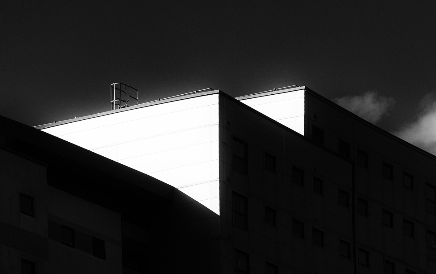
Wandering about Gateshead in February I had already come across this scene which had potential.
Sony A580 ISO200 Minolta 135mm lens 1/1000 f8
Processed in SEP the High Contrast Smooth preset was applied with the contrast raised even further.
Verticals corrected in Affinity Photo 2 using the Mesh Warp tool.
7 comments posted
John I love these types of images, the contrast and geometric shapes make a powerful composition. The bright light illumination one side of the building against the deep shadows creates a dramatic effect.
It's hard to tell from looking at this online but it seems to me that the bright area is blown out a bit? Just wondering if there was a little more texture to those panels. Posted: 12/09/2024 18:00:01
It's hard to tell from looking at this online but it seems to me that the bright area is blown out a bit? Just wondering if there was a little more texture to those panels. Posted: 12/09/2024 18:00:01
Michael, I agree that the contrast could benefit from some adjustment Posted: 12/15/2024 08:45:56
John - took me a while to interpret what you had captured, but having sorted that out it is clear that you have produced a highly graphic and dynamic image. It certainly grabs the eye and the repetition of the triangular shapes works well including the patch of cloud.
There is a hint of detail/texture in the whites which could perhaps be developed further. Well seen!
I feel that the image would be improved by the addition of a stroke to define the image limits.
Happy Holidays! Posted: 12/10/2024 10:17:58
There is a hint of detail/texture in the whites which could perhaps be developed further. Well seen!
I feel that the image would be improved by the addition of a stroke to define the image limits.
Happy Holidays! Posted: 12/10/2024 10:17:58
Peter, a stroke would certainly improve matters. and the contrast could stand some adjustment Posted: 12/15/2024 08:47:19
Hi John: A VERY dramatic image well suited for B&W for sure. I agree with Peter about adding at least a 3 px lite grey or white stroke to help the viewer determine where the black part of the image ends. Nice job. Posted: 12/10/2024 17:46:33
Hi John
Love it high contrast,the shapes the glimpse of light cloud top right adds so much, detail in the shadows lower left its a winner for me. Posted: 12/10/2024 21:04:38
Love it high contrast,the shapes the glimpse of light cloud top right adds so much, detail in the shadows lower left its a winner for me. Posted: 12/10/2024 21:04:38
John-This is my kind of image. I enjoy the stark black and white of the composition. I do feel the white could be reduced a bit in its intensity as the title of the work is shadows. I like the additon of some clouds in the image. I have a habit of removing them. Susan Posted: 12/20/2024 16:14:00
