Ed Ries
About the Image(s)
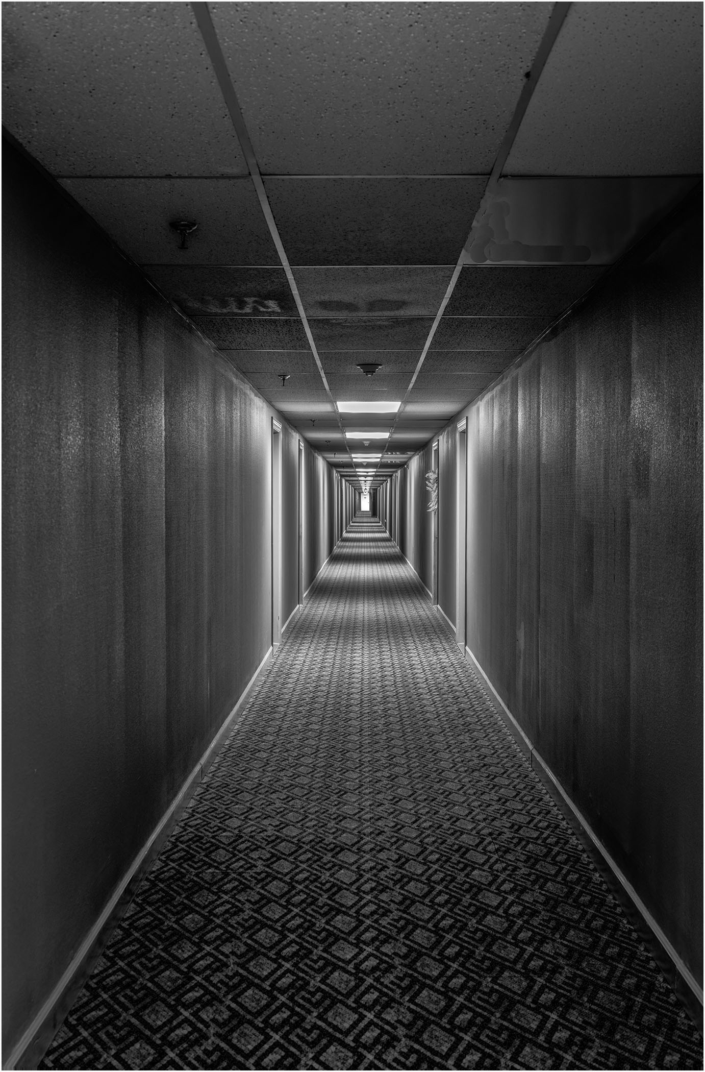
A hallway in a condo I stayed in during July and August in North Carolina. I found the combination of repetition and perspective to be very interesting. It continued to captivate me so I decided to photograph it late one night . Canon EOS R5, 40mm, f11, ISO 400. processed with NIK CEP with some dodging and burning; converted with NIK SEP; added a 3-pixel stroke, sharpened with high pass filter and finished with Topaz DeNoise AI.
6 comments posted
Ed,
I think this photo does an amazing job capturing a long, symmetrical hallway that feels like it goes on forever. I like the stark, almost cold atmosphere, highlighting the repeating patterns on the ceiling, walls, and carpet. The strong lines pull my eyes straight down the center, creating a tunnel effect that feels both inviting and a bit unsettling-like something out of a thriller or surreal movie. The lighting gives it a lonely, monotonous feel, with the doors on each side casting shadows that add texture and rhythm. The symmetry and vanishing point are spot-on, adding to the eerie vibe.
If I could suggest one thing, maybe adding a bit more contrast or highlights could bring out more texture in the carpet and walls for extra detail. Overall, it's a compelling image that uses composition and tone really well to give a sense of endlessness and solitude.
Posted: 11/06/2024 17:06:11
Hi Ed: Talk about a vanishing point - WoW your image gets A + for perspective. To my eye, the different light patterns on both the walls and ceiling really add interest and depth to your image. You nailed it with the point exactly in mid frame. I can't imagine myself walking down this hallway which seems to be never ending. Well seen and nicely processed as well. Posted: 11/06/2024 18:03:04
Ed - an mmazing imagw with such great depth and good symmetry. The lighting in the hallway adds atmosphere to the image and yields detail right to the end. Well processed but the image may have a little bit more to give with a contrast adjustment.
If the image was mine I would be very tempted to add a figure in the higlighted area at the end. Posted: 11/10/2024 11:39:25
If the image was mine I would be very tempted to add a figure in the higlighted area at the end. Posted: 11/10/2024 11:39:25
Hi Ed
If ever an image drew the viewer in its this one,composition absolutely spot on lighting so well handled great pp I can't stop looking at this amazing image. Posted: 11/13/2024 20:56:48
If ever an image drew the viewer in its this one,composition absolutely spot on lighting so well handled great pp I can't stop looking at this amazing image. Posted: 11/13/2024 20:56:48
Ed, what a super image!
You really have captured the feel of long boring corridors.
reminds me of many nights spent in such places when working away from home. Posted: 11/16/2024 07:24:21
You really have captured the feel of long boring corridors.
reminds me of many nights spent in such places when working away from home. Posted: 11/16/2024 07:24:21
Ed,
As others have said, this is a great image with leading line drawing the viewer back into the scene. I might suggest a more definitive transition of contrast going from foreground to background. Micheal made a similar comment. Susan Posted: 11/18/2024 21:17:42
As others have said, this is a great image with leading line drawing the viewer back into the scene. I might suggest a more definitive transition of contrast going from foreground to background. Micheal made a similar comment. Susan Posted: 11/18/2024 21:17:42
