Mike Schmidt

November 2026 - Hampton Inn & Suites - Fargo, ND
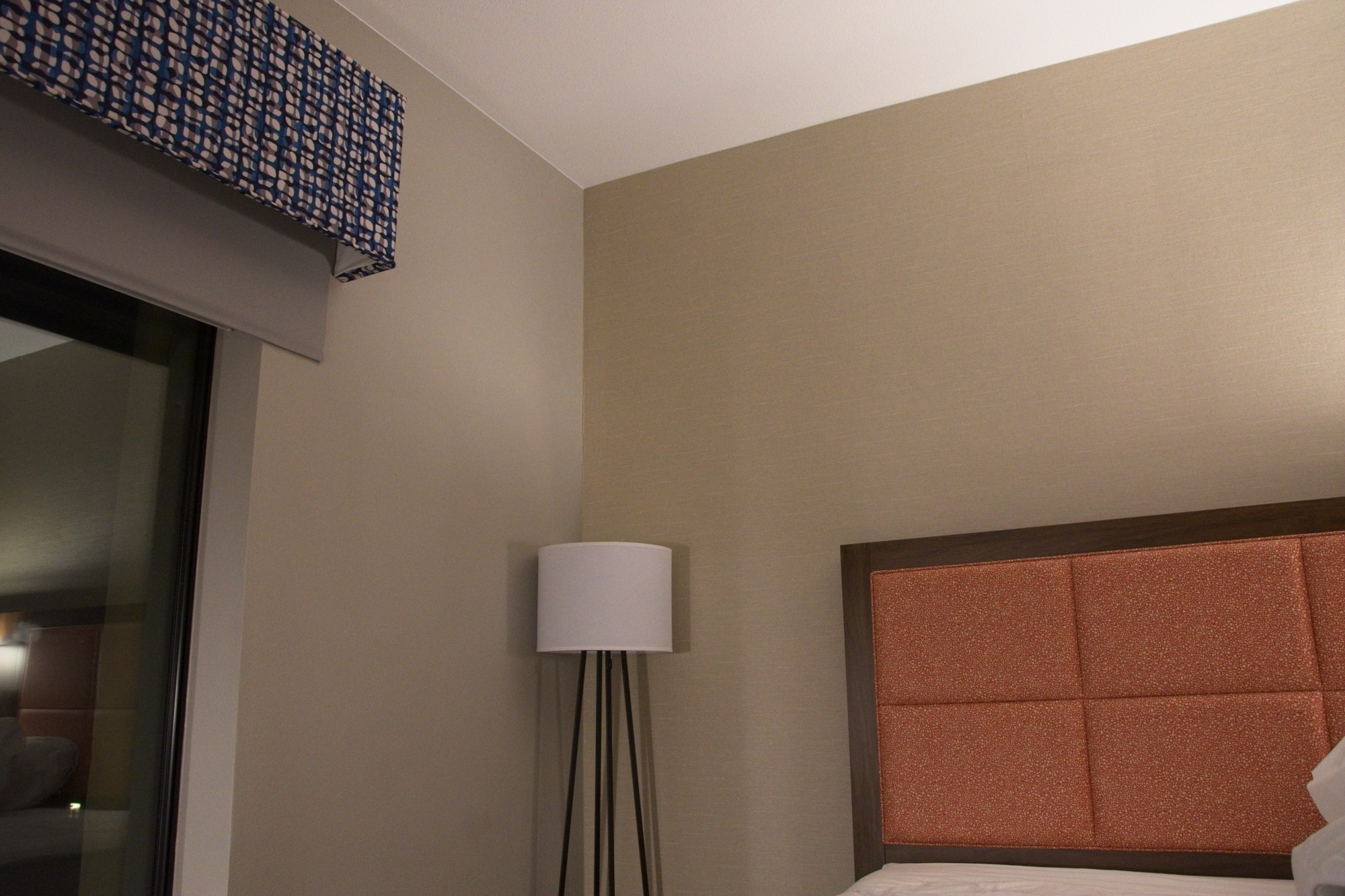
Original
About the Image(s)
Nikon D7200 w/ Nikkor 18-105. Exposure: ISO 3200; f5.6; 1/40; ambient light.
This is my first attempt at a minimalist photo. I was bored in my hotel room and stated looking around. I was drawn to the lines, large negative space, and the small areas of color in this corner of the room.
Only editing was cropping. I feel like it could be improved by making the colors more vibrant, but this was really an exercise in composition. And I still have a lot to learn about editing! (I use ON1)
13 comments posted
I think the biggest suggestion I would make is to adjust the white balance, it looks a little yellow. Usually, if your shooting indoors like this there is a camera setting for wb called tungsten or you can adjust the temperature to match the light source, and then you can make further refinements in post. Posted: 11/02/2026 14:24:54
Thank you, Mark. The colors actually came out fairly true to life. I can say so because I am currently in a different town, in the same hotel chain, looking at the same shot! (I travel a lot for work)
That said, I appreciate your comment about WB. I will definitely experiment with this setting more. Especially since I find myself drawn to interior shots more than I thought I would be when I first got into photography. Posted: 11/05/2026 04:01:58
That said, I appreciate your comment about WB. I will definitely experiment with this setting more. Especially since I find myself drawn to interior shots more than I thought I would be when I first got into photography. Posted: 11/05/2026 04:01:58
(Group 51)
Just jumping in from Group 51 to comment. I stopped to look at your image because I like to shoot this sort of thing. I am wondering if you have seen the images from Charlz Photo on Instagram or YouTube. You might have a look and see if his work is interesting to you. Just a thought.
Posted: 11/03/2026 18:39:57
Posted: 11/03/2026 18:39:57
I'm pleasantly surprised that it caught someone's eye outside our group. Thank you for commenting. And thanks for the recommendation. I took a quick took at his YouTube and I am very intrigued. I will be watching more. Thanks! Posted: 11/05/2026 04:08:50
First of all, you should delete all subject on the left and right, then you should crop it. See my suggestion Posted: 11/04/2026 20:12:55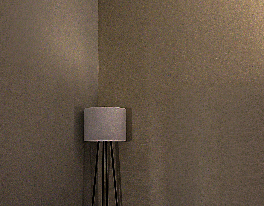
I appreciate your suggestion. However, I disagree. The areas of color from the valance and headboard make the composition for me.
And call me old fashioned but I didn't get into photography to use computer software to completely remove major elements from a photo. If I didn't want them there, I wouldn't have taken the picture.
De gustibus non est disputandum Posted: 11/05/2026 04:16:22
And call me old fashioned but I didn't get into photography to use computer software to completely remove major elements from a photo. If I didn't want them there, I wouldn't have taken the picture.
De gustibus non est disputandum Posted: 11/05/2026 04:16:22
Mike, Welcome to group 30! I chuckled when I saw your image because it is good to know I am not the only one who photographs "ordinary things" like hotel rooms! I enjoy the simplicity of the subject but wish the three elements (bed, lamp, Valence) were closer together to give more continuity of subject. I tried a couple of things: bw, cropping in, radial gradient over the lamp to visually connect the three elements. Just one idea to try to unify the subject. Posted: 11/04/2026 23:55:49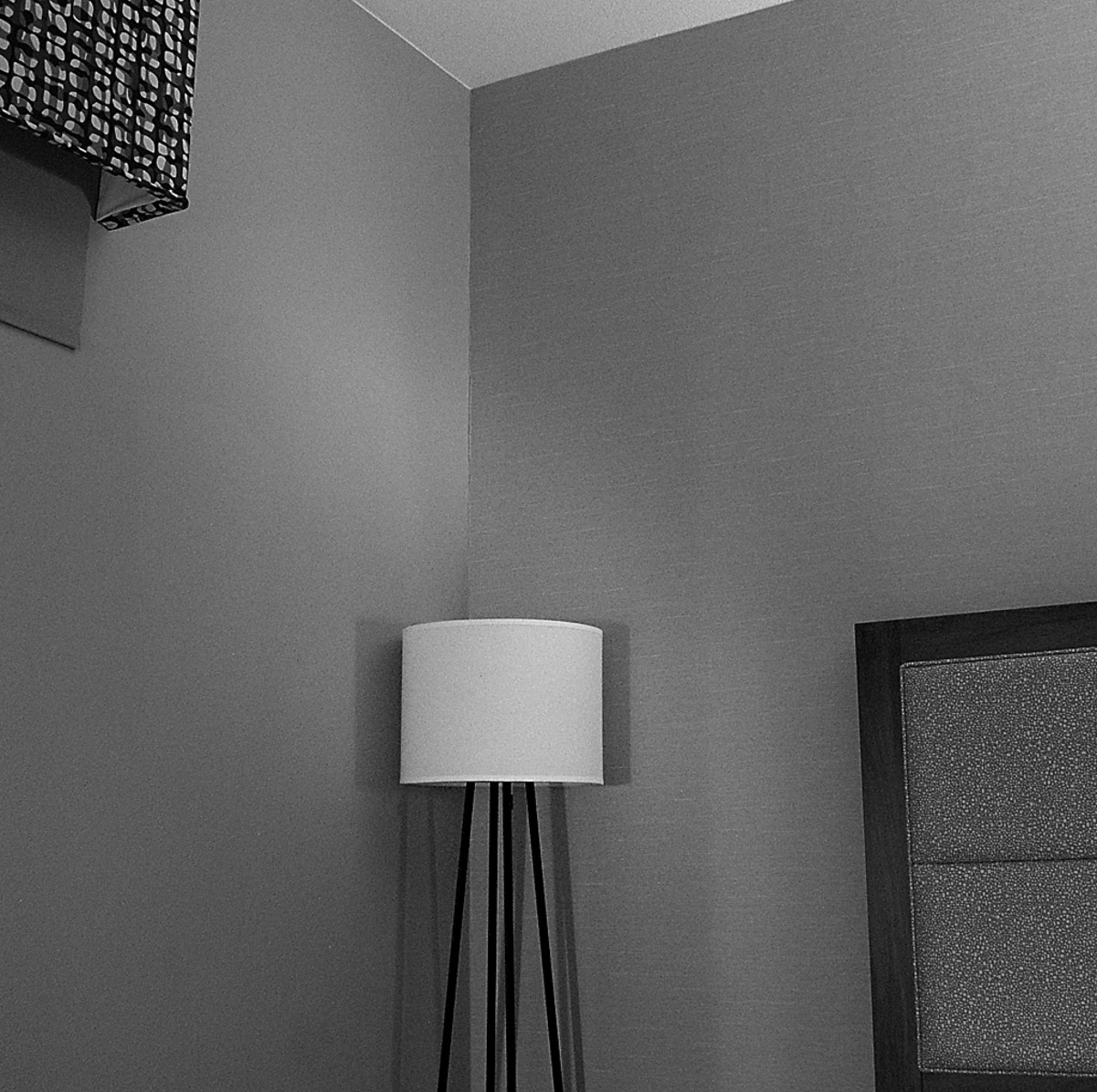
A fellow traveler, so to speak. haha! Thanks for the edit suggestions.
My initial reaction was "Nope. Not b&w." But the more I look at your edit, the more I like it. I need to learn my editing software more and play around more and even, yes, try b&w! Thanks for showing me an option I hadn't even considered. Posted: 11/05/2026 04:21:05
My initial reaction was "Nope. Not b&w." But the more I look at your edit, the more I like it. I need to learn my editing software more and play around more and even, yes, try b&w! Thanks for showing me an option I hadn't even considered. Posted: 11/05/2026 04:21:05
It never hurts to consider different versions. You may not like what you see, but then again.... I would definitely encourage you to explore what your software can do. It does open up some "creative juices" sometimes. Posted: 11/06/2026 03:29:34
Comparing the color and the B&W versions, it seems like the B&W looks better. Posted: 11/09/2026 10:08:06
Thanks Walter. The more I look at Dorinda's B&W version, the more I like it. I'm on the fence. Posted: 11/17/2026 02:44:17
I like both the color version and Dorinda's black & white version. I like that this photo reminds me to look at the ordinary to create something creative. One tiny nitpick is the headboard is cropped at an angle and I would like the rectangles straight as in Dorinda's crop. Posted: 11/15/2026 16:26:27
Thanks Ellen. The colors are a large reason I took it, so I guess I'm going to stick with the color version being my favorite. haha
I agree with you on the headboard; I also prefer Dorinda's crop on the right side. All the straight lines surrounding the cylindrical lamp shade were the other reason I took it, and I struggled deciding which lines to leave and which to crop. Posted: 11/17/2026 02:50:36
I agree with you on the headboard; I also prefer Dorinda's crop on the right side. All the straight lines surrounding the cylindrical lamp shade were the other reason I took it, and I struggled deciding which lines to leave and which to crop. Posted: 11/17/2026 02:50:36