Anges van der Logt, PPSA
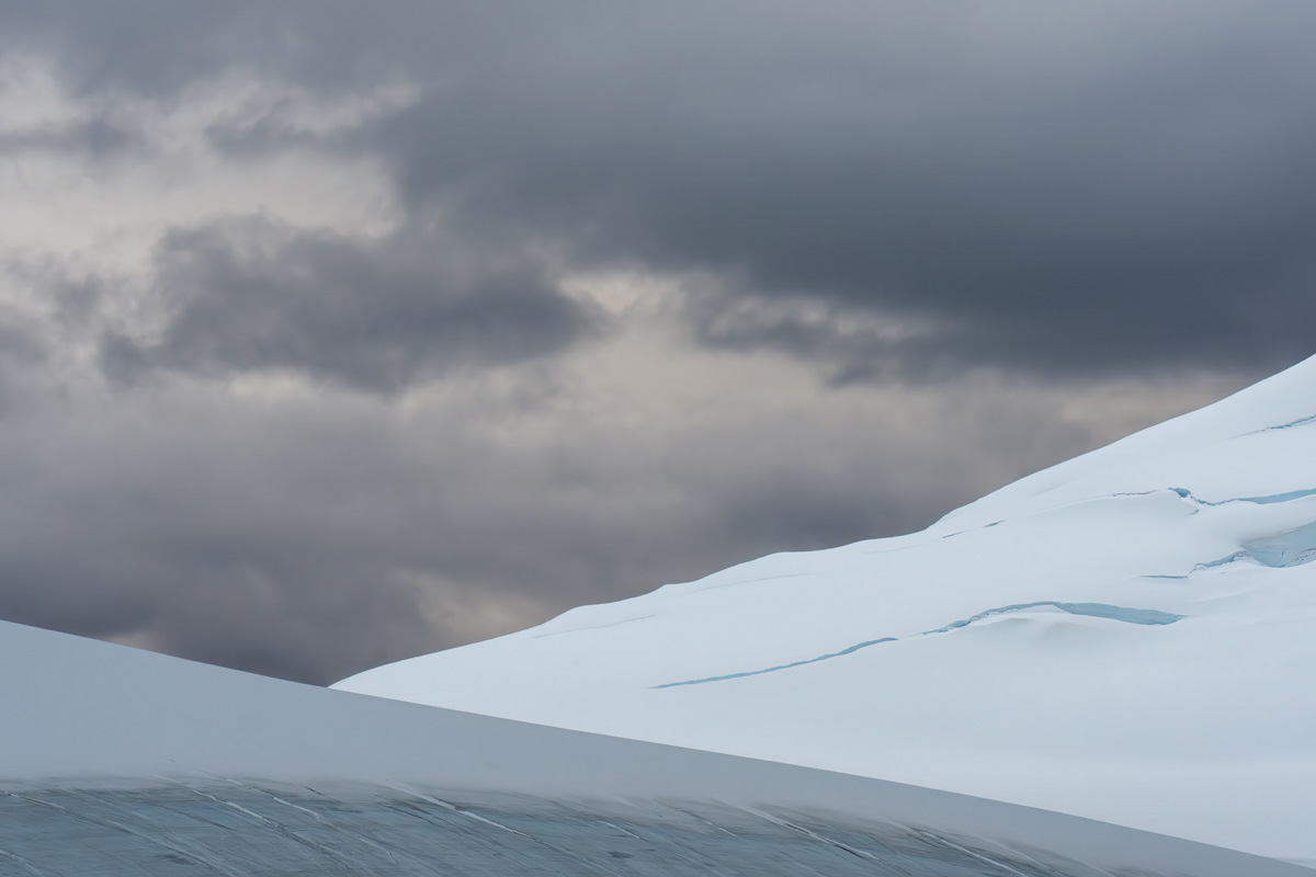
July 2024 - Abstract Landscape in Antarctica
About the Image(s)
Again from my trip to Antarctica last March. Not a wildlife pic now, but a more abstract one. The cropping is a bit of a trial and error here. Did not want to cut out too much sky as I like the dark clouds as contrast with the white snowy mountains. Not sure about BW either, as I like the little blue in the snow.. ;)
This round’s discussion is now closed!
10 comments posted
I think I would prefer it as a B&W. You can add more contrast for such without worrying about color shifts, plus there is only blue in the image anyway. See what you think. Posted: 07/09/2024 20:05:22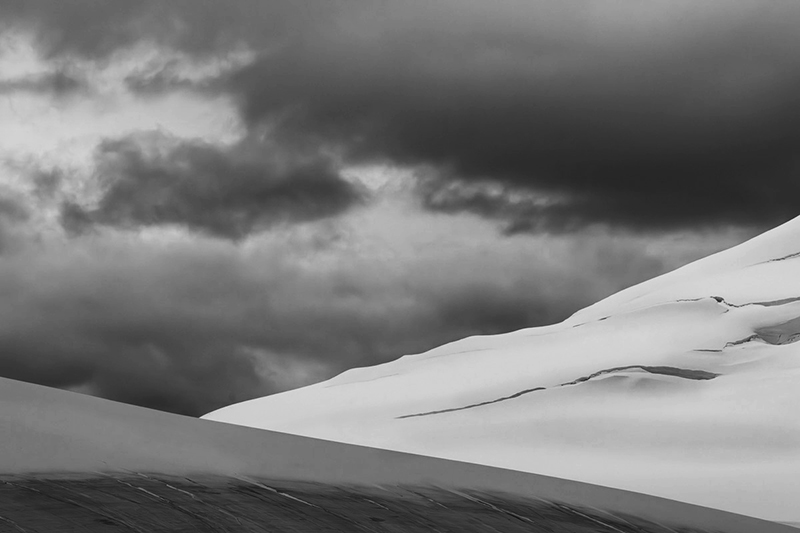
Thanks Bob. I do like your edit. Will look at it again. Posted: 07/21/2024 10:04:29
Hi Agnes, I am with you about the blue tones that I think strengthen the impression of ice and snow. My eye takes first in the strong geometric forms in the composition, against the sky with the soft organic forms of the clouds, and the contrast between the cold tones in the foreground and the warmer tones in the sky, and then starts to admire the shadows and the subtle texture in the snow. Posted: 07/11/2024 15:02:19
Thanks for your review. Glad you like it. Posted: 07/21/2024 10:05:07
It is a photo where the shapes make the picture. I like it as it is, but as an abstract I would go with Bob's suggestion and convert it to B&W, where the shapes become more powerful and one can appreciate more details. Posted: 07/12/2024 02:35:16
I do like the BW too. So probably keep them both. Posted: 07/21/2024 10:05:49
I'm on the side of those voting for b&w! I find the bluish ice on the right confusing. The tones in Bob's version is far more appealing to me. Posted: 07/15/2024 20:49:00
Thanks. I do like the Bw too after all Posted: 07/21/2024 10:06:20
Hi Agnes, given the muted colors in the original image, I totally agree that converting it to monochromatic is better, though you prefers color as you have said before. Then there are 2 triangles and the sky, it looks simple but this is the wild antarctica. Posted: 07/21/2024 08:24:44
Thanks Tony for your review.. I will keep them both ;) Posted: 07/21/2024 10:07:25