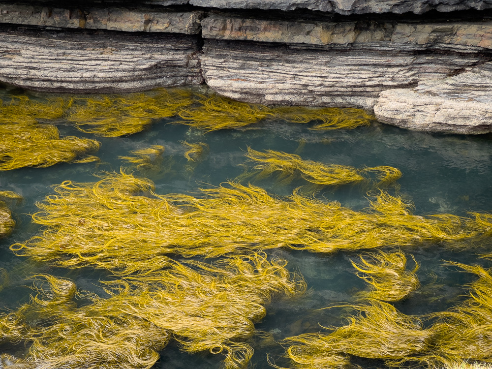
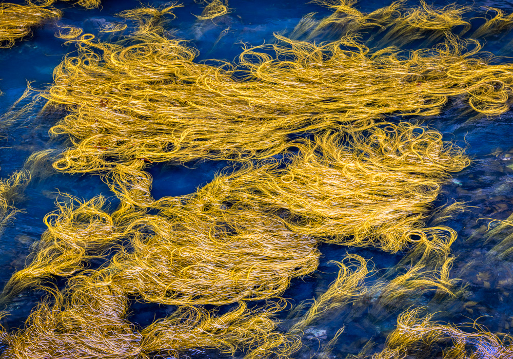
This is from my recent trip to Ireland. In this coastal area, the seaweed in this pool was golden, unlike any seaweed I had seen previously. The picture above gives context to what it is by the rock wall. The only adjustments I did to this iPhone raw image was darken the top of the rock wall from the near white at the bottom. The ââ¬Å“originalâ⬠image is another version taken with my Canon R5 at another point where the water was a deep blue and there was no surrounding walls. I did some clarity, vibrance, and a few other adjustments. This view is more abstract in quality.I would like everyone’s opinion of which version they prefer. I like the second version due to the abstract nature and the impact, but I am not sure if I am better sticking with the ââ¬Å“saferâ⬠view.
This round’s discussion is now closed! 6 comments posted
Terry Palmer
This caught my eye immediately. It is an unique and interesting image. I prefer the image with the rock. The deep blue of the "original" seems too deep for my taste. Posted: 07/09/2024 18:39:54
Kirsti Näntö-Salonen
Hi Bob, I like both versions, but would vote for the more abstract one. I think that it looks like a flock of mermaids with their hair floating on the surface. I love the bold wild quality of the swirling forms and the color contrast. Maybe you could adjust the vibrance of the blue down a tiny bit? Posted: 07/10/2024 07:07:53
Jose Cartas
I find the "original" image more abstract. It makes me think more about what it is (mermaids' hair, spaghettis?), and to focus my attention on the ed shapes. I don't mind the deep blue of the water and wouldn't change it. The other image gives more clues of what we are looking at, and it presents a nice contrast between the hard rocks and the soft weeds. But I prefer the abstract one. Posted: 07/12/2024 02:30:06
Anges van der Logt
I like the edited version better, as it has a clue of what it is.. and provides a nice contrast between the rocks and the soft weeds. For me the original version is too saturated (especially the blue of the water). Posted: 07/15/2024 08:11:57
Mervyn Hurwitz
I also prefer the blue version without the rocks. It has a sense of mystery about it. It also expresses flow and movement towards the left. The blue and gold are complimentary and adds to the mystique. Posted: 07/15/2024 20:32:02
Tony Au Yeong
Both versions look appealing, though I like the original image which appears more surreal. The golden seaweeds contrast lovely with the blue water. The curves of the seaweeds are interesting and attractive. Posted: 07/21/2024 06:55:55