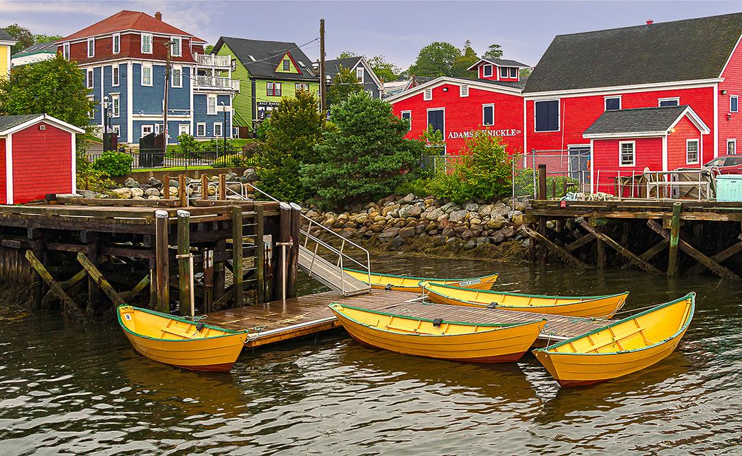
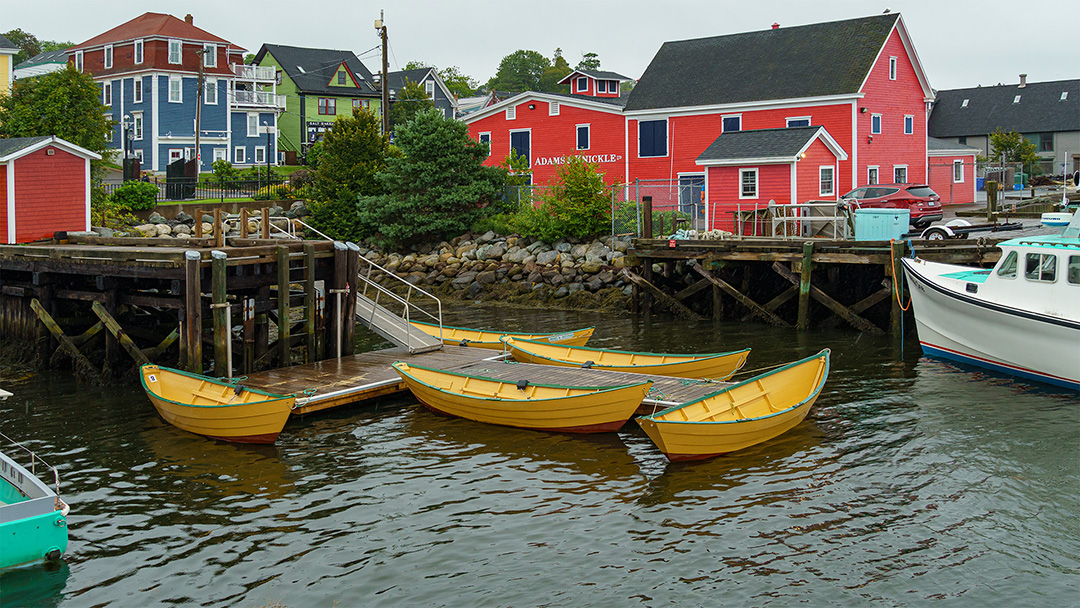
We recently spent a week in eastern maritime Canada. Since we were on a non-photographic tour, we took smaller cameras with us, Sony NEX-7 for my wife, and @6400 for me. Aside from being small, they both use the same lenses so that everything fit in one carry on. Because of the tour scheduling, bus rides, etc, we rarely are at locations with really good light, but take what we get. This image from Lunenberg, NS was an attempt to capture the feel of a small costal Canadian village on what was a gray misty day.. Sony @6400, Sony 18-135 f/3.5-5.6, ISO 400, f/7.1, 1/250, 18 mm (24 mm equivalent). Skew to straighten verticals, cropped the image, Content aware fill to remove boat lower left, and top of power pole, replaced the sky with an image from the trip a day or two later, adjusted the mid-tone contrast with a Luminosity mask, adjusted the highlights color balance (+ Red, - Yellow), sharpened with High Pass filter. I may try to eliminate the car center right since it fixes this image in time.
This round’s discussion is now closed! 6 comments posted
Kirsti Näntö-Salonen
Hi Terry, what a charming village! The bright yellow boats make a fine center element, and I think that the removal of the distracting objects brings them out so well. Personally, I think that I might prefer the more muted colors of the original that carry more of the feeling of the misty day on the coast. Posted: 09/04/2023 14:26:42
Bob Benson
I agree with Kirsti in that I think the colors, especially red, are a little too saturated for my preference. I believe some more vibrance would work well, but it can be a fine line from there to colors that seem too bright. Increasing contrast for more "pop" works for me, but unless you set whatever filter you used for that to luminosity blending mode, it also increases saturation. I like the composition, and the removal of the boat really helped. Very nice image. Posted: 09/04/2023 14:36:59
Mervyn Hurwitz
I visited this area of Canada about 4 years ago and was also drawn to these colorful fishing villages.
I like the way you have saturated the colors as it makes the image "pop". And it highlights the small fishing shacks on the dock which one sees all over Nova Scotia. Well done on removing the 2 extra boats. Posted: 09/07/2023 14:39:28
Tony Au Yeong
I was attracted by the beautiful colors of the image. The yellow colored bannana shaped boats, the red, blue and green colored houses at the background complimented well. The magenta tinged sky works well. A successful image of your trip. Posted: 09/07/2023 23:22:44
Anges van der Logt
This is a beautiful image! But I do agree with Bob that maybe the reds are a bit too saturated, although a bit more vibrance in compare to the original image I do like. Also removing the boat on the left helped a lot. Posted: 09/11/2023 23:01:44
Jose Cartas
I was almost on the same spot, but more than 25 years ago and shooting slides, so no chances of post-processing! I like the final composition, with the contrast between the red buildings and the yellow boats. It conveys very well the atmosphere of this beautiful town. The post-processing doesn't show in the final image, and everything looks very sharp. I didn't notice the car, since its red on red. Posted: 09/19/2023 17:12:27