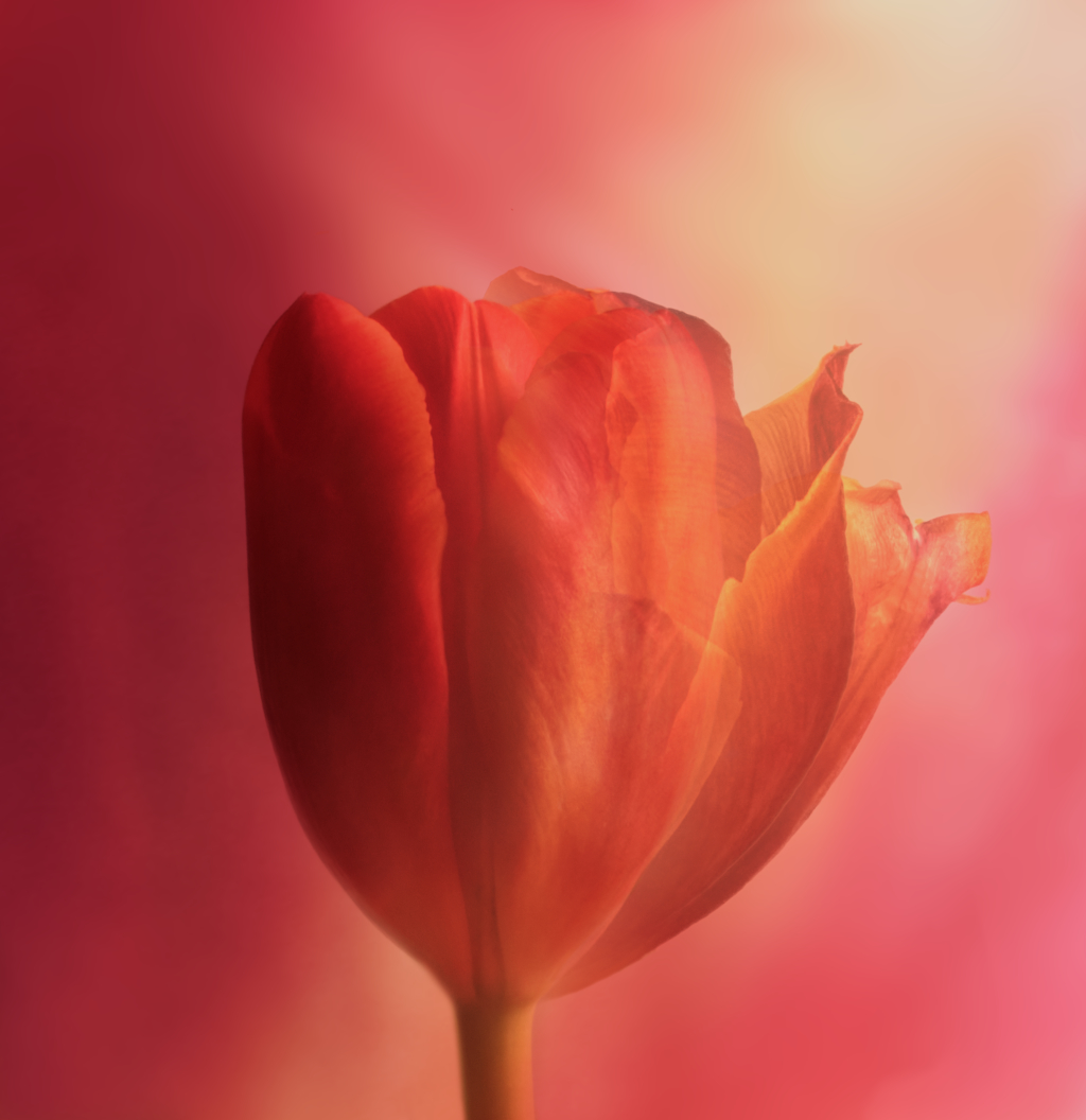
For our photo club?s April theme ”Change”, I planned sort of a time lapse project with tulips. The idea was to take a picture of the same flower once a day for a week, with the camera kept on tripod, the same lighting and settings, and then stack the images using different opacities and erase unnecessary parts of the layers, to show all the phases in one image. I placed a vase with the tulip on the table by the window against a white background. Fuji X-T4, 30 mm, f/13, ISO 400, shutter speed on auto, manual focusing. Unfortunately, the setup got disturbed during the process, and I even had to replace the flower. I started with, - As the original plan was off, I just cut the flowers off the background in Affinity Photo and started to see what I could do instead. The new idea was to keep one half of the youngest flower constant and try to show the changes in the other half. I used three of the flowers for the layers. The background is a Fill layer with the color picked from the flowers, and on top of everything is a layer of an enlarged petal with Gaussian blur in Multiple blend mode that I think did wonders for the colors. I quite like the soft watercolor feel it gave of the image. - This is just a draft from the rescue attempt, but I would love to hear what you think. Is the idea worth further work, and has anybody tried to do something similar?
13 comments posted
Bev Caine
(Groups 24 & 48)
I think I'm going to sneak in when no one ia looking and steal it. It's beyons bautiful Posted: 04/07/2026 20:41:20
Kirsti Näntö-Salonen
Thank you so much, Bev! Your lovely comment made my day! Posted: 04/09/2026 12:49:11
Jose Cartas
Although, to me, the photo doesn't say "the lives of a tulip;" I find that you produced a lovely image. Everything works well in this subtle composition. Looking carefully, I see that the right petals are older than the left one, but not too much and they complement it. Your work with the background was flawless. I've never done something like that, but it's a very interesting idea. Posted: 04/10/2026 13:41:54
Kirsti Näntö-Salonen
Thank you, Jose! I know - one of the many problems in the project was that my tulips did not flare open but just dried up and started to drop their petals, so the the range of changes remained rather limited. I think I'll try to repeat the process some day with another brand of tulips and hopefully better luck. Posted: 04/10/2026 19:33:27
Terry Palmer
I agree with Jose. Only looking closely do I see the overlapping petals, and they all look relatively alive. I would probably have tried to include some of the later images even flipping them to keep the new on the left old on the right. Very nice job on the background. I've taken a couple of classes with Jackie Kramer but have not gotten very good at backgrounds, textures, etc. Take a look at her site if you have a minute. https://www.jackiekramerfineart.com/Posted: 04/10/2026 15:22:06
Kirsti Näntö-Salonen
Hi Terry, as I explained to Jose, I blame the tulips! I tried to use the oldest one like you suggested but I could not fit it in very well, and the result had a rather lopsided look. - Thank you very much for the tip! I took a quick look already: absolutely lovely images. Posted: 04/10/2026 19:41:40
Mark Grech
I do agree with the above-mentioned comments. The soft background does compliment the image but I think a more contrast background would separate the subject. Posted: 04/11/2026 23:35:07
Kirsti Näntö-Salonen
Thank you, Mark, you are right about the contrast, but I think the softer approach fits the mood I was after. I'll try that with the next attempt! Posted: 04/13/2026 05:45:20
George Tyler
You capture a picture as an old Renaissance painter. The background is soft and wonderful. My eye keeps going to the brightest part - upper right. If the eye comes from left, it leaves the picture, and you don't get to enjoy it as much. Maybe darken the bright white spot and upper left. Or flip the image. Just a beautiful red tulip, not the lives of one. Posted: 04/14/2026 23:47:26
Kirsti Näntö-Salonen
Thank you, George! What a lovely thing to say! - You are right about the brightness! I actually flipped the image with the idea that the flower might seem to open towards light while the half in shadow remains the same. I'll try to darken the right upper corner and see how it looks - maybe a slight vignette? Posted: 04/15/2026 04:51:30
Bob Benson
I like this. Obviously you could make it more contrasty, but you were going for a soft approach. I think a slight vignette in the right corner will suffice. Posted: 04/15/2026 20:22:34
To me the combination is an interesting idea. The color and tonality of the backdrop is nice. My only suggestion is whether you like to retain the color of the stem, that is, change it back to green. Posted: 04/18/2026 16:28:12