Tony Au Yeong, MPSA
April 2026 - Pedestrian Bridge
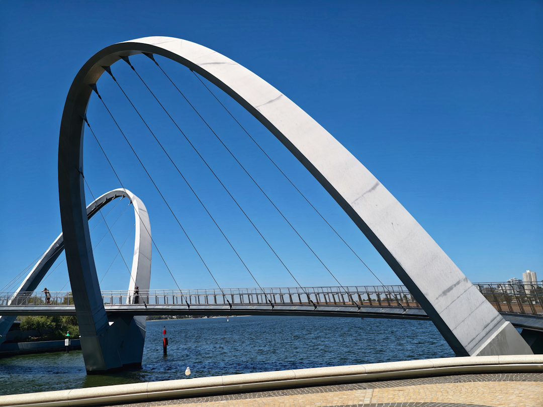
About the Image(s)
This was taken in Feb.,this year when I visited Perth. The loops built as suspension for the bridge look appealing and so I walked around to see this viewpoint and pressed the shutter. There is some minor post processing by PS.
6 comments posted
I like the composition a lot, with two strong geometric elements replicating each other and producing scale and depth of field. I have two suggestions. First, to correct the distorted perspective in the buildings on the right (just the buildings, not the arches). Second, to clone out the person on the bridge below the second arch. Not so sure about the red buoy, which might also be erased. Posted: 04/10/2026 13:38:46
Very interesting image. Nice movement and it draws me in. I agree with Jose. Also, It looks like you've done some sky adjustment that at this resolutions seems to create banding between the support wires. This is particularly evident in the section where there are six (?) sections within the area where the two arches overlap on the left side of the image Posted: 04/10/2026 13:57:44
Hi Tony, I think that the image shows the "WOW architecture" of the bridge in all its glory, filling the frame, against the bright blue sky, in a balanced composition. I agree with Jose and Terry about the perspective of the houses. I think that it would also make a fine B&W image, maybe further emphasizing the graphic elements? Posted: 04/11/2026 04:49:00
Well seen that indeed. I find the image uncomplicated but the viewing angle says it all. I wouldnt change anything. Posted: 04/11/2026 23:37:14
Wonderful arches. My eyes seem to look more at the bottom due to the white arch and the red buoy. Maybe darken the bottom portion. I like Kristi's idea of a B&W. Posted: 04/14/2026 23:22:54
I like this, and think it would make an excellent B&W. I wonder if the person at the bottom should be removed, especially since that person is so bright. Posted: 04/15/2026 20:49:31