Bob Benson, FPSA, EPSA
About the Image(s)
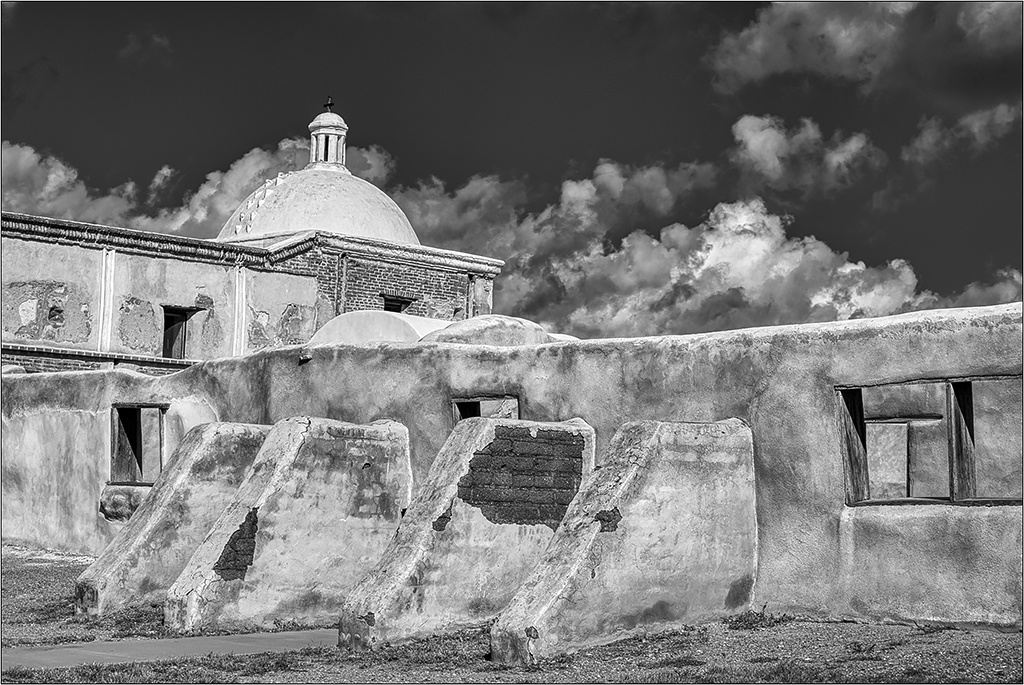
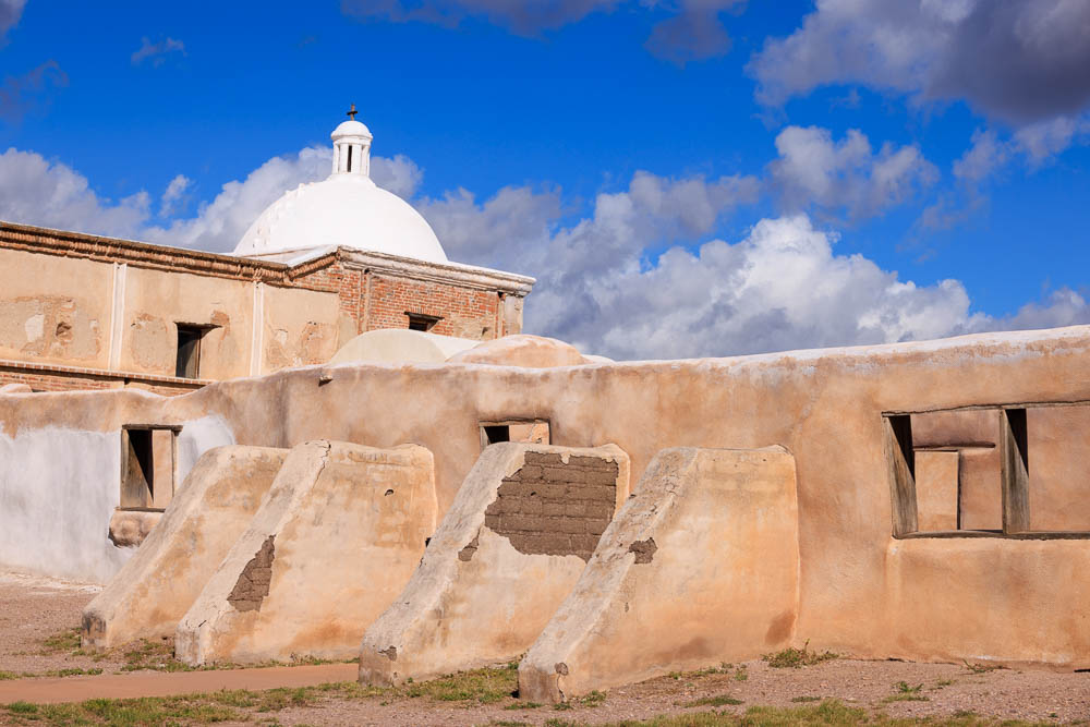
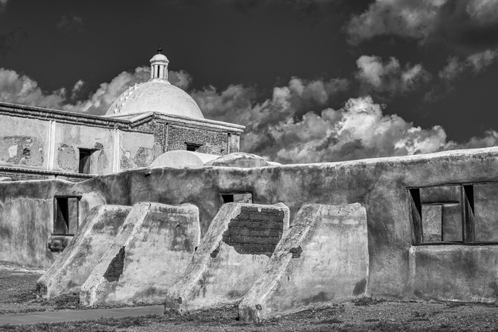
At last year’s PSA Photo Festival, I made a trip to the nearby Tumacacori Mission. The inside is not so interesting, but the outside has many viewpoints. I liked this one, but was not excited about it as a color. In LR, when converting to B&W, I darkened the blue for the sky, and moved the orange and yellow sliders to get more separation. I also increased the contrast and added texture, and reduced highlights.
6 comments posted
You are right that the structure contains very interesting elements. However, even with your post-processing, I don't find enough separation between them in the B&W version. Except for the dome, I don't think that there are other elements that attract the viewer's eye. Since you already have the complementary colors blue and orange/brown, have you tried to heavily pop-up the earth tones of the construction against the sky? Posted: 05/05/2025 22:25:10
Much better. Posted: 05/06/2025 21:51:33
Hi Bob! I like the color version very much, with the warm mellow tones of the walls against the bright blue sky with those dramatic clouds, and the palpable sense of history of the place. I think that I might be tempted to slightly reduce the contrast in the B&W version, and increase the brightness of the buildings a bit to keep that original mood. Posted: 05/06/2025 16:13:14
I agreed with Jose, the original was a little flat. Your re-edit is much better. I like the color version as well. Looks like you could get the detail back in the dome also. I feel that the left side leans in a bit at the top. I'd probably play with the skew and see how that looked.
Posted: 05/09/2025 00:45:27
Posted: 05/09/2025 00:45:27
I also prefer the color version. The tones of the b&w version are too similar although your second version is much better.
Good composition and story telling. Posted: 05/10/2025 10:04:12
Good composition and story telling. Posted: 05/10/2025 10:04:12


