Bob Benson, FPSA, EPSA  


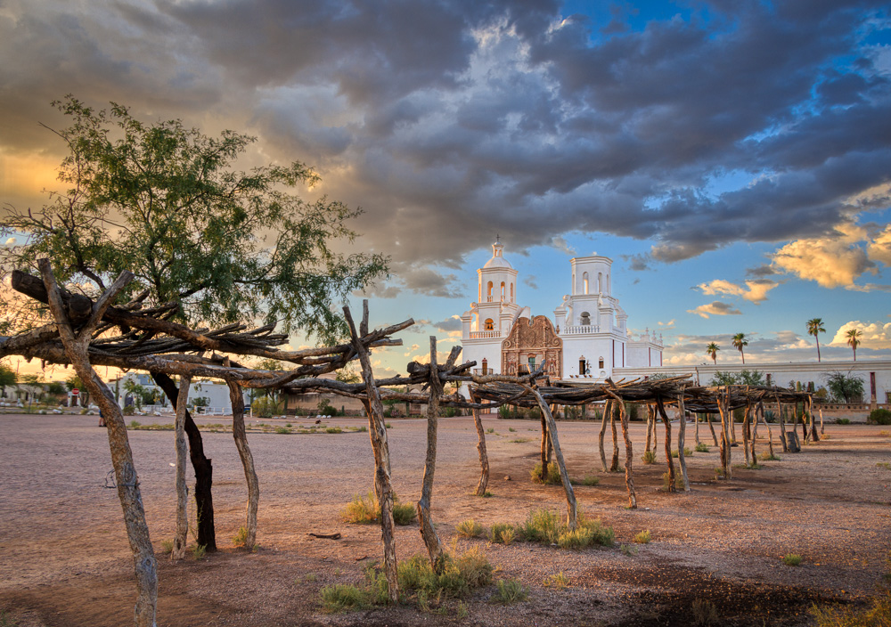
Open Air Market Area at the Mission by Bob Benson, FPSA, EPSA

November 2024 - Open Air Market Area at the Mission

November 2024 - Bob Benson, FPSA, EPSA

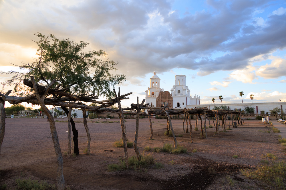
Original

About the Image(s)

When I was at the PSA Photo Festival in Tucson, I went with some friends to the San Xavier del Mac Mission in late afternoon the first day we were there. We had perfect lighting and ever changing clouds right after a storm, so we were all happy. Besides the more usual traditional front images (and even a reflection!), I wanted to see if I could find a different view. The Navaho open market had closed, but I sort of like the diagonal lines created, and made the image. In LR, I made the sky more dramatic by using the sky masking tool, selected the subject (the mission) and brightened it separately from the foreground, along with darkening the bottom corner and top. The original is a one stop over exposed version.


4 comments posted


Terry Palmer   Terry Palmer
This image captures the feeling of the late afternoon. Although the trees somewhat obscure the Mission, they are well placed and lead you to the building. This captures the impression of the location without being a been there, saw that image. I might try to darken the buildings to the left to keep the viewers eye away from them. Well done.   Posted: 11/07/2024 19:47:52


Kirsti Näntö-Salonen   Kirsti Näntö-Salonen
Hi Bob, what a lighting! I think that your search for an unconventional view of the place really paid off, both composition-wise, and by telling a story of a meeting point of two cultures. I love the way the luminous mission building in the background seems to quietly rule the square as it has done for centuries. - I wonder if applying a tiny bit of dodging to the bottom part of the building would show the roof structures at the end of the row more clearly?   Posted: 11/09/2024 08:19:36
Comment Image


Jose Cartas   Jose Cartas
A different view of an often photographed subject. It works. I like how the structure of the market frames the mission, and how it leads the viewer to the main subject. The tree in the foreground is an important element to anchor the image. I like your treatment of the sky and the mission, which renders very natural colors.   Posted: 11/09/2024 23:44:59


Mervyn Hurwitz   Mervyn Hurwitz
While I agree with the previous comments, I find that the Mission building is "lost" and took me a while to differentiate. I would prefer to see the sky a little darker behind the mission and the white building a little lighter adding better contrast in this area.
The colors in the sky and lighting overall is wonderful.   Posted: 11/10/2024 17:56:41


Please log in to post a comment