RH Samarakone
September 2023 - Still Life 2
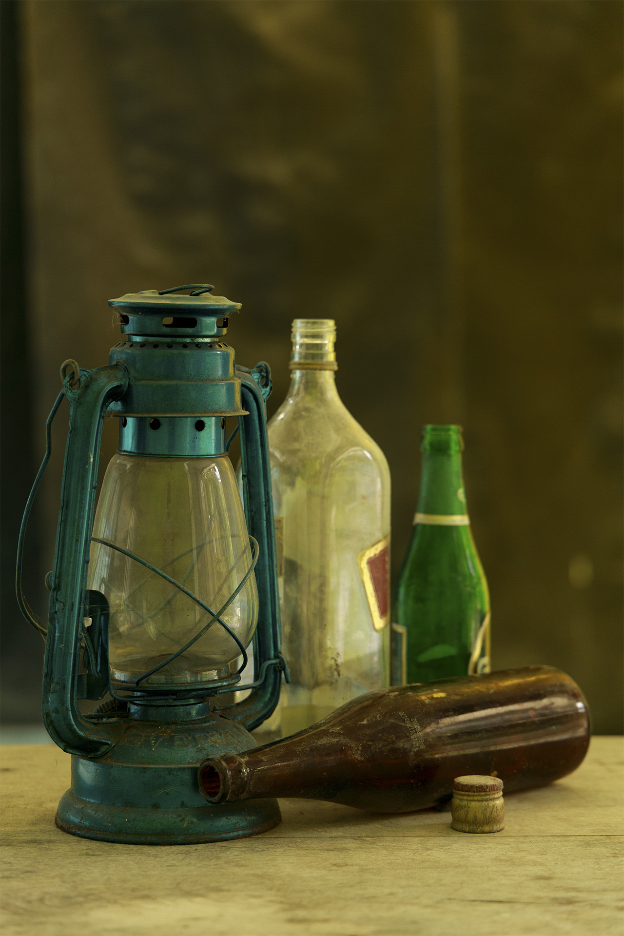
Original
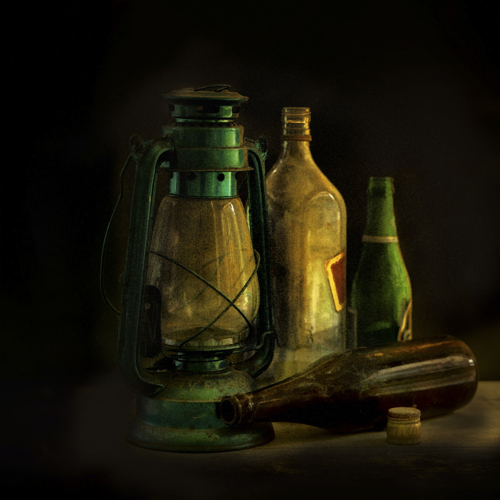
About the Image(s)
This is one of a series of images I did recently. The intent was to create an image with an old master's painterly look.
The original was a straight forward capture of some old empty bottles and a lamp placed on a wooden table. Lighting was from the two sides, being diffused sunlight coming through the doorway to the right, and windows to the left.
In post processing, I have done a fair bit of dodging and burning, color enhancements, darkened the background, and added some noise to get the "feel" that I was looking for.
This round’s discussion is now closed!
8 comments posted
The kind of look I try to get with some of my still life but, as yet, not too successful!!
The lighting is great. The composition works very well and the post processing has made it into a really pleasing image. The noise gives the feeling that the bottles need a good dust!! It was a good idea not to show the full labels on the bottles as I feel that may have been distracting.
Well done. Posted: 09/08/2023 05:48:22
Thanks Angela! Posted: 09/08/2023 21:48:53
(Groups 18 & 29)
Hi Sam, terrific still life image. I can feel your passion by the light, so that is successful. I might consider using the oil paint filter in PS rather than noise to get a better painterly effect. Great work. Posted: 09/13/2023 11:30:43
Thanks Bob! Posted: 09/13/2023 21:06:03
Sam,
Thank you for sharing. Your innate sense of design has popped up to tell us that there was one enjoyable party at that location. My first thought on seeing your image, was please invite me to the next party. You did a great job in dealing with a difficult background. If the subjects were tack sharp, you would have lost the painterly look. I have just two suggestions: put a bit less shadow at the right bottom; and a thin guideline around the image so it's easy to see the dark image against a dark background. Posted: 09/17/2023 13:45:36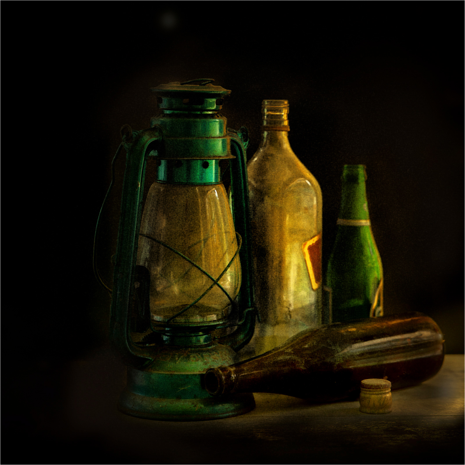
Thank you for sharing. Your innate sense of design has popped up to tell us that there was one enjoyable party at that location. My first thought on seeing your image, was please invite me to the next party. You did a great job in dealing with a difficult background. If the subjects were tack sharp, you would have lost the painterly look. I have just two suggestions: put a bit less shadow at the right bottom; and a thin guideline around the image so it's easy to see the dark image against a dark background. Posted: 09/17/2023 13:45:36
Thanks Peter...you are most welcome to join us, any time.
Thanks for the suggestions too. I have this kind of dislike for borders on my images, but agree with you that when the image is viewed on a dark background it mergers with the background. Shall remember this. Thanks again! Posted: 09/17/2023 22:52:13
Thanks for the suggestions too. I have this kind of dislike for borders on my images, but agree with you that when the image is viewed on a dark background it mergers with the background. Shall remember this. Thanks again! Posted: 09/17/2023 22:52:13
Glad that someone suggested you add a thin white border... I love borders, especially when the image has a very dark background. Be careful though that the border doesn't over-power the image. Posted: 09/18/2023 15:53:09
Thanks Shirley...point well taken. Posted: 09/19/2023 06:07:53