Sylvia Williams
About the Image(s)
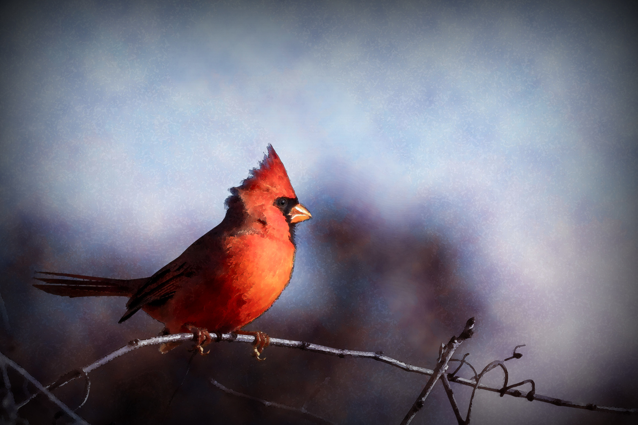
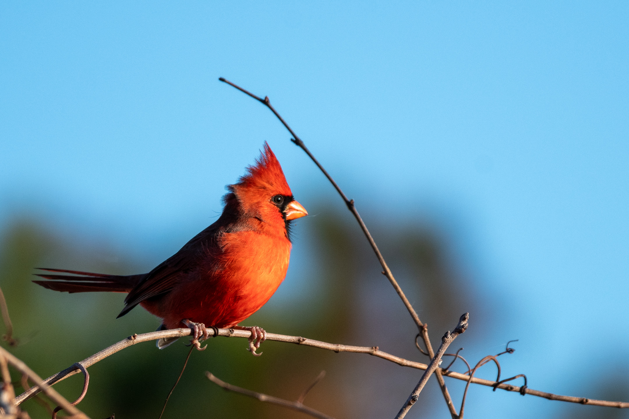
This month I attempted to give this cardinal a watercolor painting look.
Basically,
I started with duplicating the original and adding Filter Gallery ??“ Artistic ??“ Watercolor (layer two)
The next layer I added a black outline: Duplicate previous layer then go to Filter ??“ Stylize ??“ Find Edges, then took the Saturation all the way down. I changed the blend mode to either darken or multiply.
I added a layer on top of layer two and chose two colors from the bird to use as my foreground and background colors, then Filter ??“ Render ??“ Clouds, then filter blur - Gaussian blur (red layer)
I added a layer on top of layer two and chose two blues my foreground and background colors, then Filter ??“ Render ??“ Clouds, then filter blur - Gaussian blur (blue layer)
I then added a mask to both color color layers and took a watercolor brush to each layer until I liked it.
Then I went to lightroom and added a radial gradient over his face then a bit of a vignette to the whole photo.

