Renee Whitley
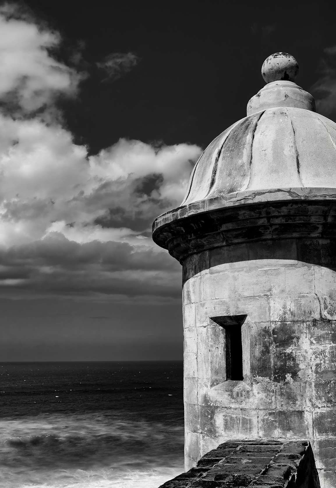
July 2025 - San Cristobal Fort
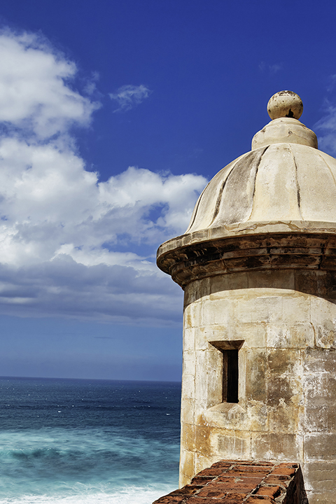
Original
About the Image(s)
This image was taken in April during a visit to San Juan, Puerto Rico. I took a walking tour of San Cristobal Fort and this is one of the iconic scenes from the fort. While I really like the color version because of the beautiful turquoise water (the attached original hasn’t been processed at all), I wanted to give it a try in B+W. The post processing was done using a Luminar Neo B+W filter and further adjustments made in Photoshop.
4 comments posted
I must say I do love the color version best. I feel the contrast in the blues of the sky and ocean allow the wonderful stone colors of the fort with its texture to be the star of the image. With that said, I can see the possibilities in the black and white version however I feel that the depth contrast in the background competes with what you want the viewer to see. I have attempted to make a background a little less contrasted and added to the texture of the building which may allow the viewer to focus on the fort. Beautiful image! Posted: 07/08/2025 01:28:17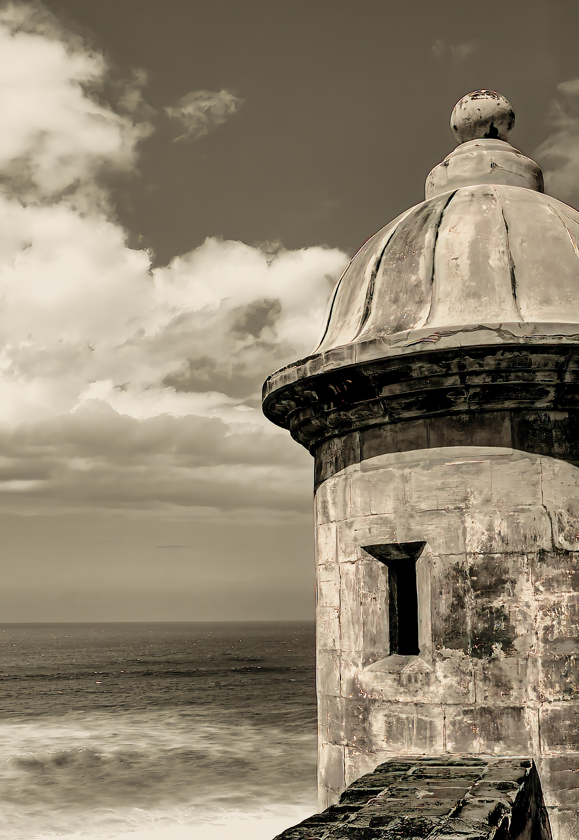
I'm a big fan of b&w (from my film days) but I do prefer the colour version of this image. I'm not sure why, but to me, the b&w image seems to have the tower leaning slightly - whereas the colour version seems fine. Posted: 07/19/2025 09:33:22
Interesting image. I liked both color and B/W. I liked the composition. In the color version, to me, the tower looks leaning anti-clockwise. Posted: 07/25/2025 07:52:59
And I prefer the monochrome image. In the color one, the colors seem harsh together. For the monochrome version, I would prefer sepia rather than b&w, as Terry showed in her image. I think it softens the scene. But I would lighten the dark areas just below the dome and on the platform leading to the fort. Posted: 07/27/2025 00:22:51