Jeri Conklin
May 2021 - Spring Sunrise
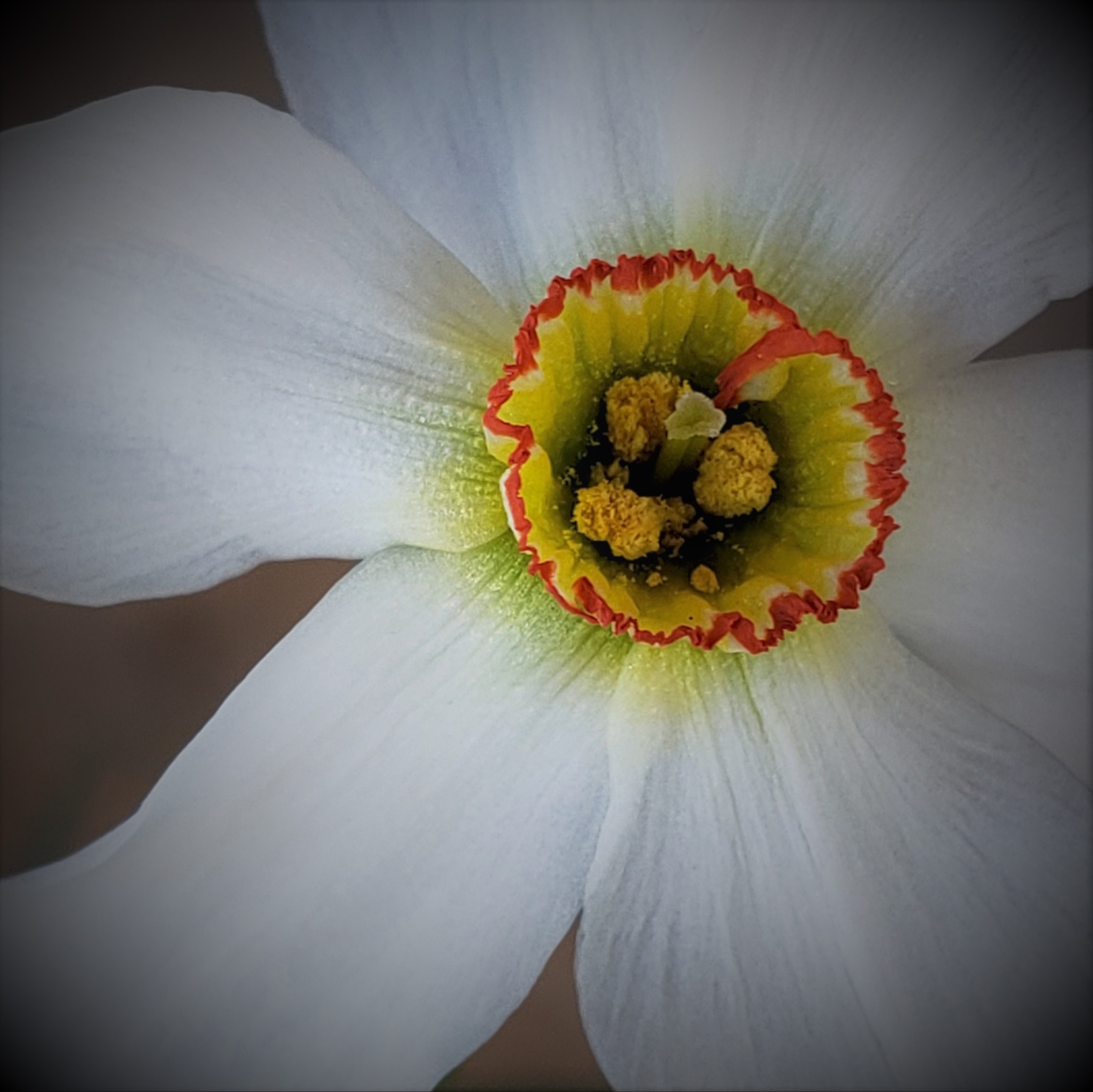
Original
About the Image(s)
Shot with my Samsung Note 9 cell phone - F2.4; 1/97s; 4.3mm; ISO 50
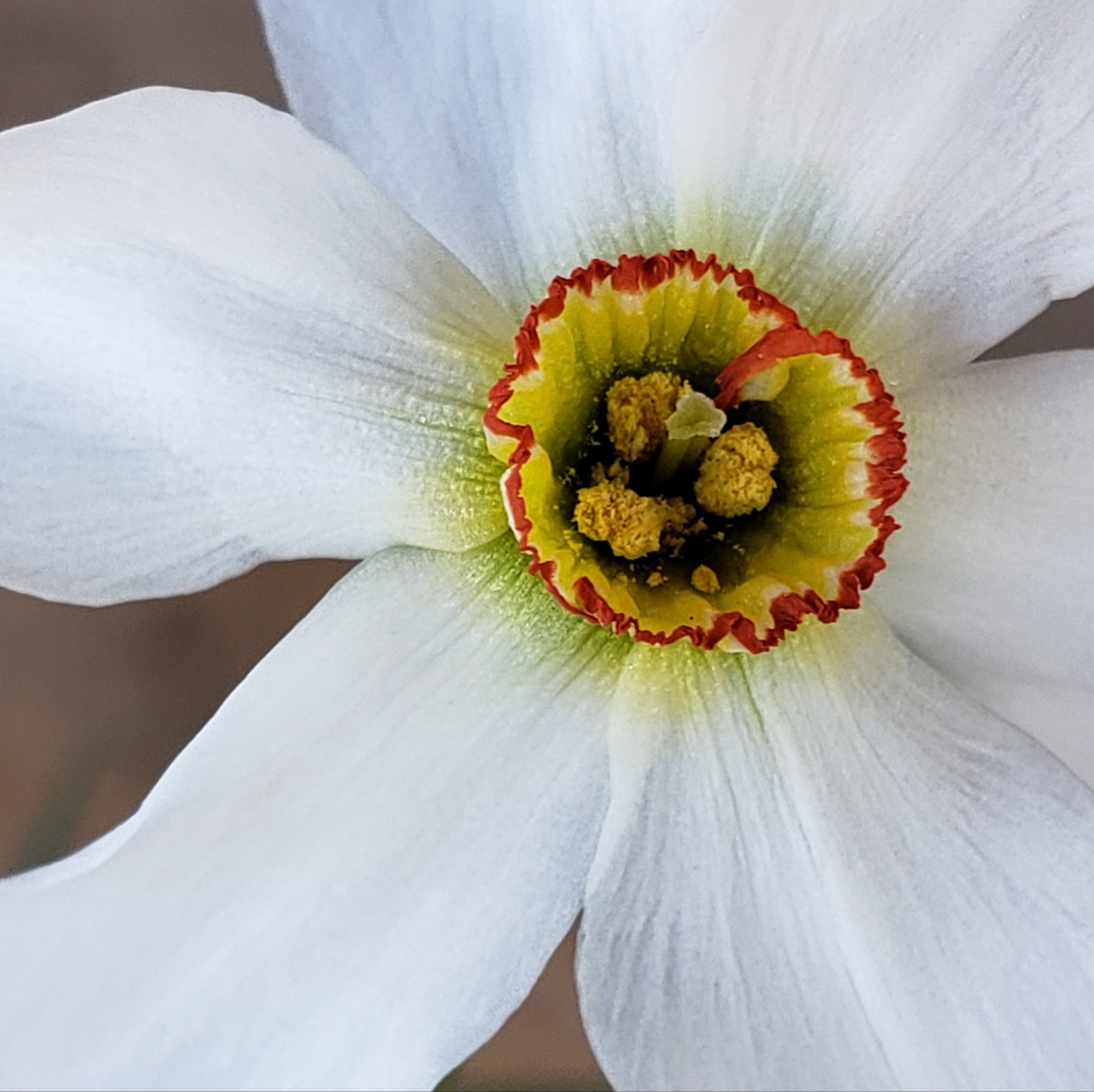
I am submitting this with a vignette for consideration. I like both the vignette one and the original one. I realize we shouldn't have areas open that attract our attention to lighter areas as is what happens with this crop. With the vignette it seems to lessen that effect. Thoughts?
This round’s discussion is now closed!
13 comments posted
(Group 9)
Hi Jeri,
I like your placement of the flower follow the rules of one third. The stem draws the center attention in addition with the shadow from the sun. The vibrant orange color certainly make any day sunny. Nice captured! Posted: 05/03/2021 15:41:10
I like your placement of the flower follow the rules of one third. The stem draws the center attention in addition with the shadow from the sun. The vibrant orange color certainly make any day sunny. Nice captured! Posted: 05/03/2021 15:41:10
Thank you Linda. Posted: 05/19/2021 10:07:01
(Group 9)
Hi Jeri,
Did you replace another image? As I recalled, the first image you submitted has orange color petals. Is that correct? Posted: 05/06/2021 13:39:52
Did you replace another image? As I recalled, the first image you submitted has orange color petals. Is that correct? Posted: 05/06/2021 13:39:52
(Group 9)
Hi Jeri,
I just realized the above comment was supposed to be for your April flower image. I like this white flower image as well. I tend to like the flower placement in your original image where it's off center more. I would lighten up on the vignette a bit because I like to see more of the beautiful white petals. The Interesting orange border stem highlighting the entire image. Nice shot! Posted: 05/06/2021 14:10:50
I just realized the above comment was supposed to be for your April flower image. I like this white flower image as well. I tend to like the flower placement in your original image where it's off center more. I would lighten up on the vignette a bit because I like to see more of the beautiful white petals. The Interesting orange border stem highlighting the entire image. Nice shot! Posted: 05/06/2021 14:10:50
Thank you Linda, I appreciate your comments. I did do the lightening on the vignette and felt it was either go all the way or not at all. Posted: 05/19/2021 10:09:03
(Groups 26 & 47 & 54)
Hi Jeri! You have such a great eye for the flowers! I agree with Linda about the vignette, I think that the white petals shine so beautifully in the original. Just an idea: you might also try to crop it to a square just round the interesting center part. That would make almost an abstract macro-type image. What do you think? Posted: 05/11/2021 14:33:19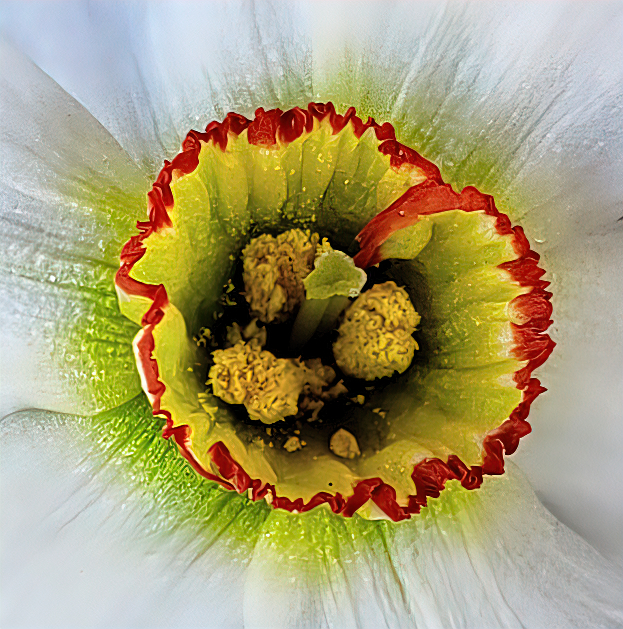
Kirsti, thank you. I do like what you cropped and presented. It does capture the center which is the beautiful element of this flower. Posted: 05/19/2021 10:10:36
(Groups 24 & 48 & 58)
I love flowers and take every opportunity to shoot them, In this case, I prefer the brightness of the original. In addition, I think the center is where the story is; so, as Kirsti did, I'm offering another alternative. Posted: 05/16/2021 06:34:54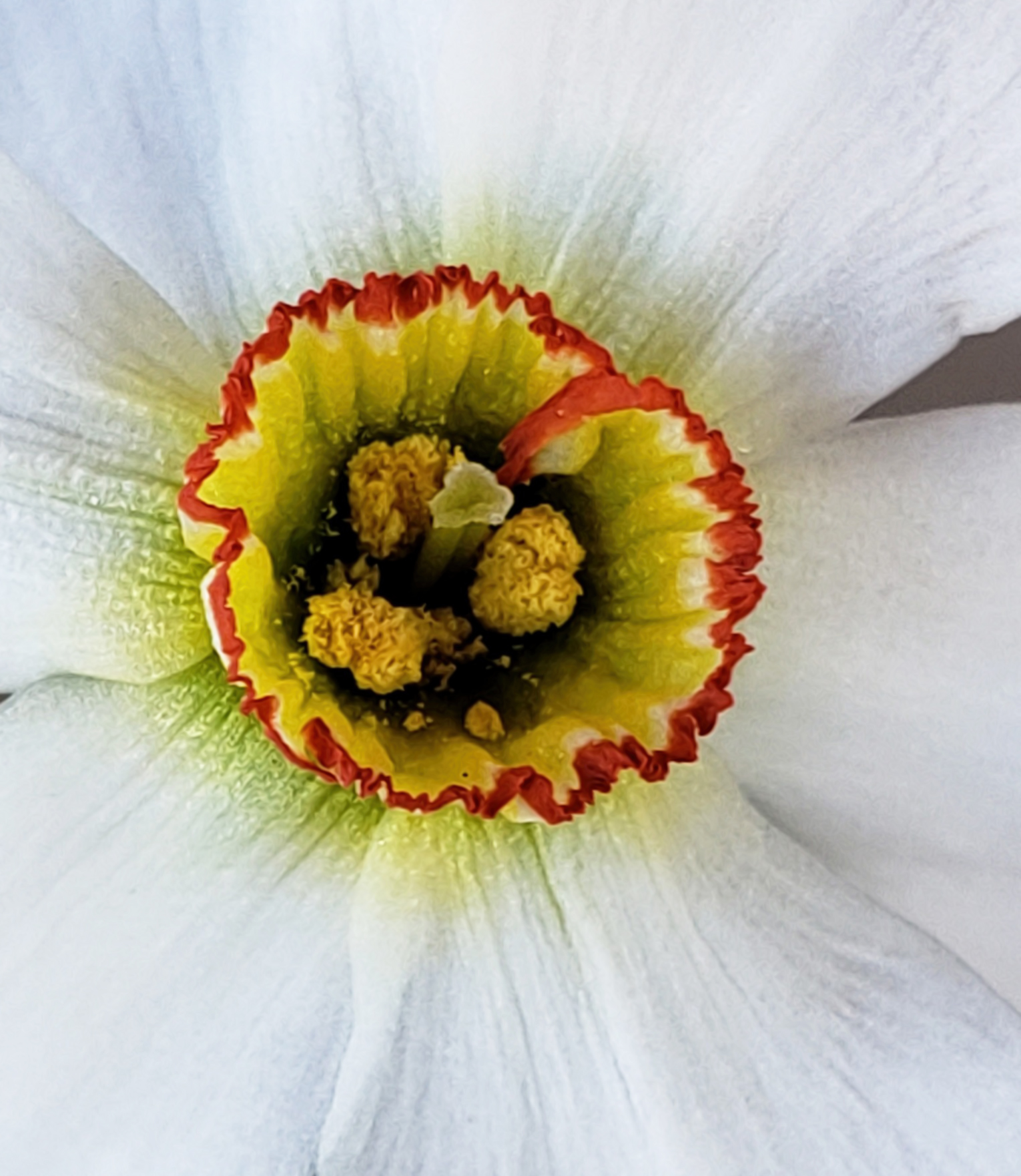
Thank you Bev, I like this one too. Interesting how the same focal area can look so different with just a crop. Posted: 05/19/2021 12:51:49
Hi Jeri, I happen to prefer your version with the vignette. It draws my eye to the orange and yellow center of the flower. From there I slowly notice the texture of the white petals. I think it is great that we get so many interpretations of your image.
Regards
Billy Posted: 05/19/2021 09:37:49
Regards
Billy Posted: 05/19/2021 09:37:49
Thank you Bill, I do too! I can't tell you why, but I do. I think I will try doing an exercise in different crops with this photo and line them all up. I think the vignette just brings it all together to the center by pulling in all areas to get there. Posted: 05/19/2021 12:54:25
(Groups 3 & 18)
Jeri,
Great flower close-up. I have to admit that the flowers shown by Kristi and Bev are preferable to me than the rather strong vignette. I feel that it dulls the flower down too much. Cropping in like that makes the center really stand out and makes it look almost like a daffodil.
Posted: 05/24/2021 17:56:53
Jeri: Nice image. Do away with the vignette; keep the white and bright. Strike around the image with a small white line to separate your image image from the black background of the site. By the way, either suggestion of Kristi or Bev have a lot of merit. Posted: 05/30/2021 18:46:44