Karen Davis
April 2026 - Erin's Classic Car
Original
About the Image(s)
I'm so sorry for the lateness of my submission. I totally forgot about the NEW deadline and completely missed even the OLD one. Darcy said to let you know what I've "been working on", so here goes. (And this is partly the reason/excuse for my tardiness!)
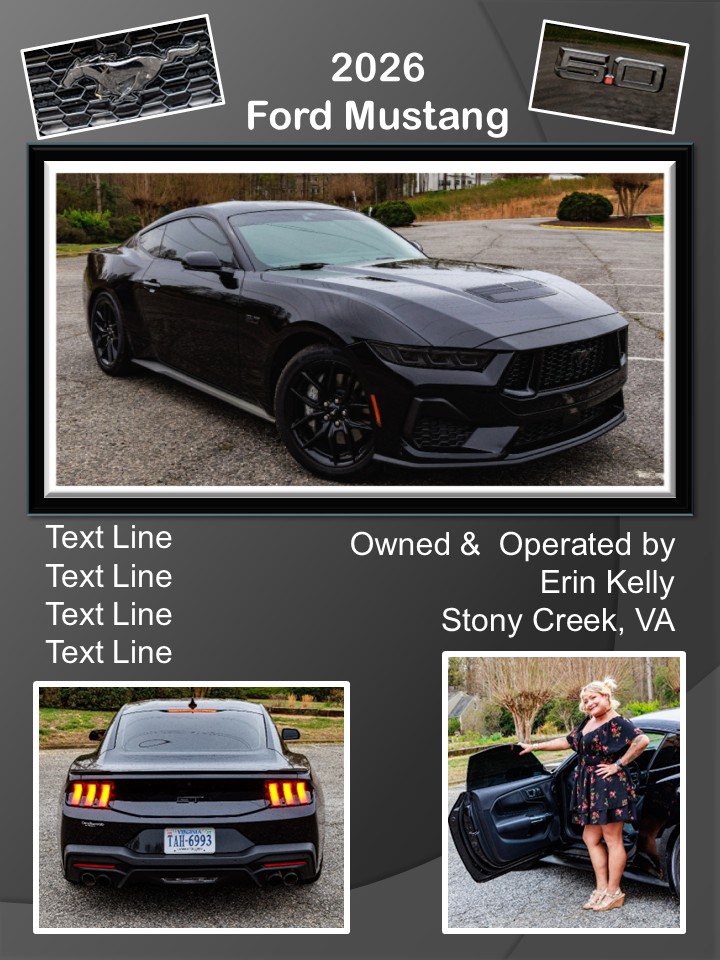
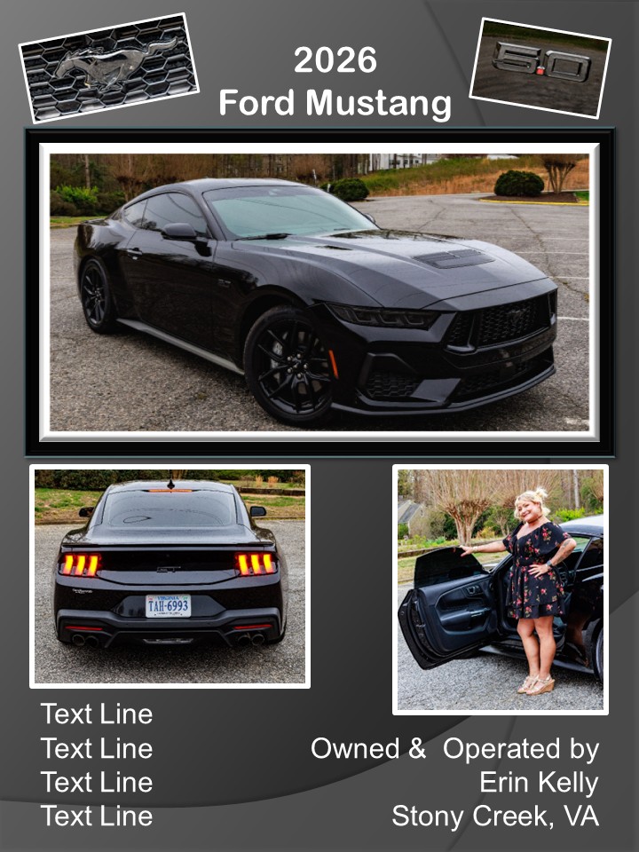
I've been shooting classic cars. A friend introduced me to the president of a new car club that was formed a few years ago and I've gotten to know the members through my "Official Photographer" (volunteer) role at their car shows. Shooting cars and meeting the owners is fun, and it has also turned into a mini-side-job/new stream (well, maybe a trickle!) of income for me. These owners LOVE to see photos of their "babies" and some of the members started requesting that I create large posters of the photos I've taken so they can display them with their cars at these shows.
I do a shoot with them and their car, then create the posters in PowerPoint. (I may switch over to Canva for that. We'll see.) I use a local print lab to print and mount the posters. So this month's submission is a compilation of shots we have chosen together. It's a collaborative process; with some owners needing more "collaboration" than others! But it's fun and rewarding when I see my work on display at these shows.
This is a work-in-progress. Erin still needs to provide whatever "specs" she wants to include for her car. Let me know if you like the text better in the middle (larger, v4) or all the way at the bottom (smaller, v3). It will probably be printed as an 18X24 or 24X36 poster.
Thanks for your indulgence this month. I'd love whatever feedback you'd care to offer.
P.S. If anyone has advice on whether to save as a jpg or png in order to create the best LARGE print, I'd love your advice.
5 comments posted
What a nice layout. AS far as your text goes, I think it works both ways. If I had to choice one, I would put the text on the bottom. As far as saving your files, I would save the image in both jpeg and png. The jpeg would be to share with the client or potential clients. The png would be for any changes you may want to make in the future, like changing the backgrounds.
Best regards,
Greg Posted: 04/11/2026 17:40:34
Greetings my friend.
A carefully layout set of images for the ad campaign. This is superb, only one thing I would suggest as Greg also mentioned, the text could be at the bottom of the images. Nice work. Thank you for sharing.
Cheers.
Kamal. Posted: 04/13/2026 02:52:10