Tom Brassil
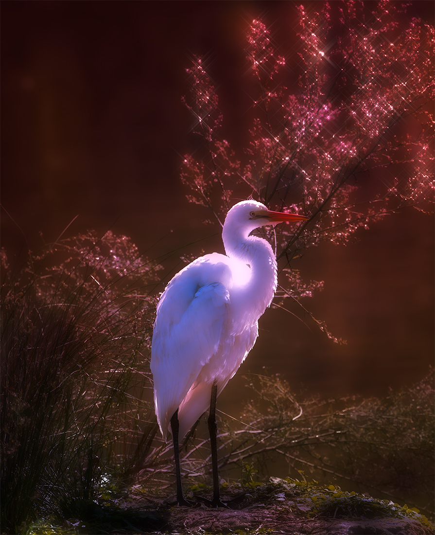
July 2025 - Great Egret, Back Lit
Original
About the Image(s)
Iso 72, F7.1 at 1/320with 400 mm Lens
This month's image is of a Great Egret. I was taken by the back lighting on the bird and the bushes. Obviously, in Photoshop, I've greatly enhanced that lighting with luminance and blur applied.
I accept that a few areas are blown out; they weren't in the original, but to take them back, sort of degrades the rest of the lovely light, to my eye.
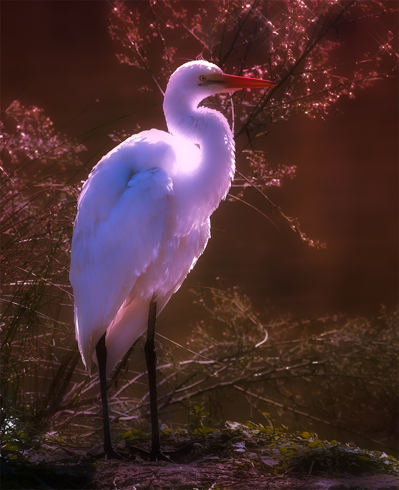
I'm also in a bit of a quandary with this image, where the image I like is as presented. I'm taken by the play of light on both the bush and the bird. However, I accept that a cropped version featuring more of the bird would normally be presented. A major crop would be needed to come into the realm of an acceptable image (also attached). However, as it's my image, I'm going with the image I like, not with an image that would be acceptable in a competition approach.
Thanks for viewing and for your comments.
11 comments posted
I do like both images, but I think the crop in the "Original" that positions him a bit off-center is more appealing to my eye.
The one suggestion I might make - and it's minuscule - is to remove the white line/branch below his beak.
Beautiful image!
Karen
Posted: 07/18/2025 19:15:38
Thanks for thinking out loud for the group. The image is interesting with very unique lighting. I think sometime you just have to go with your gut. I think you made a good choice.
Best regards,
Greg Posted: 07/22/2025 19:35:53
Greetings my friend.
Eventhough some part of the image is blown out, I think you have handled the image pretty good.
Lovely capture and thank you for sharing..
Cheers.
Kamal. Posted: 07/29/2025 11:05:41