Gene Whalen

August 2026 - July Day Lily
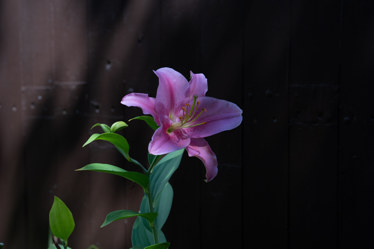
Original
About the Image(s)
Image was taken with my Sony A7iv. 70mm f/5.6 1/200sec -1.7EV ISO 125
To process, I cropped for balance, Exposure +.33, Contrast +23 Blacks -18
I originally had a B&W photo in mind for this month and was working on October’s “Flowers”. When I saw the contrast between the fuchsia and green of the lily I figured I couldn’t get more "contrasty” as they are opposite each other on the color wheel. The orange of the pollen is almost 90? off of their axis. And anyway, the B&W was kind of dull.
6 comments posted
Great color contrast, as well as positioning of the subject. Nice sharp center for the flower details. As a suggestion, I would darken the background to eliminate the details of the wood paneling so all of the emphasis is on the flower. Posted: 08/09/2026 00:03:47
Thanks, Barbara. I did one version with the background going "all black" but then the iris was just floating in space. I thought the faint light on the left side gave it a bit of space behind. If anything, I should probably have removed the four "ghosts" in the field to the right. Looking at it now I find them distracting.
I thought you might like this when I submitted it. You seem to gravitate towards flowers and garden life. This is from my wife's iris garden with dozens of varieties along the fence and when they start blooming is quite the show Posted: 08/12/2026 21:19:39
I thought you might like this when I submitted it. You seem to gravitate towards flowers and garden life. This is from my wife's iris garden with dozens of varieties along the fence and when they start blooming is quite the show Posted: 08/12/2026 21:19:39
Nice colour contrast here as you recognised. The crop helps to focus more on the petals of the fuchsia. The flower is nice and sharp and there is the added contrast of the yellow tips of the stamen. Good composition allowing a little for the flower to grow into, although that may take a while. :) Posted: 08/11/2026 09:25:26
Yes, Gene, I'm all about garden photography! Posted: 08/13/2026 17:29:23
Almost perfect. I would remove the water droplets on the right. Tone down the light on the left upper corner. Posted: 08/14/2026 02:24:00
Hi Gene, great looking Lillium, nicely placed in the frame and slightly facing away, the colours contrast and stand out well from the background, the light from behind highlights the area around the stamen, I would be inclined to clone out the spots on the right, they are distracting and are not adding to the composition, the image is sharp and the details on the petals stand out well. Posted: 08/17/2026 12:07:30